Home Decor

Zodiac Decor Ideas

This is fun! Take a look at what your zodiac sign is recommending for you. The signs are categorised in 4 main groups: fire, air, water and earth. Each of them have a different home decor style. Here are the zodiac decor ideas!

Fire

The zodiac signs Aries, Leo and Sagittarius belong to the Fire group. Their strong and passionate personality makes them love to stand out. That is why their style is original and have special pieces with WOW effect.

Air

Aquarius, Gemini and Libra are the zodiac signs of the Air. Born under these signs and free souls by nature. They love light and airy style, serene tones such as whites and greiges. Their decor style is minimal and pure.

Water

Imaginative, transparent and in constant movement, the signs of the water element - Pisces, Cancer and Scorpio - feel comfortable in a colour palette that reminds them of their element water. That is the shades of blue. The curved and wavy forms as well as imaginative patterns are for these zodiac signs.

Earth

Stability, organization, tranquility... these are the features associated with Capricorn, Taurus and Virgo - all signs of Earth. They have also a common connection with tones of sand and terracotta. They love robust decor pieces, which make them feel connected to the ground.

Do these zodiac decor ideas reflect your own style?

Nature Inspired Wallpaper designs

Looking for Nature Inspired Wallpapers?

Italian wallpaper company Tecnografia is specialised in large scale wallpapers and decorative panels. I picked up here some of my favourite wallpapers from their new collection - all nature inspired and hand painted designs. Which one is your favourite?
Step into this lush green rain forest! It definitely has a soothing effect. I can feel and breathe that air coming from the fresh and humid jungle.

Landscape wallpaper by Tecnografia.

This wallpaper goes perfectly with Japandi style interior. It is minimal yet eye-catching and gives you a feel of an artwork. No pictures needed on this wall.

Bamboo wallpaper designed by Marco Fontana.

Who can resists of peonies? Huge peonies in sophisticated hues make a beautiful statement wall for any room. I think in a bedroom they make you dream and fall asleep easily.

Pemberley wallpaper comes in different tones.

Would you like to have a statement wall at your home?

Iconic Stool 60 by Alvar Aalto

Iconic Stool 60 was created by Finnish architect Alvar Aalto in 1933. The stool has been in production ever since - thanks to its simple, time transcending model. Alvar Aalto wanted to design a universal object made entirely from native birch.

Stool 60 available at Finnish furniture company Artek.

When I saw that Stool 60 is available in bright blue, I just couldn’t resist. I had to buy it for my client as the colour was exactly the same as the chosen accent colour for their new home in Spain. This blue tone is called Bothnia Blue, and it was possible to order from Danish Wood Wood company.

Bothnia Blue

Every Stool 60 is unique developing a rich patina and ageing with grace over the years. It is also multi-functional - you can use it as a seat, table, storage unit or as a display surface.

This year there have been special editions celebrating the stools 90th anniversary. Find out more at Artek!

Furnishing a Vacation Home From the Scratch

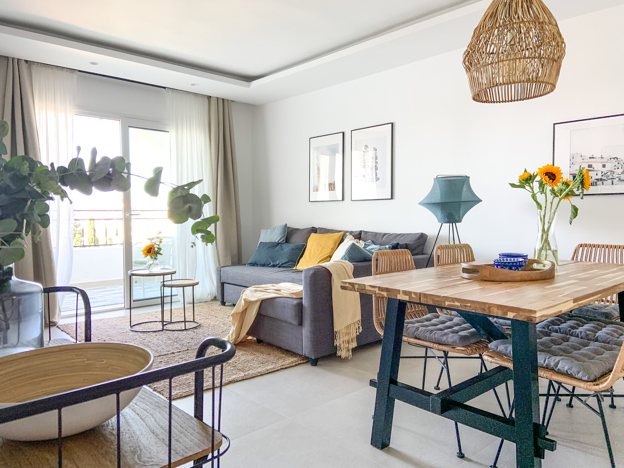
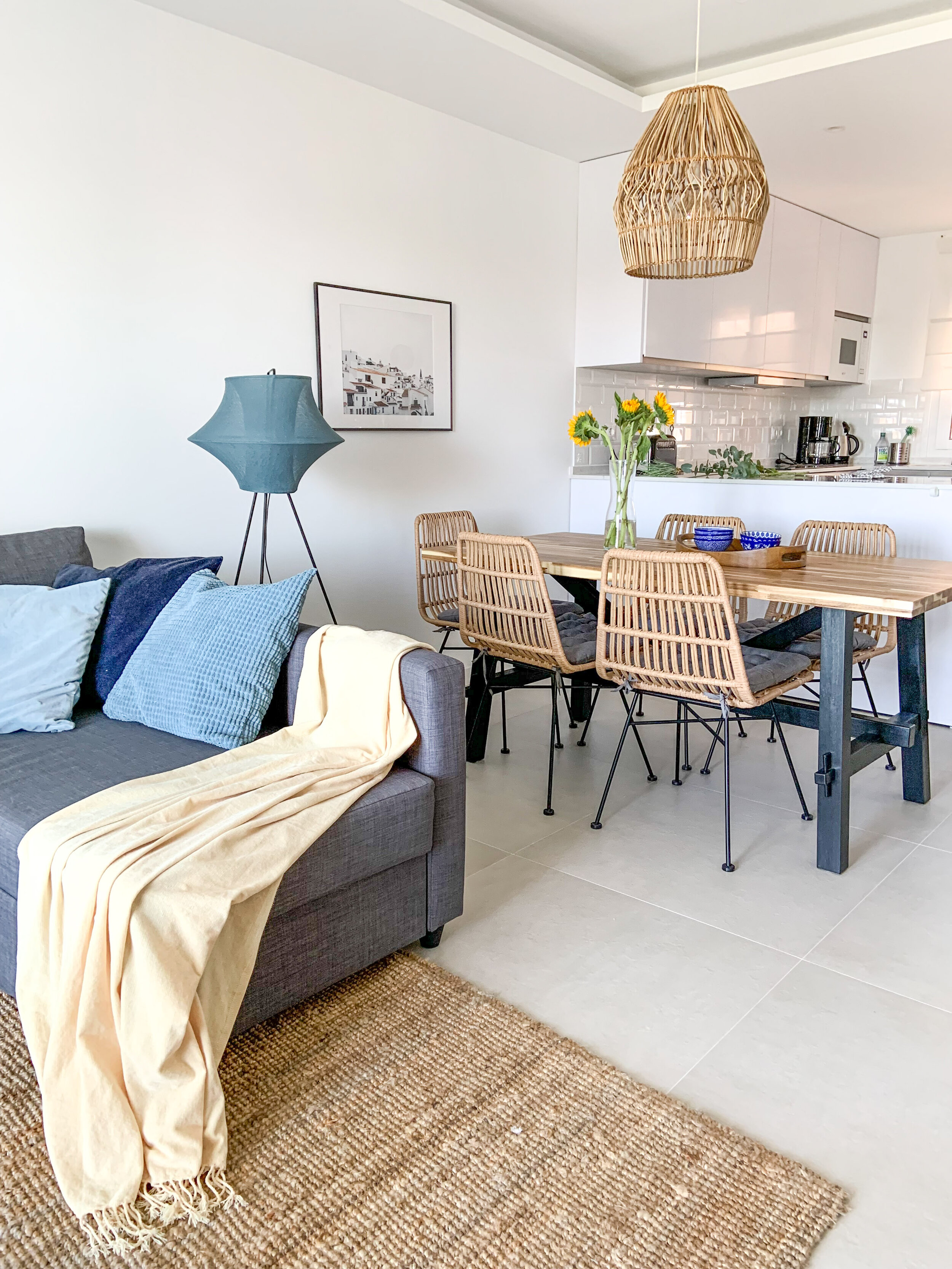
This totally renovated 2 bedroom apartment was bought for rental purposes as well as for the family themselves to spend their vacations and for remote work when ever possible. Beautiful sea and garden views together with an open plan layout make the small apartment feeling airy, light and spacious.

Renting out a vacation home in Spain is rather easy. Of course, it’s renters market at the moment and that makes it even more important to stand out from the crowd and attract potential renters.

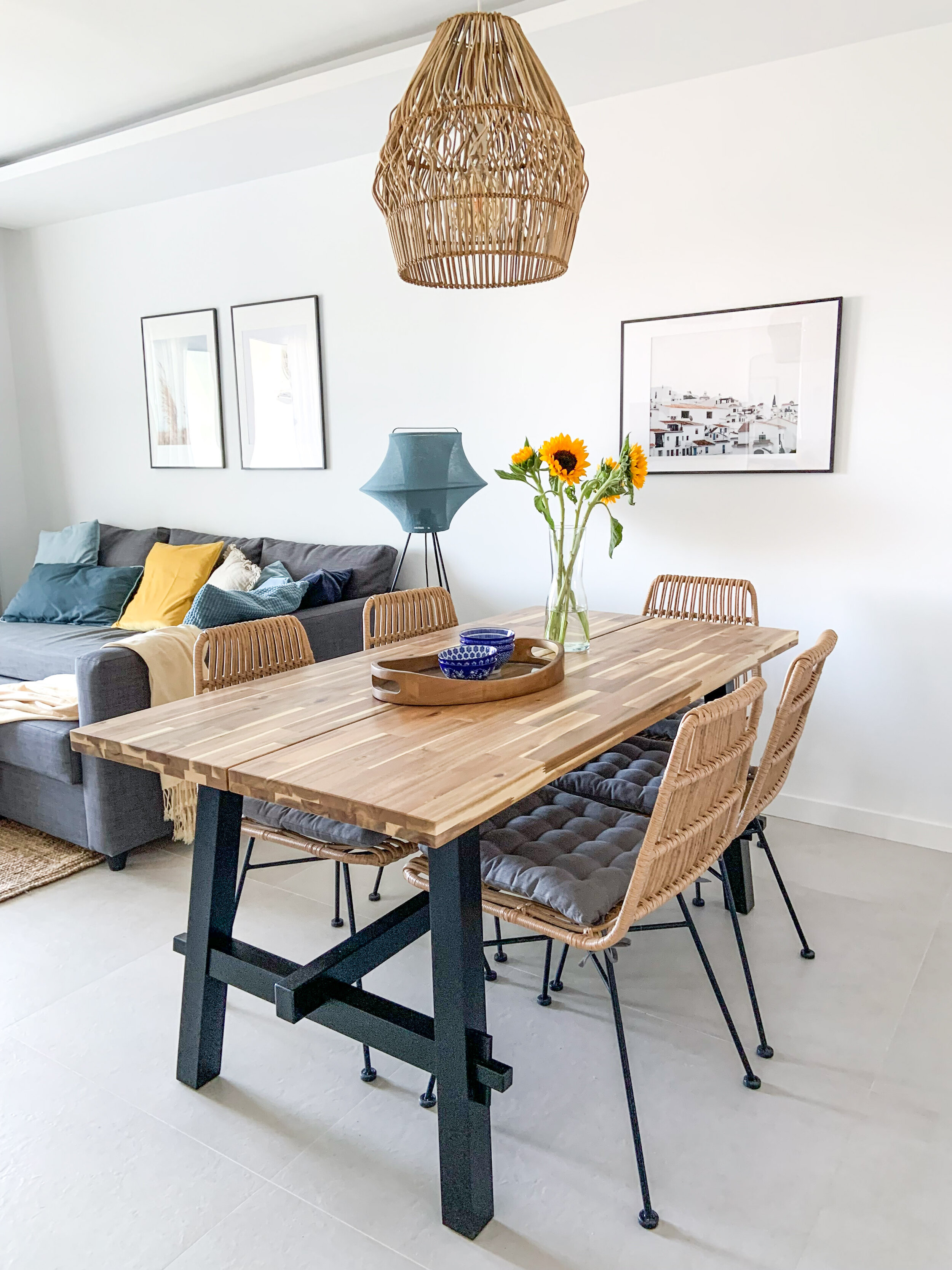
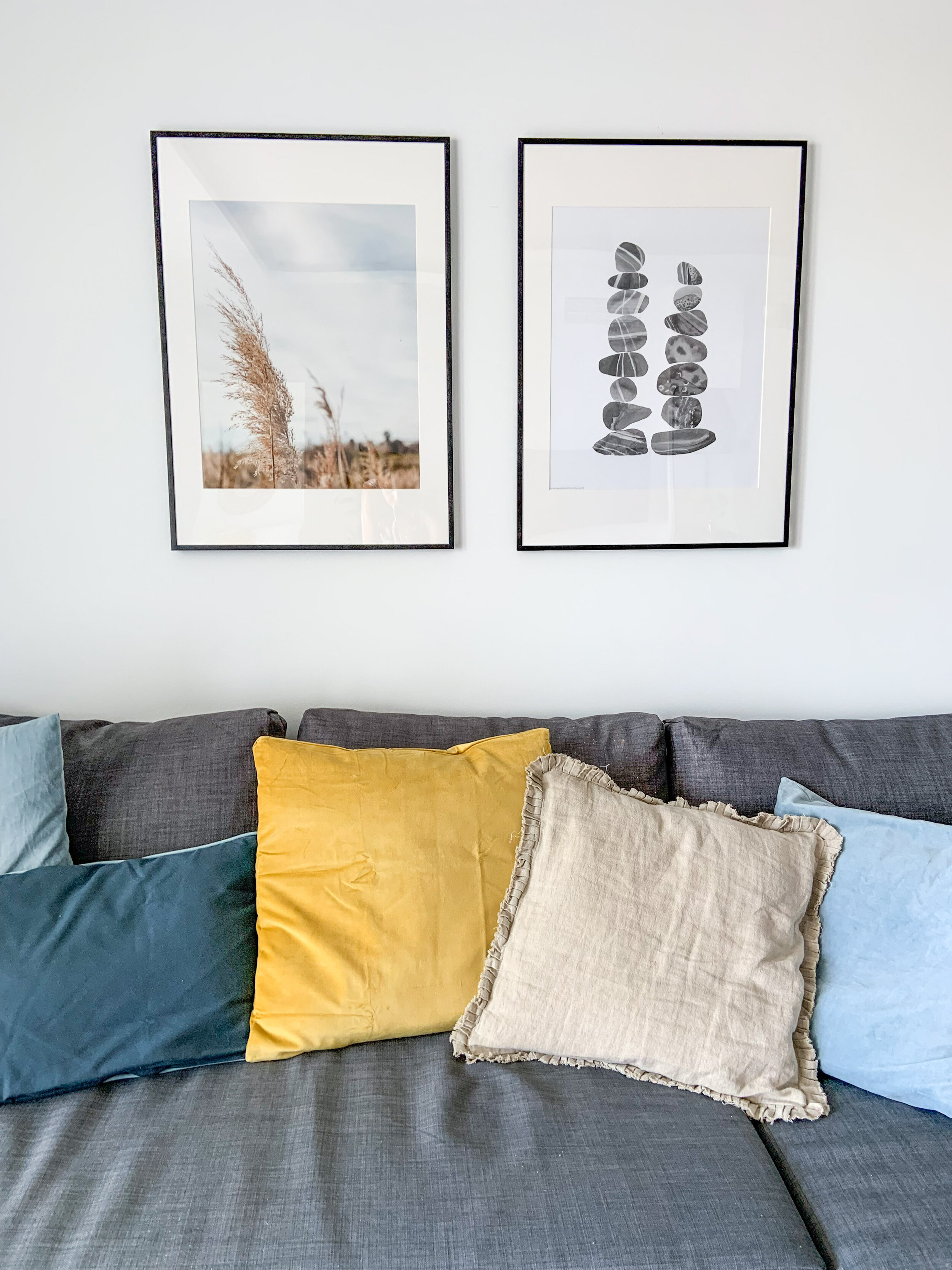
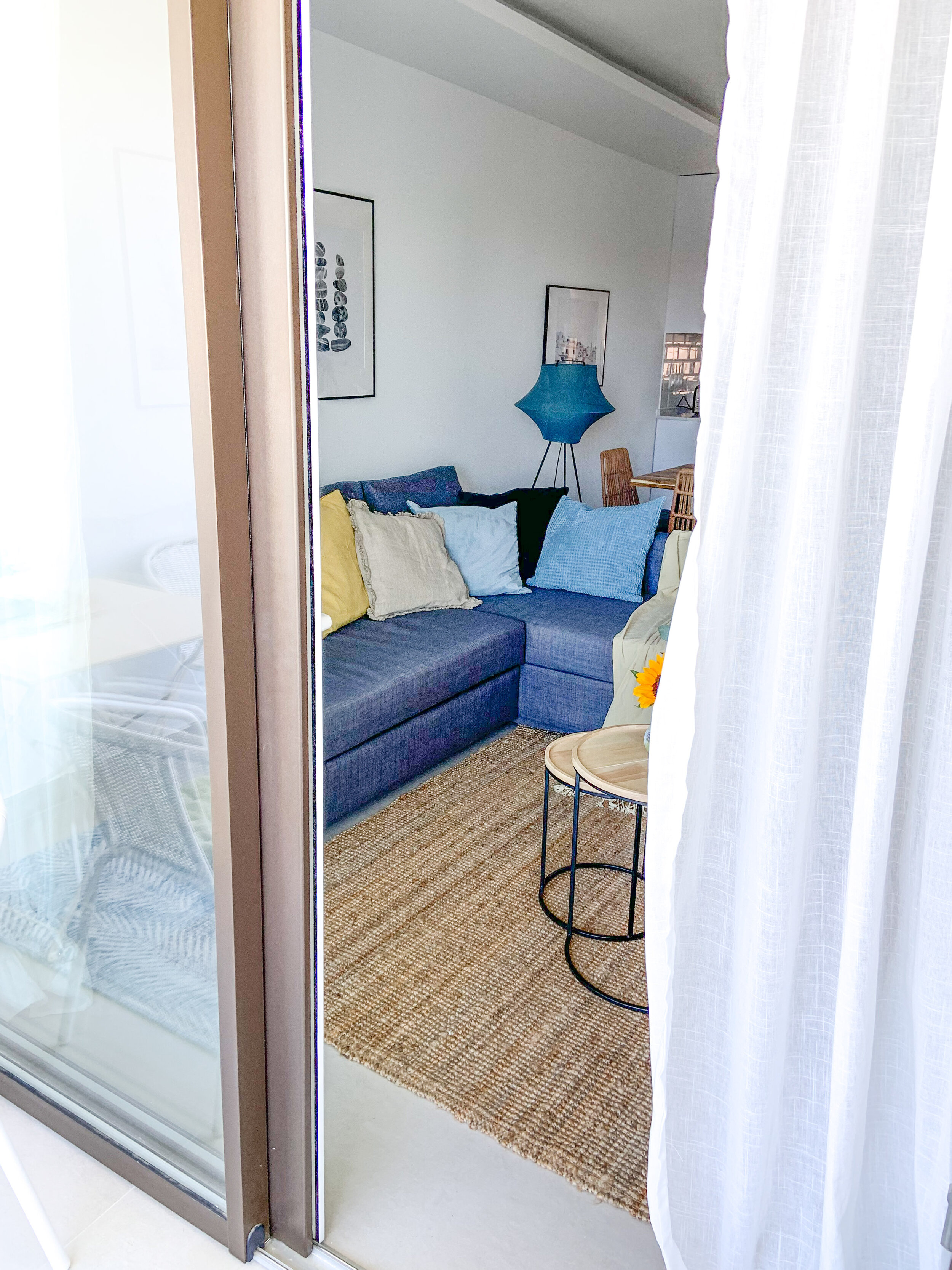
Living & dining - natural hues with tones of fresh blue & sunny yellow.

Living & dining - natural hues with tones of fresh blue & sunny yellow.

Tips For Creating a Standout Vacation Rental

  1. Keep it simple

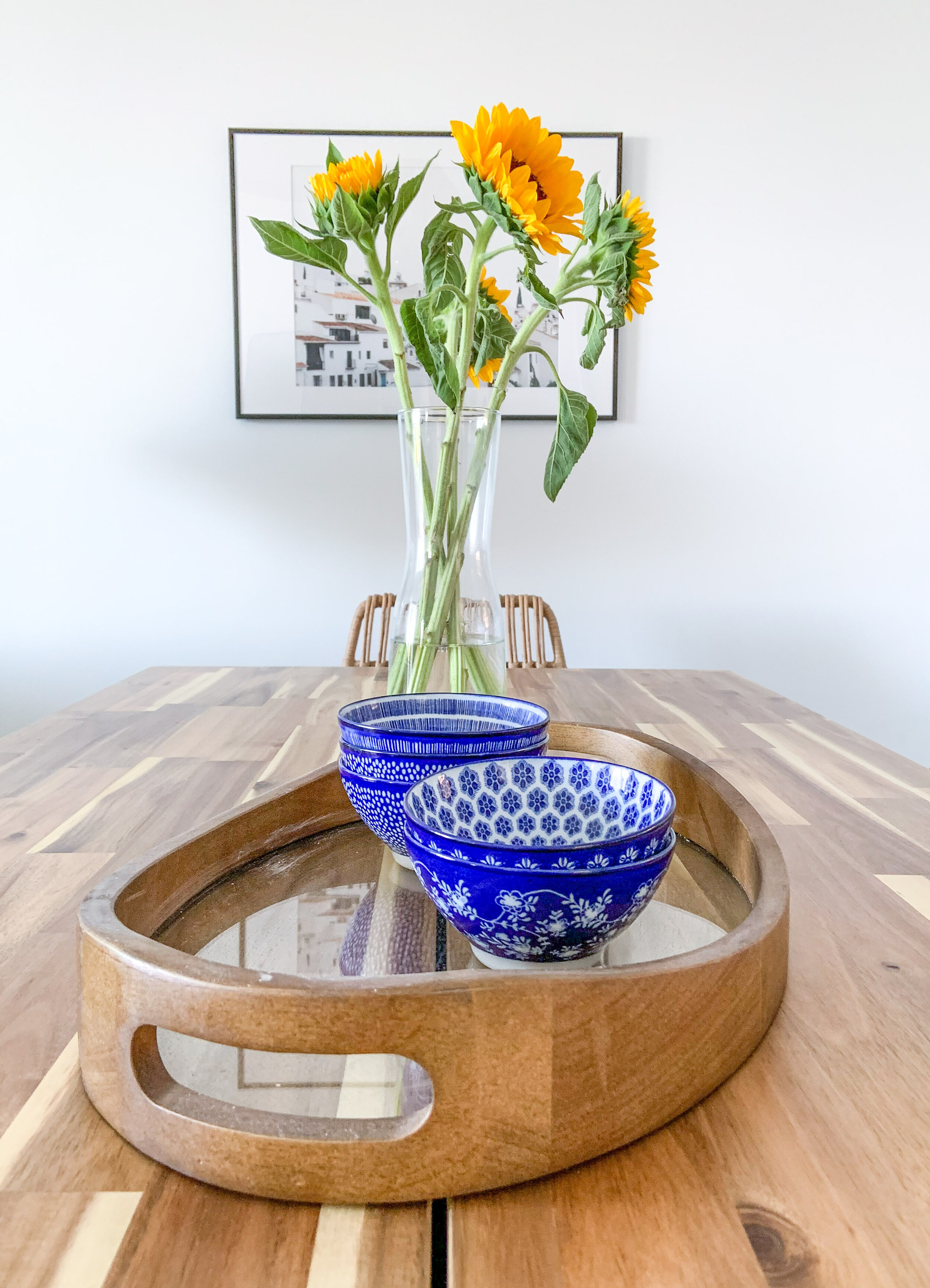
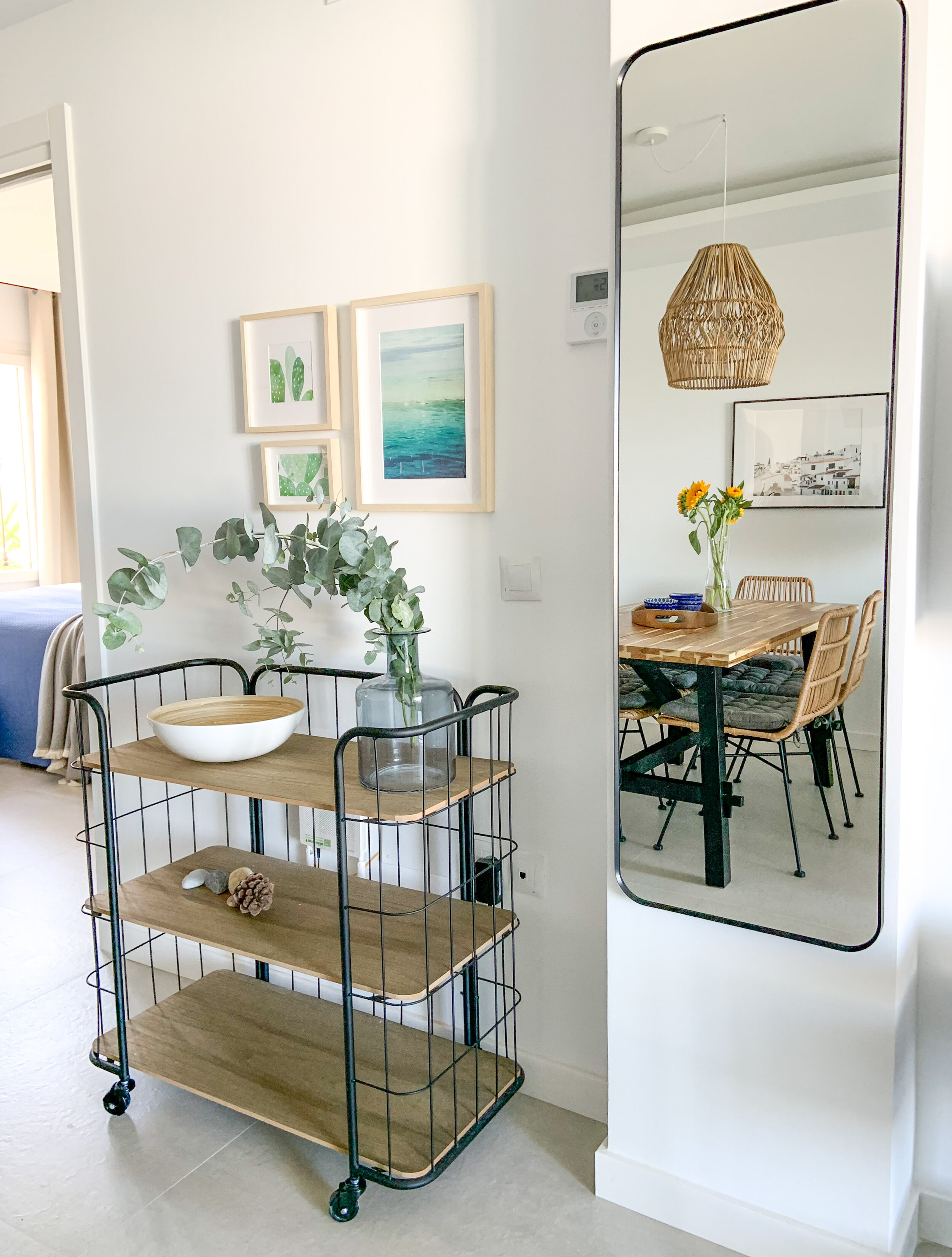
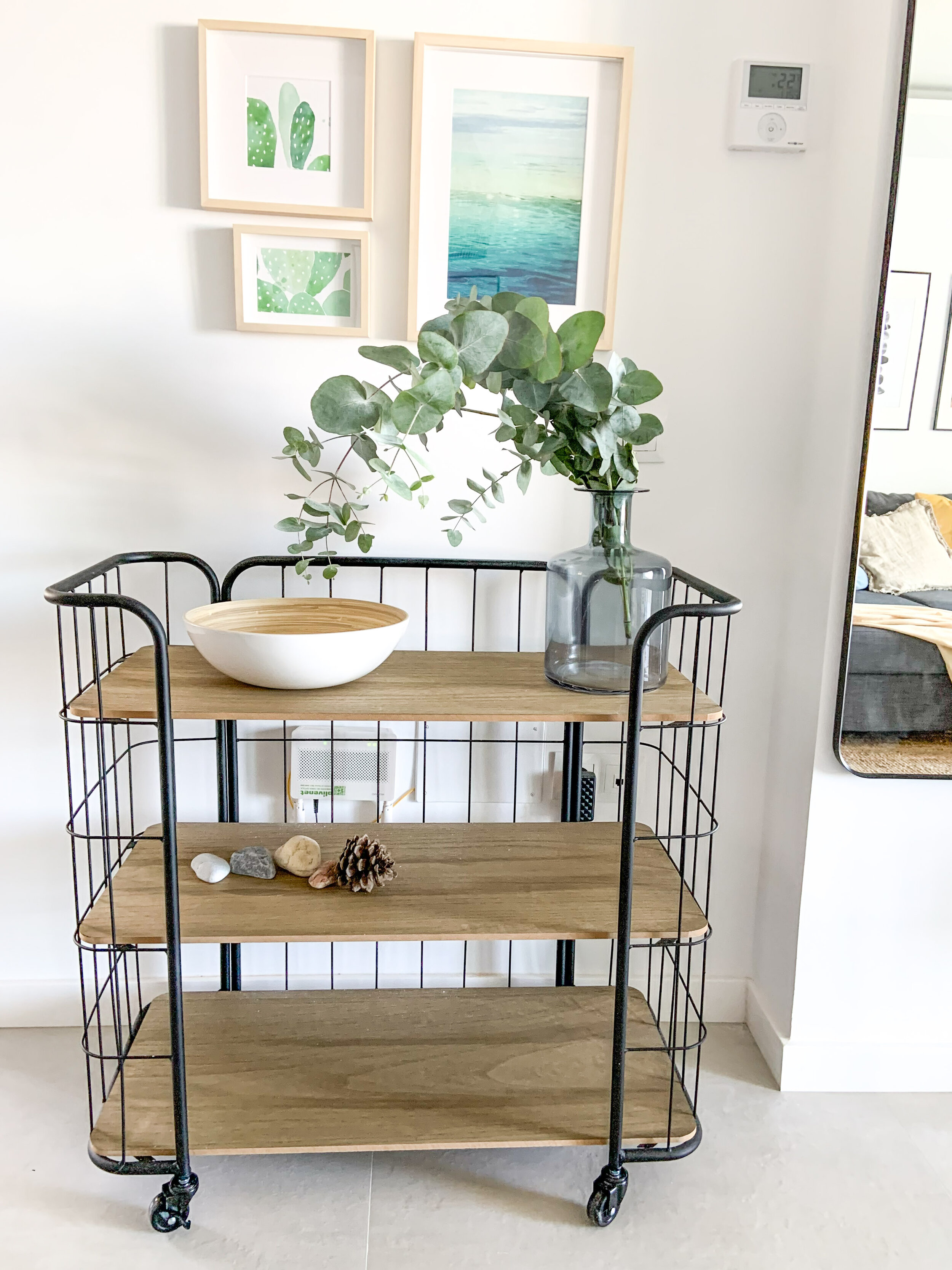
    When designing vacation rentals, simplicity in the furnishing is the key word. Keep the furniture highly edited and accessorising down to a minimum. Use neutrals as your foundation, then build on that with accent colours. Use cushions, blankets, vases, bowls and ‘feel good’ art.

  2. Mix & match

    You can buy the main pieces of furniture in one place and save with the transportation , but add also some smaller pieces from different brands. In this particular case we bought a lot from Ikea such as the sofa, dining table and beds, but the home was spiced up with pieces from Zara Home, Westwing and Casa Mijas.

  3. Decorate with Purpose

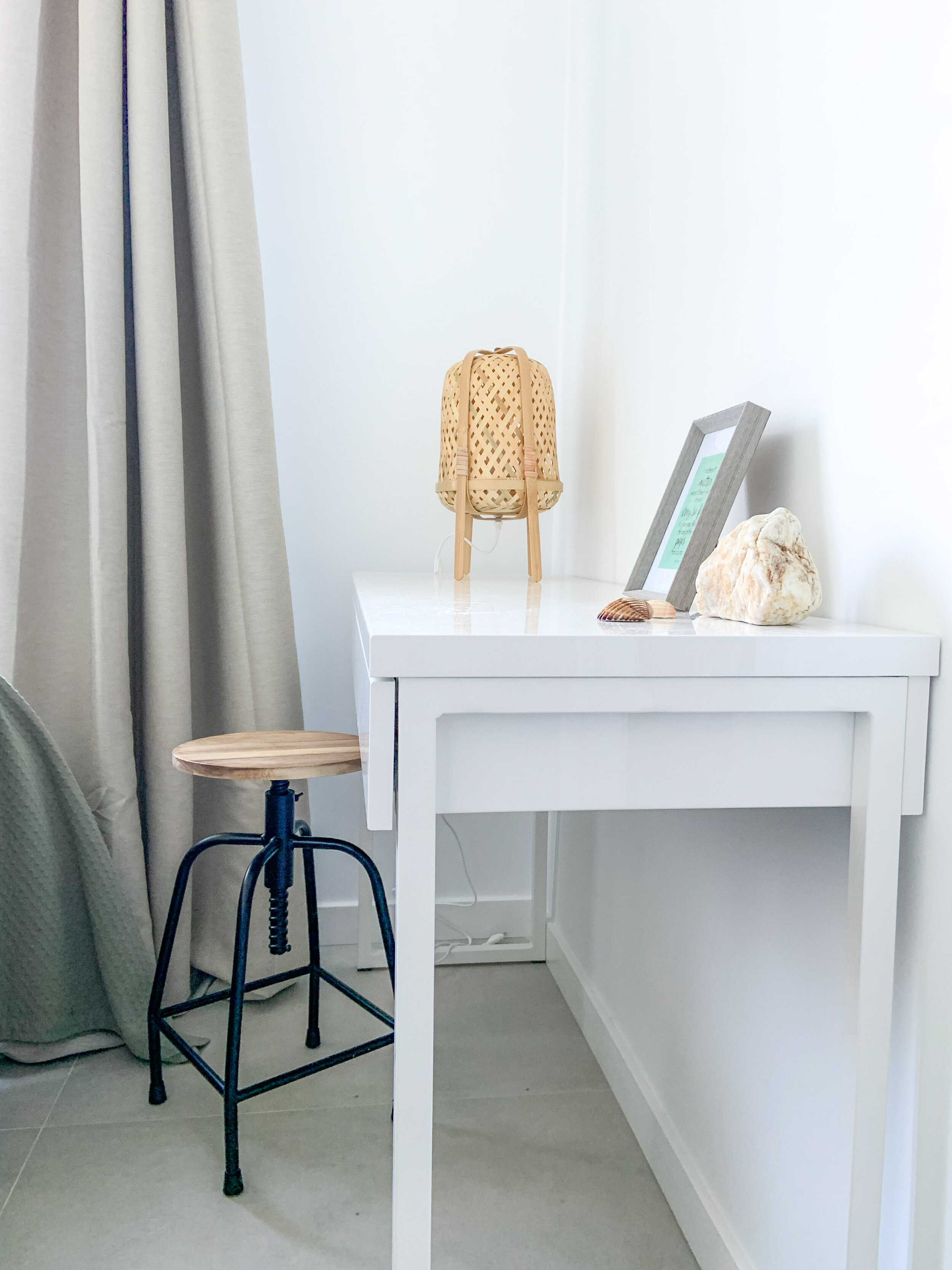
    Every room and space should have a function. In this home it was easy and obvious as the open plan layout gave spaces for different functions - cooking, dining and watching TV & relaxing. Both bedrooms were quite small, but it was important to make the beds inviting and comfortable. In the other bedroom there’s a locked sideboard for owners’ personal stuff, and a desk for working in the other.

  4. Add Thoughtful Touches

    Choosing matching bedlinen and towels show that you care and want your guests to enjoy their stay. Same thing goes with the kitchen utensils - there should be enough of them and all going well together.

IMG_3695.jpg

When you need beautiful images to your walls, go to StockBoutique by AT!

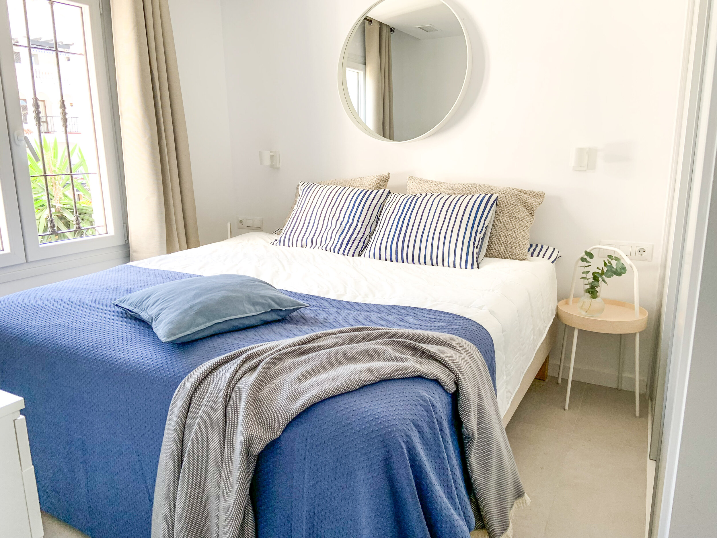
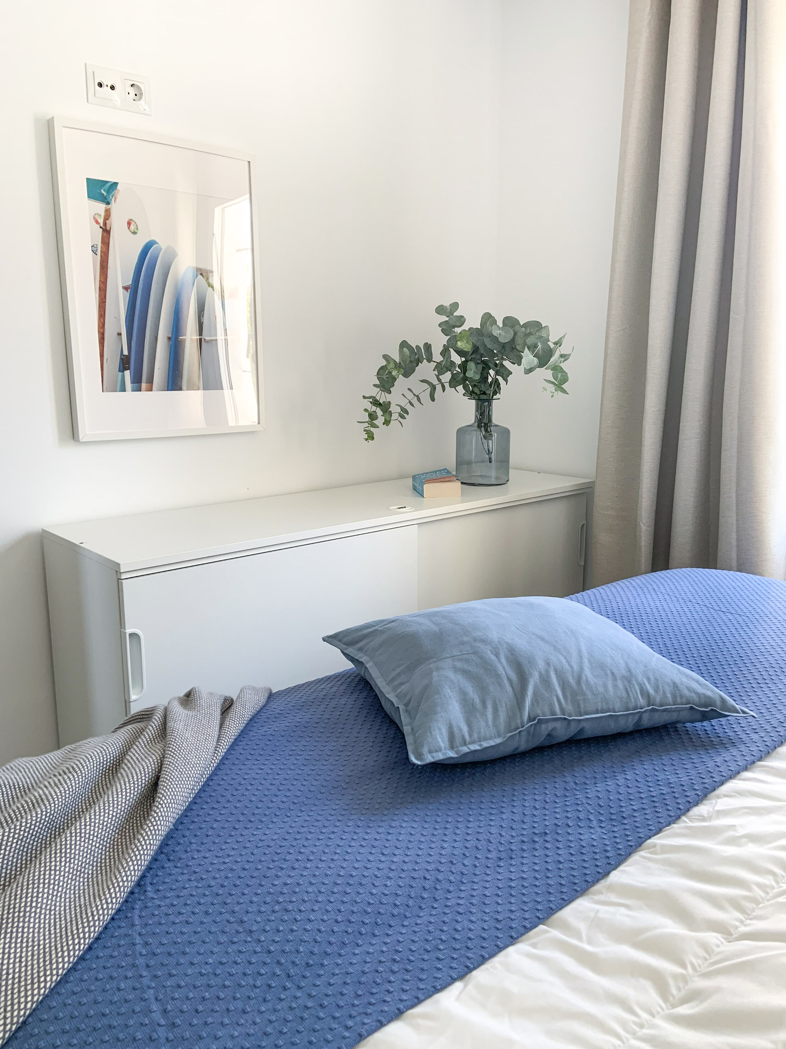
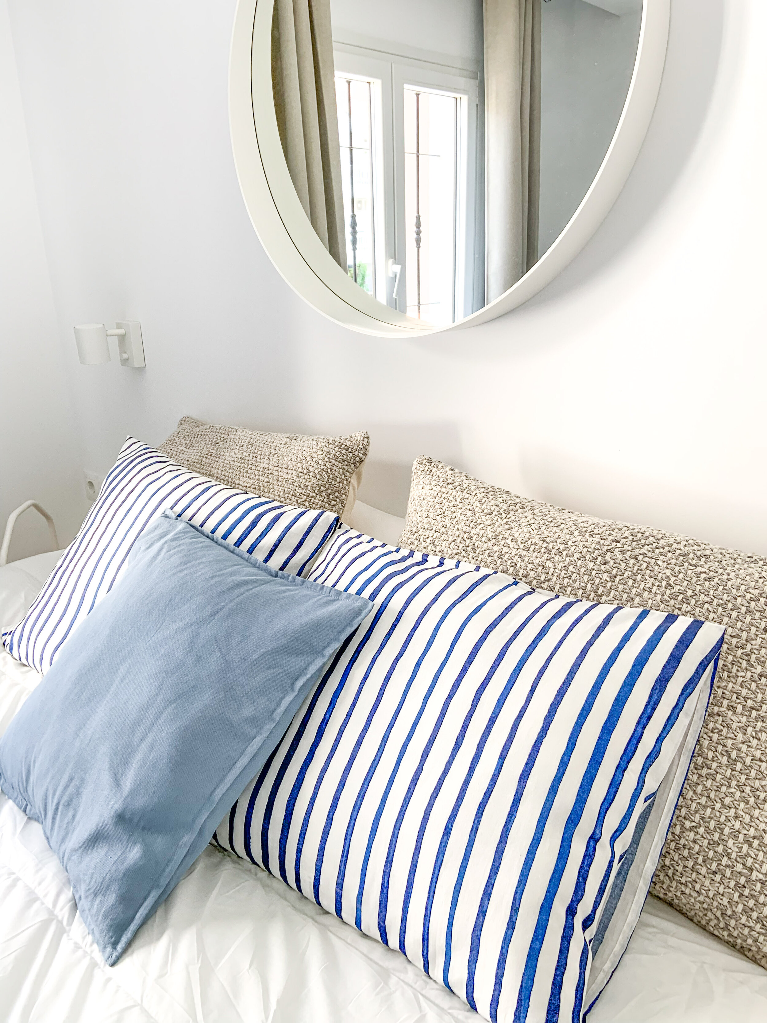
Blue bedroom.

Blue bedroom.

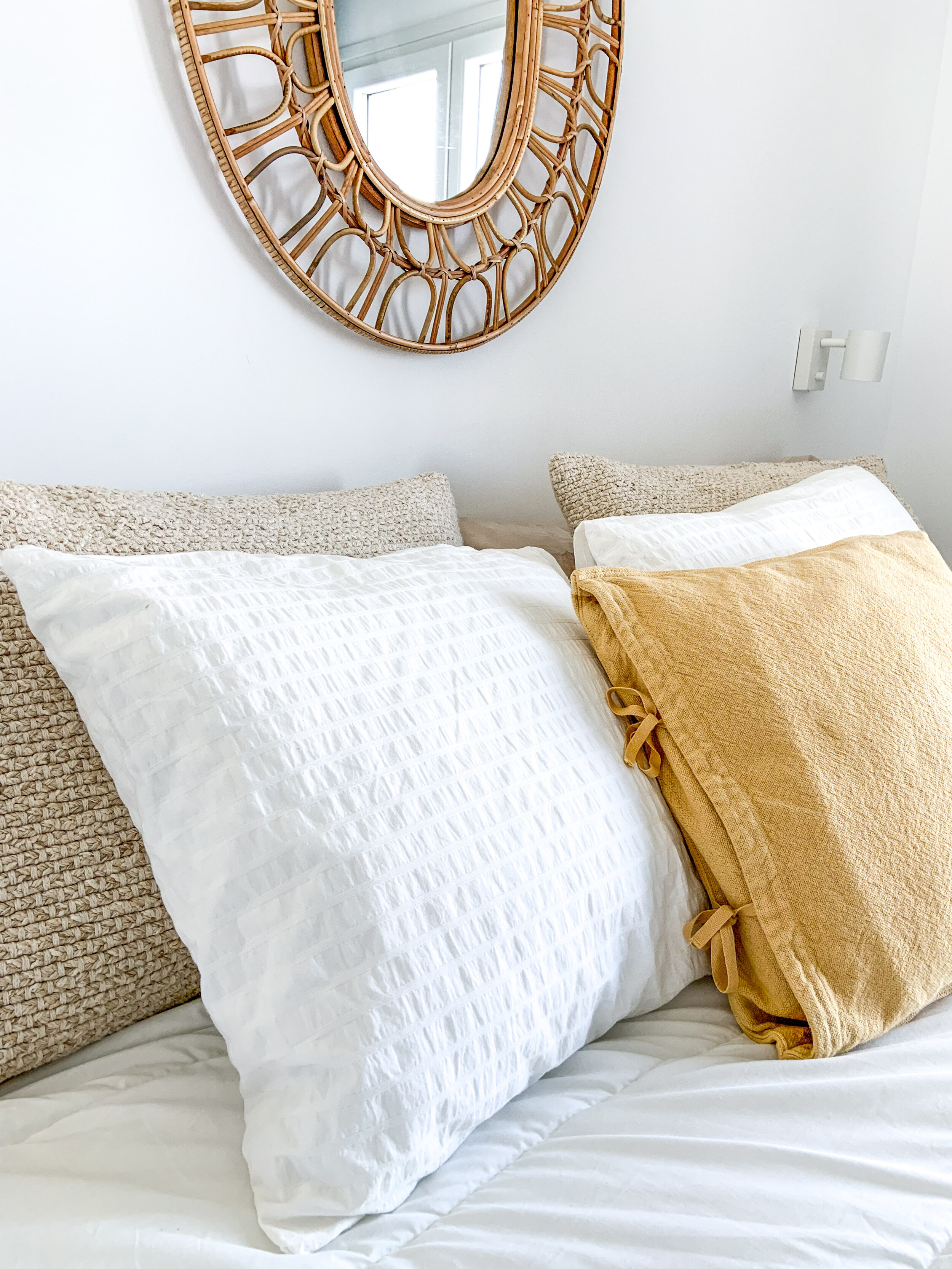
Sunny yellow details.

Sunny yellow details.

The idea is that if guests have a wonderful experience with the home, hopefully they take better care of it. The more you finish a rental home — the more you complete the story — the more respect people have for it.

Beautiful and well-maintained garden with 2 pools.

Beautiful and well-maintained garden with 2 pools.

If you need a holiday home for a week or 2, or for the whole month, this home is available here.

Tips For Decorating A Rooftop Terrace

Decorating A Rooftop

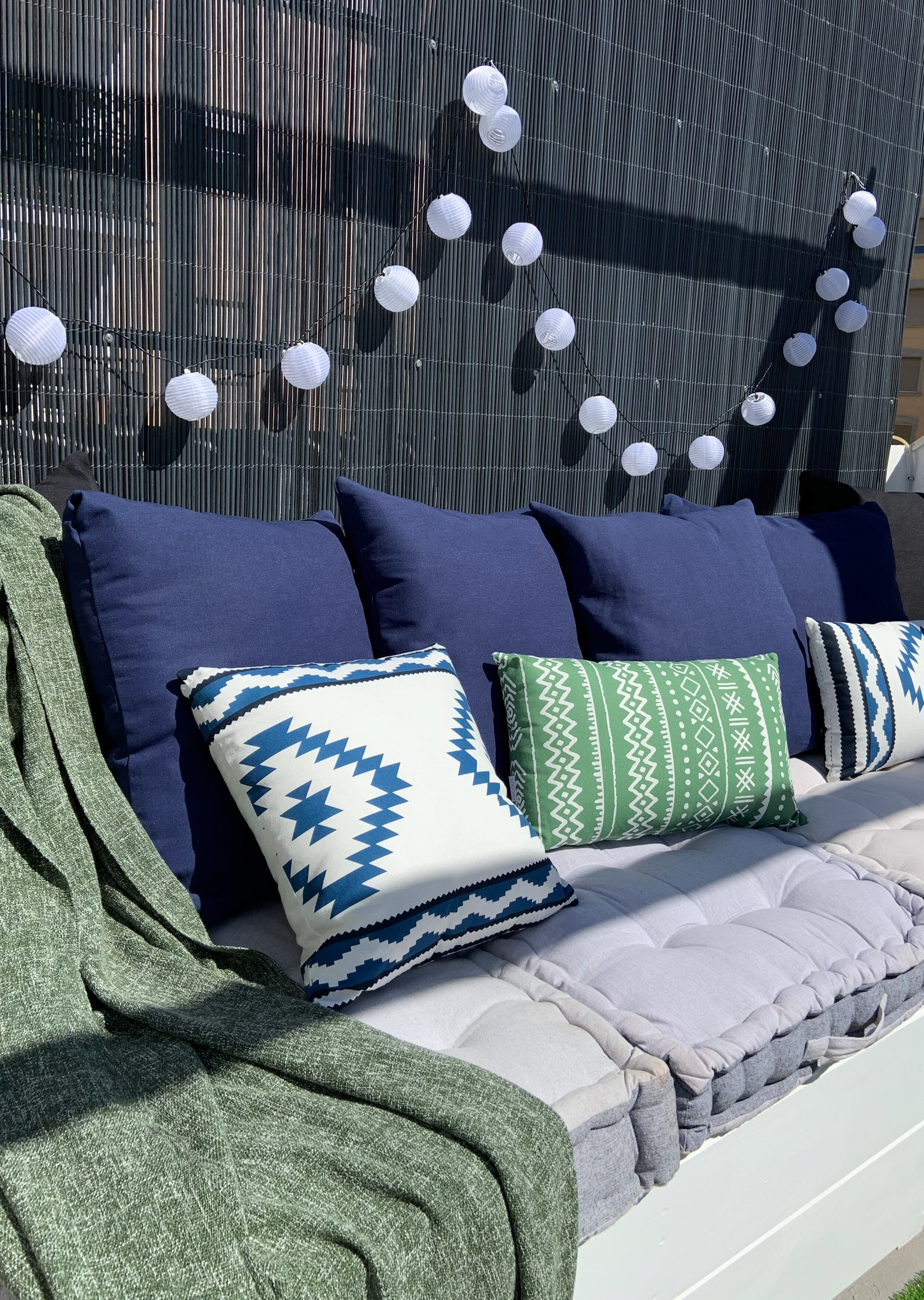
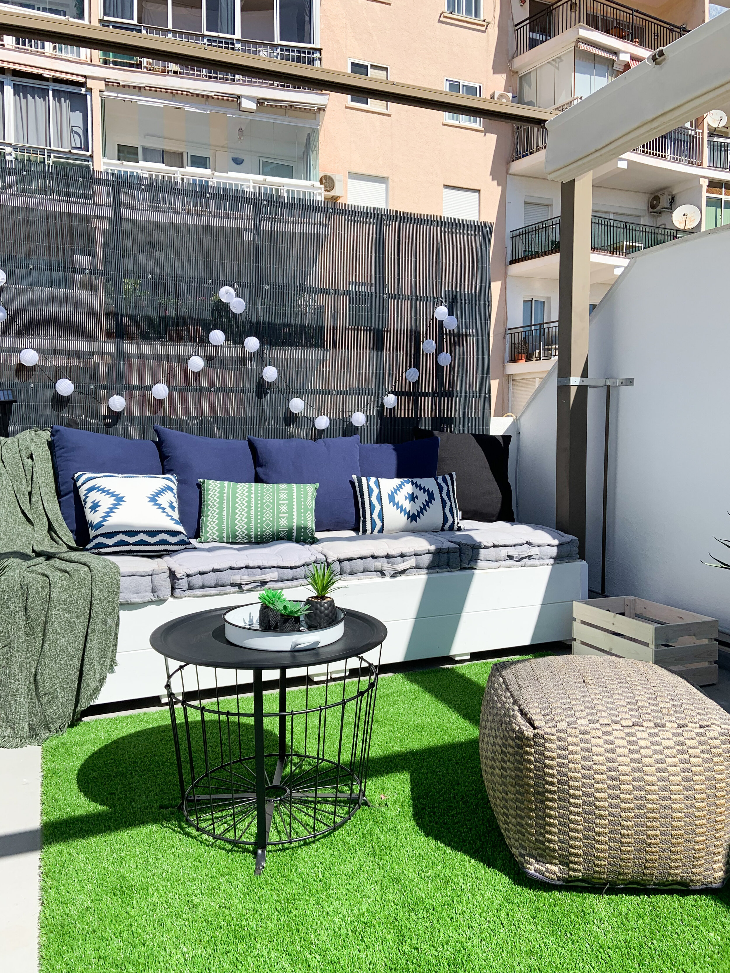
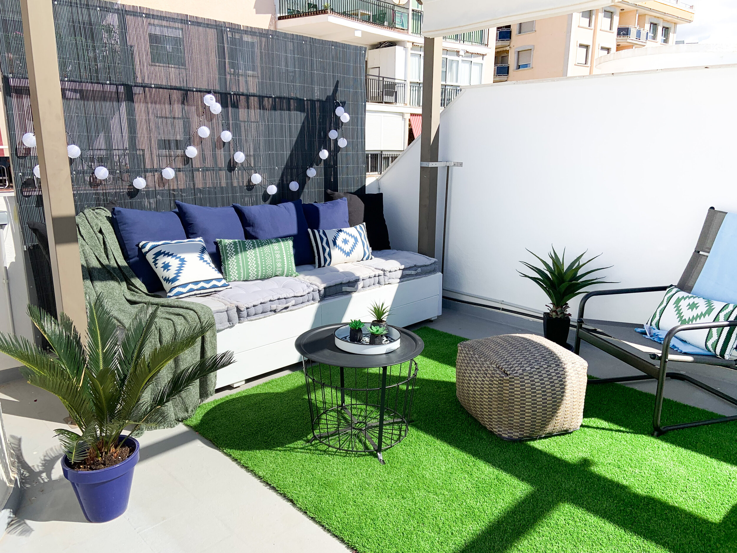
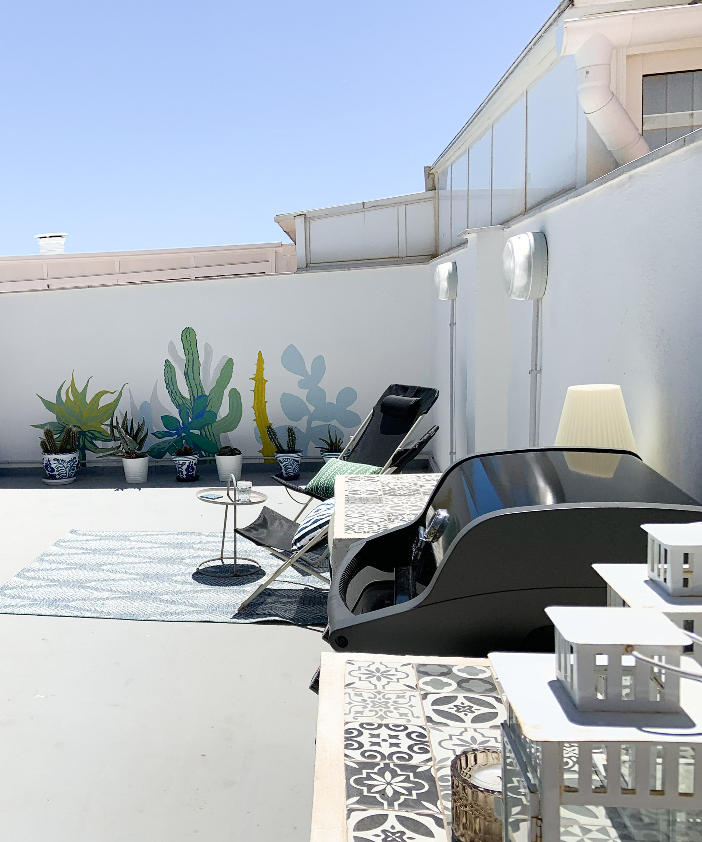
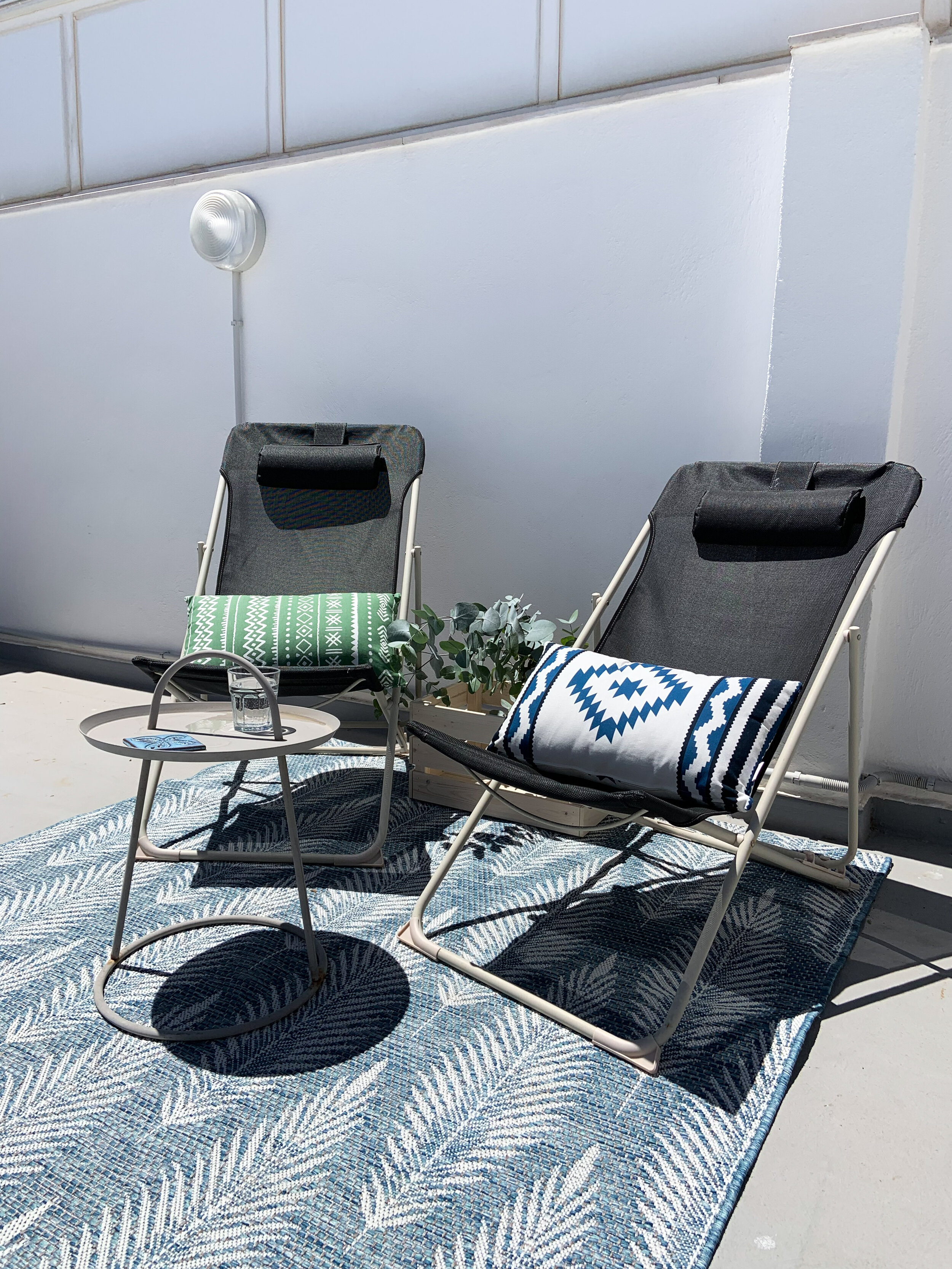
This roof top terrace might look familiar to you. I styled it a couple of years ago (click here!). Under the harsh sun materials fade and loose their colour and texture - that happened to this terrace too. As it’s a rental guests didn’t really take as good care as it would’ve needed, so the owner decided that it was the time to refresh it.

The roof top terrace got a new layer of paint, rugs made of more durable materials as well as a shelter wall to block the view from the opposite building. As much as possible the existing pieces of furniture were used.

The colour scheme was changed to a more vibrant one - with blue & green accents. Mirai Kodit made the hard work - I just did the decoration and took some pics.

IMG_3603.jpg

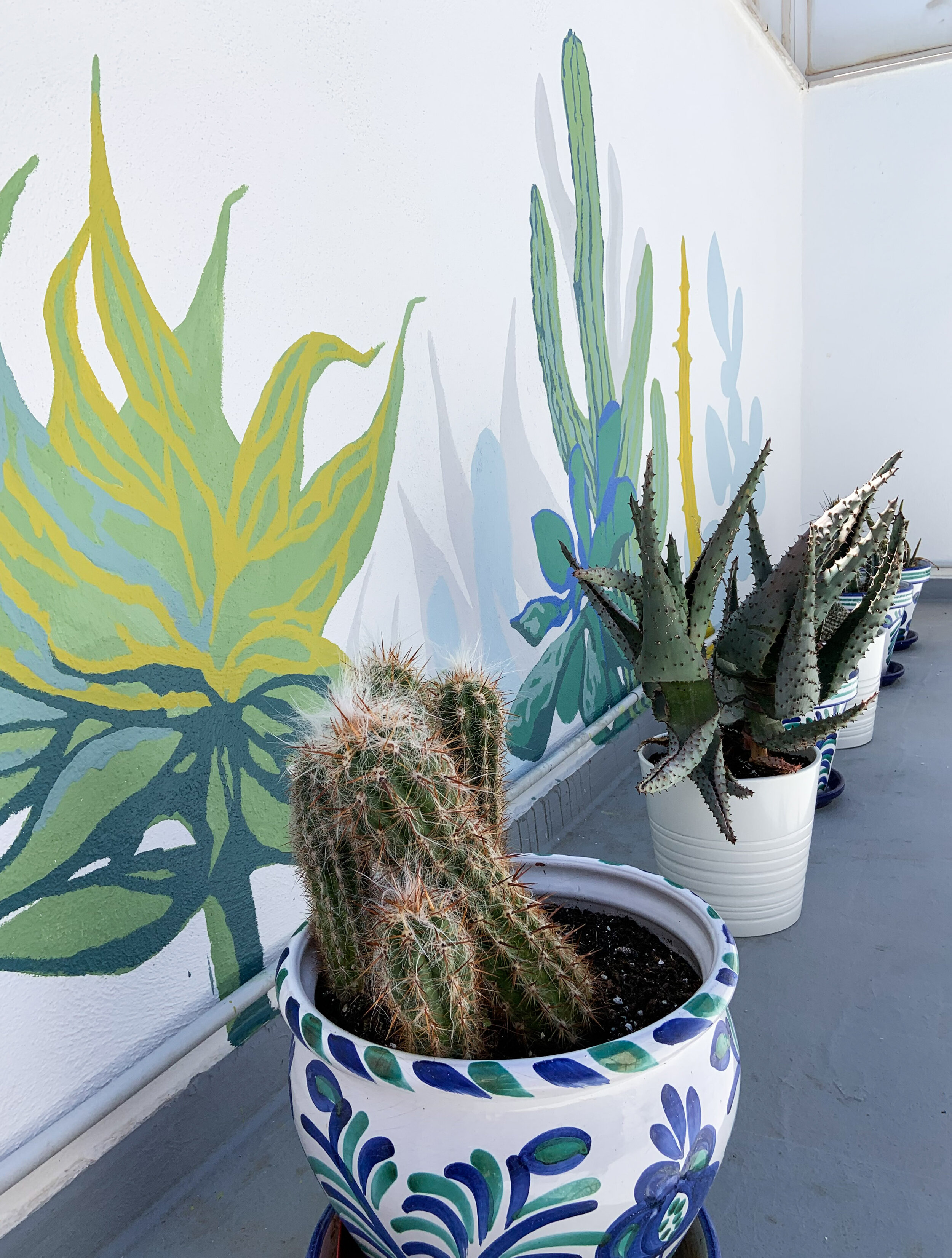
The real center piece is the mural on the back wall made by Sanna-Mari Prittinen. The cactus garden is simply gorgeous!

IMG_3604.jpg

Tips To Transform A Rooftop Into Relaxing Haven

  1. Add some shade. For sure it’s going to get hot up there. So enjoy the outside and beat the heat by adding awnings, umbrellas or pergolas.

  2. Go green. Plants and flowers that need direct sunlight, love your rooftop. Cactus and succulents are a sure choice.

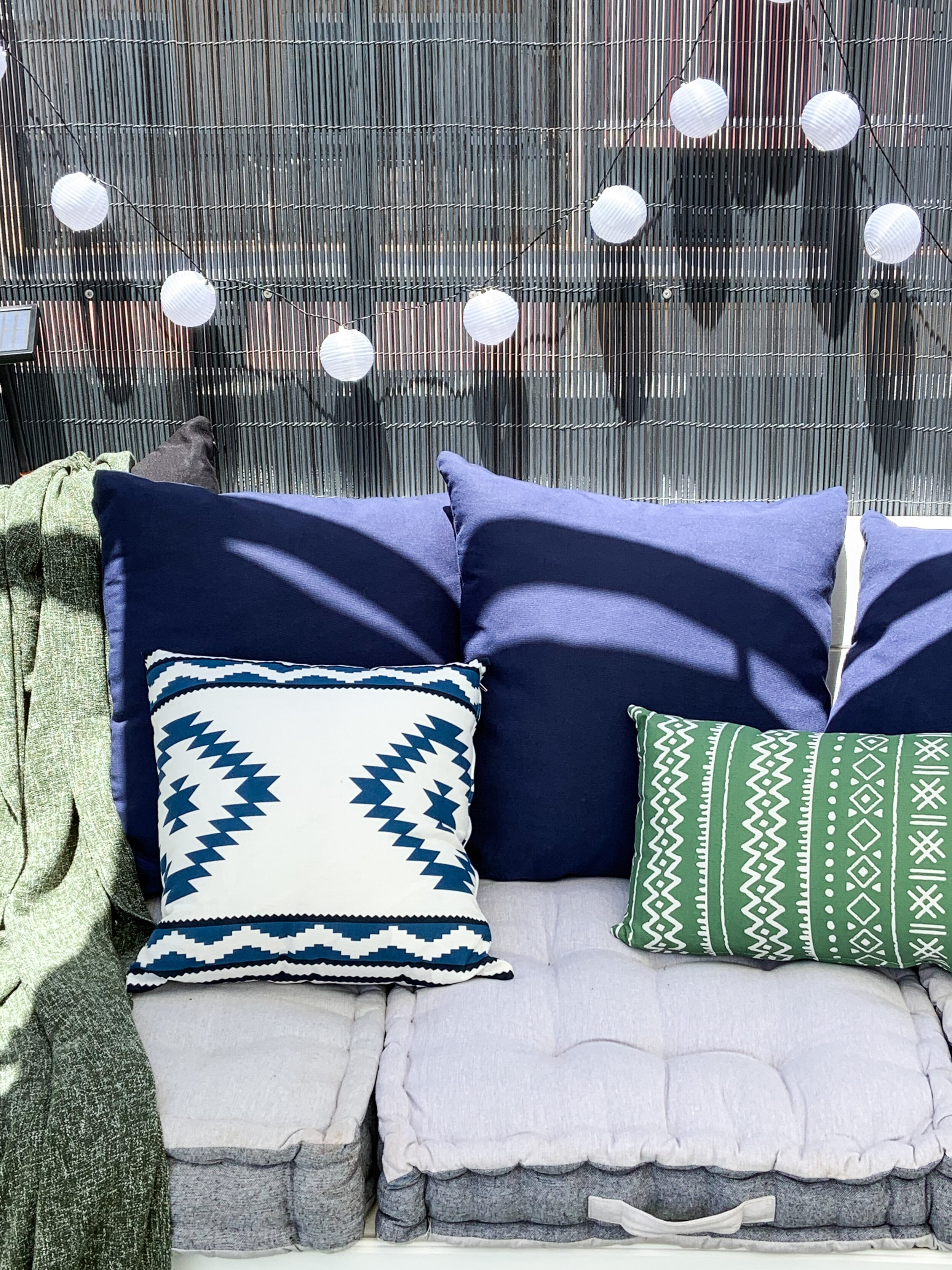
  3. Get cozy. Cushions, blankets, rugs together with lanterns, candles and lighting chains soften the space.

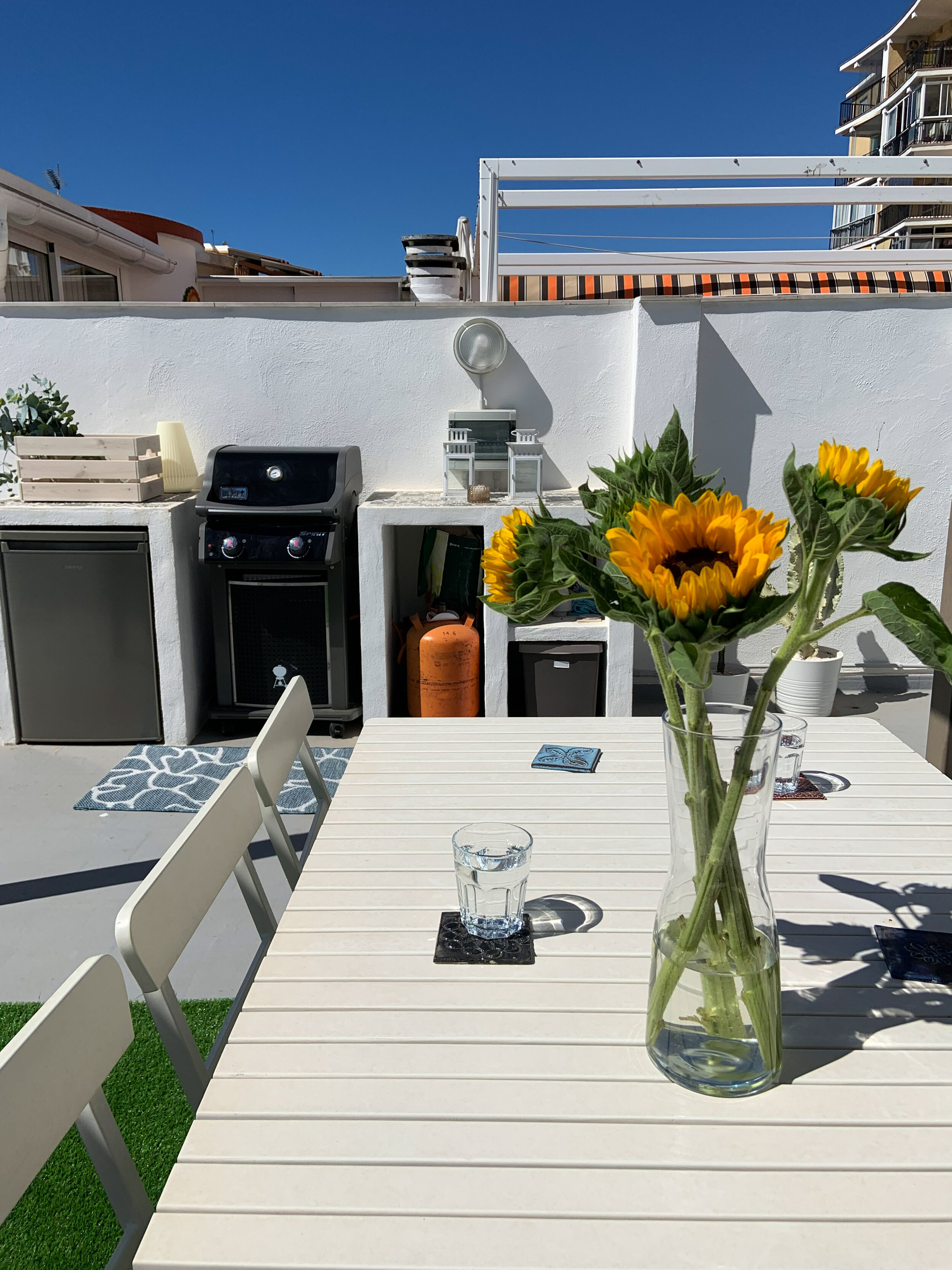
  4. Get cooking. A grill for cookouts and a dining table for summer gatherings with family and friends make delicious and memorable moments.

  5. Make it fun. Adding eye-catching features such as murals, figures, old cafe signs etc create an unique atmosphere and a place your guests will definitely remember.

IMG_3618.jpg

Green Couch

This home needed a new layer of paint. Neutral white with a hint of greige (a combo of warm beige and cool grey) gives a fantastic contrast with the pure white ceiling. This tone was a special mixture of the painter. Often people are afraid of pure white walls and add yellow to the paint - especially here in Spain. Perhaps they find it too bright with the harsh Spanish sunshine, but the yellowish paint on the walls can easily look stifling. A slightly greyish white looks softer than pure white yet is still fresh looking.

living_b.png

The location is absolutely fantastic for every golfer - just next to the golf course. Even though birdie and eagle were just simply birds for you, I’m sure you would enjoy the lush green environment. All the rooms have an access to the huge terrace facing to the pretty green field (well, there are some trees to cover the direct sight).

sofa_1 copy.png

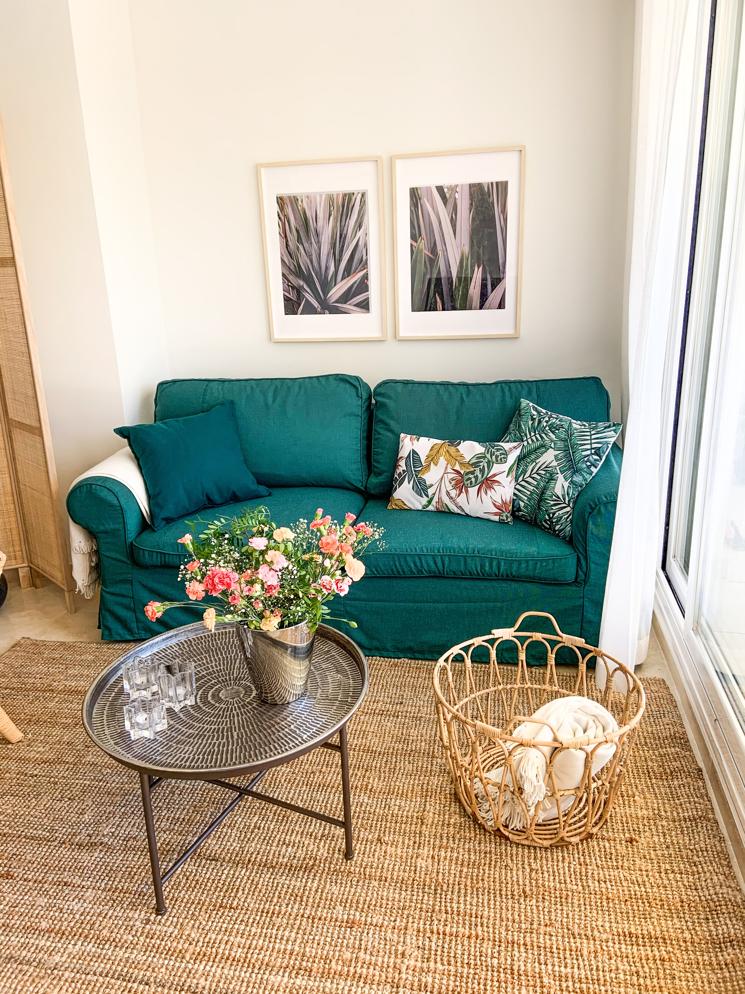
The aim was to update and refresh the interior of the living & dining area, master bedroom and guest room. The old sofa bed was still functioning and in pretty good shape, only the white cover was quite worn out. So the starting point was to find a nice couch cover. It was supposed to be an easy task, but in the end the only solution was to buy 2 covers and make them one. Fortunately I know a talented sewer!

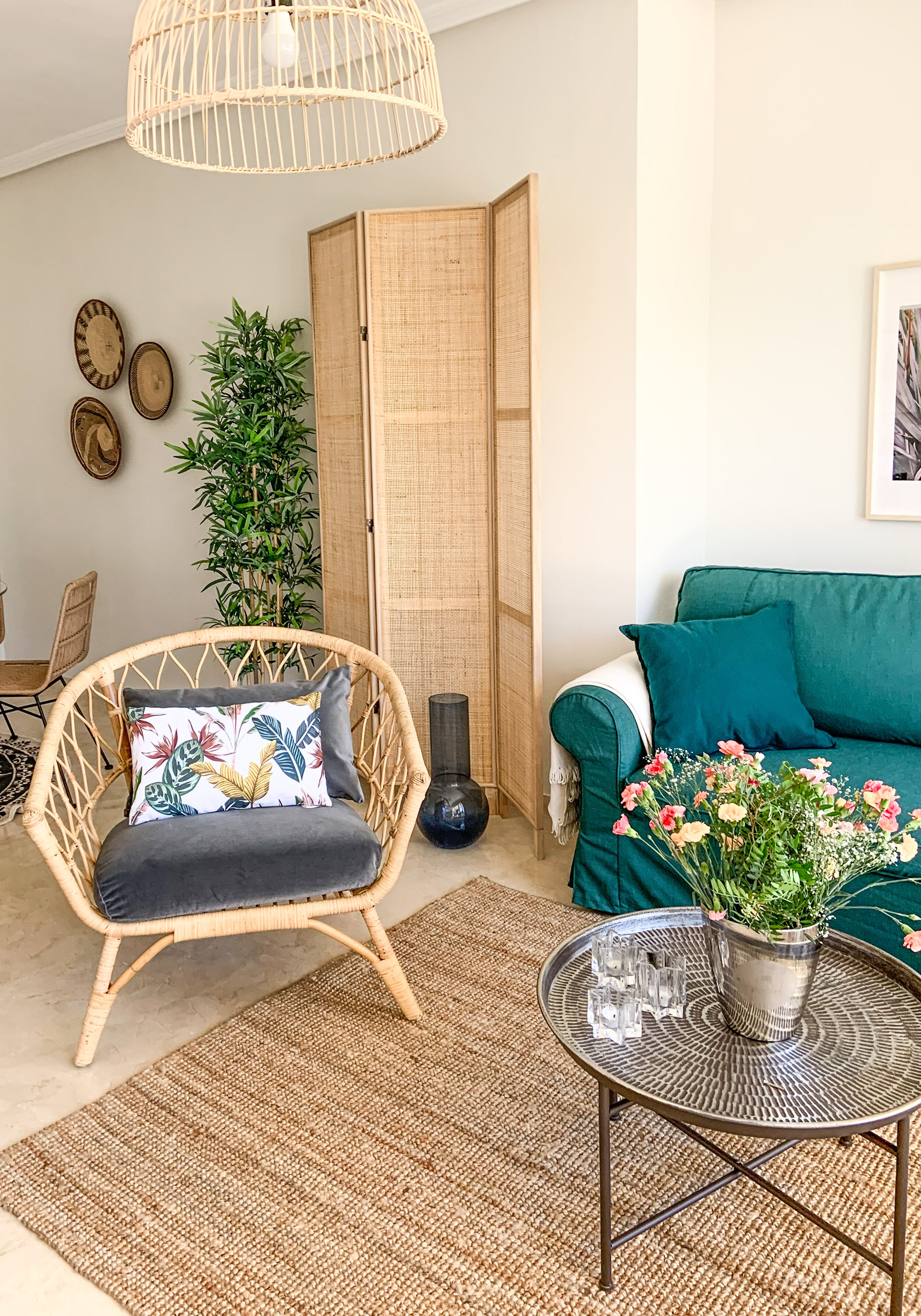
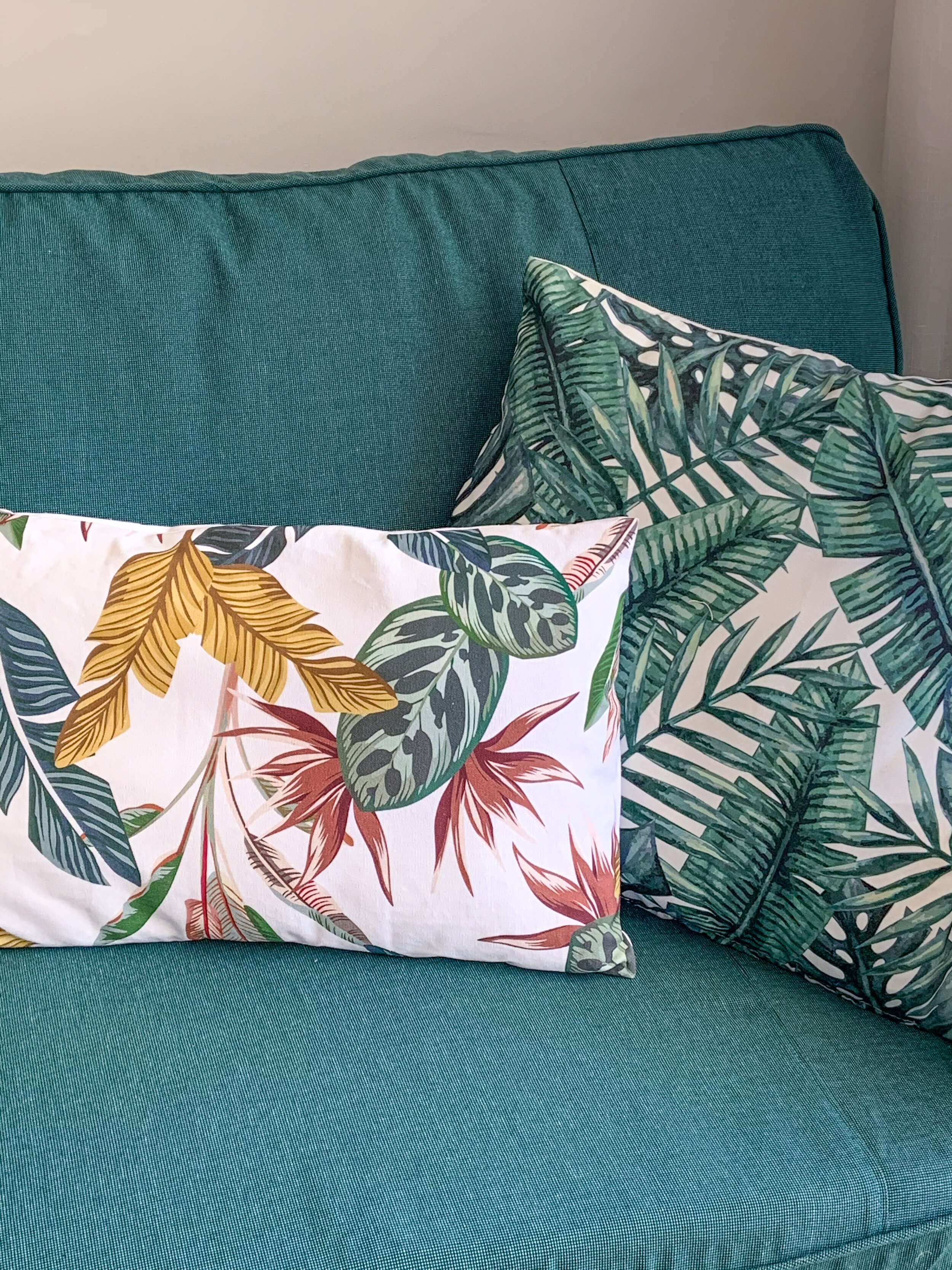
You might guess that the idea of a green couch came from outside - that’s correct! Why not bring the surrounding nature inside! With green natural materials such as jute, sisal and bamboo work perfectly. That combo creates a cosy and inviting look for a holiday home. I often like to add some black, because it sharpens the look without being too noticeable as black is still a neutral tone.

living_c.png

An electric fireplace was on the wish list of the owner. Absolutely a wonderful wish! It is not just a great feature yet a practical one as well. During the winter season it can be pretty chilly inside, even though the sun is shining and it’s warm outside. The electric fireplace warms up the room and creates a cosy atmosphere. A slim simple fireplace which is easy to use - just plug in and adjust the wanted temperature with a remote control - is a perfect choice.

fireplace_a.png

So the couch was the only existing piece of furniture that was kept, all the others were changed. A round glass dining table for 6 persons keeps the dining area light and airy. Also the light TV stand and glass vitrine continue the airy feel even though they are black - the black parts are rather slim & thin so it’s exactly the right amount of this neutral dark hue.

Both bedrooms had already good beds and bedside tables - no need to change them. With new cushions and blankets one can make wonders. The mirrors were placed horizontal opposite the bed in the guest room. That looked a bit outdated, but as the mirrors were in good condition and the frame colour suited perfectly with the colour scheme, I wanted to use them and just rearrange them differently.

lasacacias_2.jpg
master_a.png

There was an empty space between the master bedroom and en suite bathroom. Btw, there was no door to the bathroom, so a sliding door to the doorway was installed to give some privacy. The owner had an idea of a reading corner with an extra bed. That fitted perfectly to this small place.

The kitchen and 2 bathrooms are still waiting for updating, but as they are totally functional no need to hurry. Instead the terrace needs a bit of TLC. That’s the next step together with the utility room.

Now the home is welcoming the family to enjoy their summer holidays!

Living Room Make Over

In Spain you usually buy a house or apartment with furniture. The previous owner takes the most personal items, but often leaves the whole set of furniture and plenty of decor items such as lamps, rugs, curtains, paintings etc. This was also the case with the apartment my clients bought in Benalmadena.

The 3 bedroom apartment was basically move-in ready, but the style was not exactly what the new owner couple wanted. It’s always quite a job to get rid of the old furniture. You don’t want to throw them away, especially when everything is in good condition and made of quality materials as it was in this case. We put an ad on Facebook and immediately received plenty of responses. The whole sets were sold and picked up in no time.

Here’s a sneak peek how it looked

  1. at the time of purchase

  2. after getting rid of the old furniture

  3. when furnished according to the taste of new owners

Livingroom_make_over.png

In the living room the first step was to choose a sofa, and then build up a modern, light & cosy atmosphere to the space. White painted walls suit perfectly to the beige marble floor and together they create a fresh, clean and cosy look.

white_or_cognac_sofa.png

Couch in cognac was the winner. Below you can see the moodboard I made with the chosen couch. White, cognac, beige and black with some shades of blue create a relaxed yet stylish combo, doesn’t it?

living_3a.jpg

Here’s the result. The floor lamp in the corner was kept from the previous design, but all the other furniture is brand new. The colourful rug is a real statement piece and that’s why we decided to leave the walls without art. Time will show if some art work is needed.

IMG_9899.jpg
Add a heading-5.png
Add a heading-6.png
Add a heading-7.png
IMG_9904.jpg

Reading Nook

readingnook_masterbedroom.png

How to decorate a space between master bedroom and bathroom? Especially so that it would be as functional as possible. This was actually the owner’s idea - let’s make it a reading nook with a chair bed.

Now there’s a quiet space for reading, having online meetings, and an extra bed for a quest. I wanted to keep the colours very neutral to fit with the rest of the house. Beige with small black accents and plenty of white around make the room relaxing and calming - no extra hassle around.

One important thing in this space was to install a door - preferably a sliding door - to the bathroom. So far it had been without any door. There’s a door separating the master ensuite from the rest of the home, but a door also for the bathroom would make the whole area more functional and comfortable. Especially as the house is not just for the owner’s own use but it will be rented out for holiday makers.

When buying a sliding door make sure you get everything delivered in one package. I was surprised that there was only a door when I opened the package - no rail where to hang it even thou it was in the cover picture of the package and the seller said it’s a complete set. Well, it wasn’t. No harm, just had to reschedule the job.

Moodboard for a reading nook with an extra bed in neutral tones.

Moodboard for a reading nook with an extra bed in neutral tones.

What was on the shopping list:

  • chair bed

  • reading lamp

  • blinds

  • rug

  • small shelf

  • cushions

LassAcacias_readingnook_2.jpg

Grab a book or laptop -there’s a place for you!

Ikea and Prettypegs

Together with NYC-based potter Helen Levi, Swedish company Prettypegs is now launching a limited collection of ceramic knobs to give your IKEA furniture a one of a kind look. In just minutes, your outdated IKEA cabinet such as Besta, Metod or Ivar will transform into a modern, high end piece.

Helen_Levi_10.jpg

Handmade from tinted clay, these ribbed and unglazed knobs have a super tactile texture and were inspired by one of Helen’s previous designs which she calls “Corduroy” where clay pieces are made using an extruder, - basically a giant pasta maker - that pushes clay through a shaped die.

knobs all come in the colours Terracotta, Sand, Dove Blue and Sage Green,

knobs all come in the colours Terracotta, Sand, Dove Blue and Sage Green,

“Like most people, I have purchased many IKEA pieces over the years. In the past I’ve bought vintage knobs to make them more special because I didn’t know about Prettypegs - I love that people can make an affordable upgrade to their furniture to have more design in their home”, says Helen Levi and continues: “Making knobs felt like a natural extension of my work since I love creating something that is part of people’s everyday life. ”

Native New Yorker and potter Helen Levi crafts her line of functional ceramics

Native New Yorker and potter Helen Levi crafts her line of functional ceramics

The Pottery Collection is limited and consists of two knobs; Corduroy Pin and Corduroy Knob, as well as a longer handle called the Corduroy Bar. They all come in the colours Terracotta, Sand, Dove Blue and Sage Green, and you can either choose to go for a more subtle look with knobs in the same model and color - or mix and match models and colors all together for a more personal look!

Corduroy Pin 

Corduroy Pin 

“We’re always looking for new inspiring ways for people to personalize IKEA furniture. I had admired Helen’s work on Instagram for a while and since we were interested in adding ceramics to our offer, I simply reached out asking if she wanted to design some ceramic knobs together with us, which I’m super happy she did!”, says Jana Cagin, founder of Prettypegs.

All pictures from Helens studio is taken by photographer Hanna Grankvist hannagrankvist.com