#interiordesign

Nature Inspired Wallpaper designs

Looking for Nature Inspired Wallpapers?

Italian wallpaper company Tecnografia is specialised in large scale wallpapers and decorative panels. I picked up here some of my favourite wallpapers from their new collection - all nature inspired and hand painted designs. Which one is your favourite?

Step into this lush green rain forest! It definitely has a soothing effect. I can feel and breathe that air coming from the fresh and humid jungle.

Landscape wallpaper by Tecnografia.

This wallpaper goes perfectly with Japandi style interior. It is minimal yet eye-catching and gives you a feel of an artwork. No pictures needed on this wall.

Bamboo wallpaper designed by Marco Fontana.

Who can resists of peonies? Huge peonies in sophisticated hues make a beautiful statement wall for any room. I think in a bedroom they make you dream and fall asleep easily.

Pemberley wallpaper comes in different tones.

Would you like to have a statement wall at your home?

Pretty And Peaceful Bedroom In Blush Pink

This bedroom was supposed to be ready in the beginning of the year. As this spring and summer have been a bit different due to COVID19, we had to put the project on hold and wait until it was at least a bit safer to work away from home again.

In this project I mainly played with textiles and small items. In the bedroom there were already a bed, cupboard for clothes, bedside table and stool. On the wish list there were an armchair and lamp for reading, a rug to hide her yoga mat and a shelf unit for books. She also wanted to have a cosy feeling for the room.

The bedroom was very white with white walls, white bed and bedlinen, but there were also some bright colours in the cushions and paintings. I wanted to tune the colours a bit down. Dusty shades of pink together with beige and brown hues would give a soft and warm look when combined with crispy white walls. Golden finishes in metal items also bring warmth and gives a fresh luxury feeling.

I started the project by creating a moodboard. This way I made it easier for my client to see how the colours as well as the existing and new items would look together. Due to Covid19 we didn’t go shopping together, instead I gave her the links of the pieces and she could order everything online.

Now most of the items have arrived, and last week we could make some progress there. We are still missing the floor lamp, small table by the armchair and big pillows for the bed. Otherwise it starts to be ready.

Here’s a sneak peek for a pretty and peaceful bedroom in dusty shades of pink.

Pom poms give some colour and creates a boho atmosphere.

Pom poms give some colour and creates a boho atmosphere.

bedroom_decor_9.jpg
bedroom_decor_7.jpg
bedroom_decor_10.jpg
Bedroom moodboard with shades of blush pink and golden accents.

Bedroom moodboard with shades of blush pink and golden accents.

Ikea Botanisk Limited Collection

Ikea did it, again! Absolutely a wonderful idea to have this Botanisk limited collection, which is not only organic and beautiful but also creating jobs for local artisans. Now you can create your own garden without having a huge outdoor space.

Dig into BOTANISK

BOTANISK collection is created in collaboration with six social entrepreneurs in India, Thailand, Jordan and Romania. They all have business ideas that are based on creating jobs in regions where they are most needed, and for people that need them most.

Today, IKEA has 27 social business partners in 15 countries across the world, and the number keeps growing. It means 20 100 jobs - 5300 artisans and 14 500 small scale farm holders. The ripple effect improves the lives of 140 000 family members.

Whether you’re a plant swapper, urban gardener, or simply dream of growing a green thumb, BOTANISK has what it takes to sort you out. From tool kits and clay pots to large baskets, this handmade collection doesn’t only add to the fun of indoor potting – it creates jobs in regions where they are most needed. Let’s sprout some seeds of hope!

Sustainable in more ways than one

“The whole collection is made with people in mind. From start to finish the process has been all about the collaboration, developing the items together.” Maria O’Brian, Creative Leader IKEA.

A collection that grows on you, literally

Best of all, you don’t need a garden or even a balcony to enjoy all the lush greatness. Your apartment jungle is just a few pots and plant swaps away, which is exactly what BOTANISK is all about.

Seeds, sugar snaps and green ideas

While growing monsteras and vegetables are good for you – it can also get messy. Luckily, there’s BOTANISK tool storage (and more) to organise your gardening sessions. All in natural materials that feel great to touch and use.

Leaves that sprout new jobs

“We designed it together with an Indian seamstress, an expert embroiderer. After we’d shown her our general idea, she came up with great suggestions on how to do the leaves.”Paulin Machado, IKEA designer.

ps. This is not a paid partnership post - just to let you know. The text is mainly from Ikea’s website.

Ikea Botanisk limited collection is here!

Ikea Botanisk limited collection is here!

These cushions are my favourite!

These cushions are my favourite!

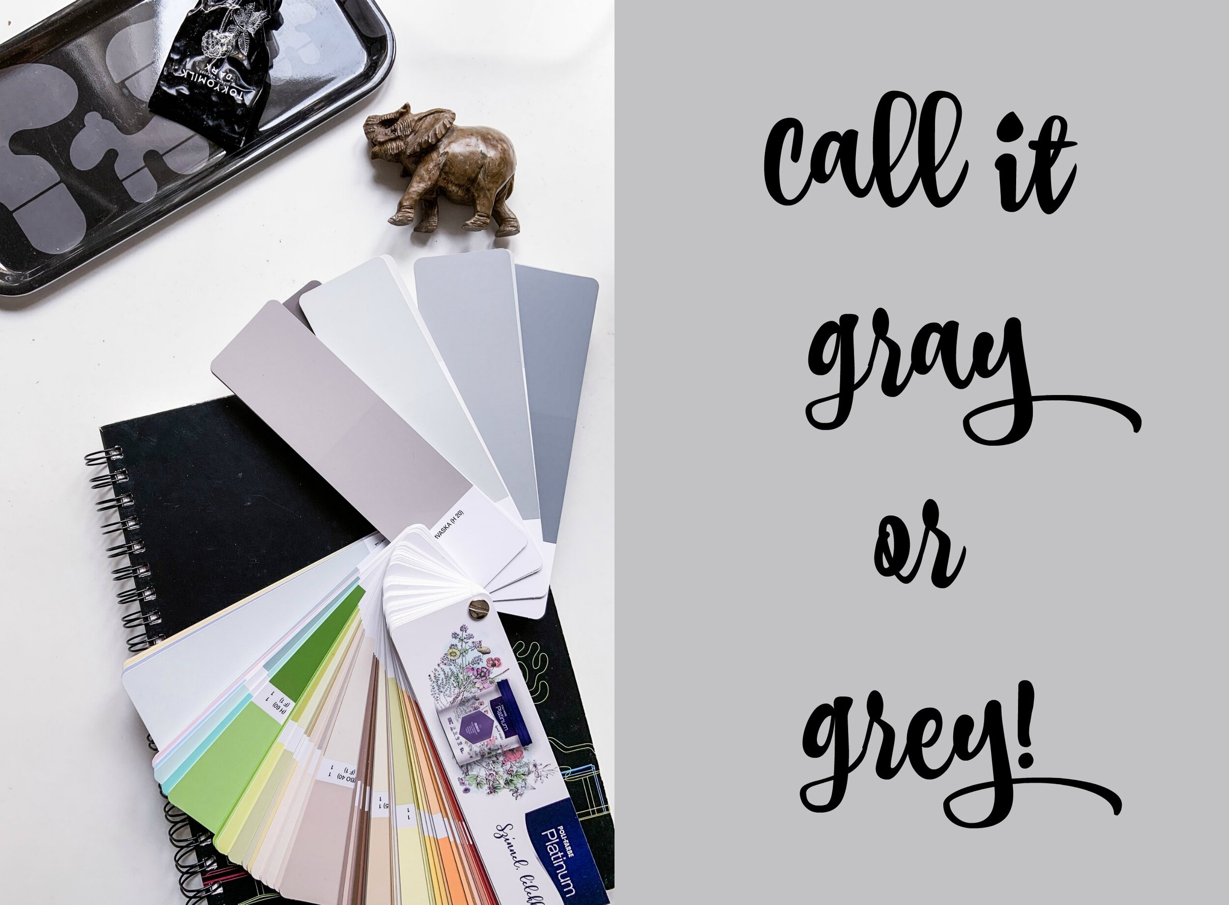
Call It Grey or Gray!

Call it Gray Or Grey!

I call it grey now! But on my Pinterest board I call it gray. Grey has been the most popular colour paint for the recent years - actually for decades especially in Scandinavia. In the north we love grey. I’ve been wondering why, but perhaps it’s because it is so neutral and don’t steel the attention from winter’s snowy whites and summer’s shades of greens. Well, it’s quite grey outside no matter what the season is. Anyways, grey is not a boring colour at all.

Grey is both chic and neutral.  So, it’s super easy to decorate with.  It goes with almost everything.  It’s the new neutral.  Years ago, it was beige, but grey has made it greige - a kind of mixture of these two tones..  Most homeowners, especially those that focus on style, opt for the trendier and more stylish gray. We tend to think that grey is always a cool colour, but there are plenty of different hues of grey. That actually makes it rather difficult to pick up the right one. Even though grey is neutral, there are warm tones and cool tones.

Cool and Warm

Cooler tones include blues, greens, light purples (or mixtures of that include these undertones).  They are more soothing and calming.  They remind us of the sky and water.  Cooler tones tend to recede and hence make spaces look larger.

Warmer tones are made with oranges, yellows and reds.  They remind us of heat and the sun.  They tend to make rooms cozier and more intimate.  They tend to make spaces look smaller.

Pick Up Your Grey

Choosing the paint shade is one of the most common fears among people. Most homeowners don’t have experience or confidence in selecting the right shade. If you walk into a home and you’re super impressed with the paint colour selection, chances are that they had a design expert assist them in the process.

As a general rule, going lighter grey (rather than darker) tends to look better.  It gives a fresh and airy look without making your space look too dark. Always ask for samples to test the colors in your own home, because the paint can look different on the walls than on the paint swatch and it can look different in different lighting, and different times of the day and on different walls, so definitely test using the samplers.

Basic Greys From Poli-Farbe

Poli-Farbe is a Hungarian family-owned paint company. They want to invest in the future, protecting the environment, creating jobs and encourage everyone to create a beautiful home.

LISZTES URÖM ‘floury wormwood’ is a light grey. It has a warm tone.  It goes really well with dark hardwood floors and almost all types of furniture. It has several coordinating darker greys that are great for accent walls 

EZÜSTFA ‘silverberry’ is probably the most popular grey.  It’s a light cool grey, with slightly blue undertones and it’s exquisite. This shade is pretty much a pure grey.  Very calming and relaxing hue. 

SULYOM ‘water chestnut’ is a tad darker than the previous grey. It has some aqua and blue undertones reminds me of stormy sea.

HAMVASKA ‘burnt ash’ is a grey with brown undertones (and some very subtle yellow undertones).  It works well when your room has a mixture of greys and browns.  It has some brown and yellow undertones, so I would call this greige.

PicMonkey Image-2.jpg
greyitis.jpg
PicMonkey Image.jpg

Interior Designer's Tips

My Tips For Home Decor

There are three types of clients who buy interior design & decor services. One group consists of persons who know what they want but don’t have time for looking the items and make the whole package together. Then there’re clients who had an idea which style and colours they prefer, and thirdly there are people who just have a budget but no idea what to do decor wise with the space they have.

As an interior designer and decorator all those types of clients are ideal and have the same goal - beautiful & functional home. Designer has to understand client’s dreams, hopes and aspirations, and bring those alive in that specific place. Every home tells a story.

To make a home beautiful and functional I like to keep in mind the following ideas one the list below.

Mix New & Old

Trends come and go. That’s why it is not recommended to make your whole home according to the current trend, unless you have big pockets and ready to make a total makeover after a year or two. It goes also the other way - not such a good idea to stick the old times. A great rule is to mix them both and create a space with personality. Updating home with a couple of trendy pieces - a chair, small table, lamp etc - gives a nice fresh touch. The main thing is that your home is that place where you should enjoy being in.

When you hire a designer/decorator it doesn’t mean that everything in your place goes out and new ones are brought in. I always discuss with my clients which existing pieces they like to keep and which ones they want to get rid of. But I’m also clear that it’s my job to tell them if I feel it doesn’t work.

Choose Beautiful & Functional

Home, office, any space should be functional. Sometimes it is a wise decision to make a compromise and choose something over functionality if is beautiful and you really want it. If you love the look of a white sofa, but at the same time you feel it is not practical, my advice is - take it! Especially if another colour wouldn’t have the same desired effect in your space. Nowadays it is not too difficult nor time-consuming to take care of fabrics and other delicate materials.

A balance between beautiful and functional is the keyword.

Choose Sustainable

With timeless pieces and materials you can’t go wrong. Where renovations are concern, it’s especially important to pick materials that will stand the test of time.

Leather, linen, wood and stone are natural materials and just get better when they age. Home is not an exhibition hall nor a museum. it is a place for living that’s why the marks of living belong to it and only add charm and cosiness.

Be A Visionary

Consider an “unknown” artist or designer and buy based on shape, comfort and how the art or furniture works for you and your needs. The most humble objects can have the most soul and be the most beautiful thing in a room. Do not be afraid to mix high and low price points. Not everything must be precious to be important. The opposite can be said with splurging on something that you really love.

Your chosen not so well-known artist may become very well-known, and you become a visionary and trendsetter :)

Mihaela_moodboard_living_1.jpg

Tips For Choosing A Rug

Tips For Choosing The Right Rug

First of all you should consider the colour, texture and size. It is not the easiest task to choose the right rug. Even though it is ‘only’ a thin layer on the floor it can totally change the whole atmosphere of a space. Rugs can also be pretty expensive so take your time and check these tips.

Colour Of A Rug

It is good to start with colour. Should the rug be bright red or neutral grey depends on the other colours of your space. If there’s a lot of going on already and many different colours around, a single-colour in a neutral shade would be better as it would complete your existing furnishing.

If you prefer a pattern rug with many different colours, it is often better to choose it first and after that add in furniture and accessories. Playing safe is not always the right answer when selecting a rug. Sometimes a neutral rug can make a space looking dull and - well, very neutral. while a bright coloured or boldly patterned one can really cheer up a room and make it unique.

To be honest it is not always so that a designer or decorator can automatically pick up the right rug. Often it needs to be seen on the floor in that specific place in that light to make the right decision. A good idea is to ask the store deliver two or three pieces and try them at your home, especially when the rugs has a bit bigger price tag.

Texture Of A Rug

It makes a difference what your rug is made of. The texture of a rug should give a bit of contrast to the overall atmosphere. It is always good to have different textures and layers in a space as that makes it warmer, more relaxed and cosier.

If you have a very sleek furniture, choose a rug with longer, fluffier pile. With seating in a soft fabric, a sisal rug might be the answer.

It is important to consider also the function of your room when selecting a rug. If you have pets, maybe you need to clean it more often, so the texture should be easy to clean. For elderly people or those with limited mobility, a raised pile or shag rug can be a tripping hazard.

Size Of A Rug

Quite often I have seen too small rugs placed in an area. There’re standard rug sizes and some how people are a bit of afraid choosing a larger rug and they easily go with the smaller one. Small rugs look a little bit lost and unfinished. Well, a too large rug won’t look good either.

In the living room your seating area should fit on the rug. A good and common compromise is to have the front legs of seatings on the rug, not to have a cap between them. Under a dining table, you want to be able to pull the chairs back and still have them on the rug.

Square rooms look great with square or round rugs, and rectangular rooms with rectangular rugs oriented in the same direction.

I made some mood boards for a living room with 2 existing black leather sofas and a Noguchi coffee table. That space has large windows and lots of light, so I had courage to choose a bit bolder rug options for the room. I also wanted to give the owners an option to see how the atmosphere would change with a different sofa - they promised to think about replacing the old one.

Light, airy & cheerful.

Light, airy & cheerful.

Black with colours.

Black with colours.

Black with colourful stripes.

Black with colourful stripes.

Black with geometric patterns.

Black with geometric patterns.