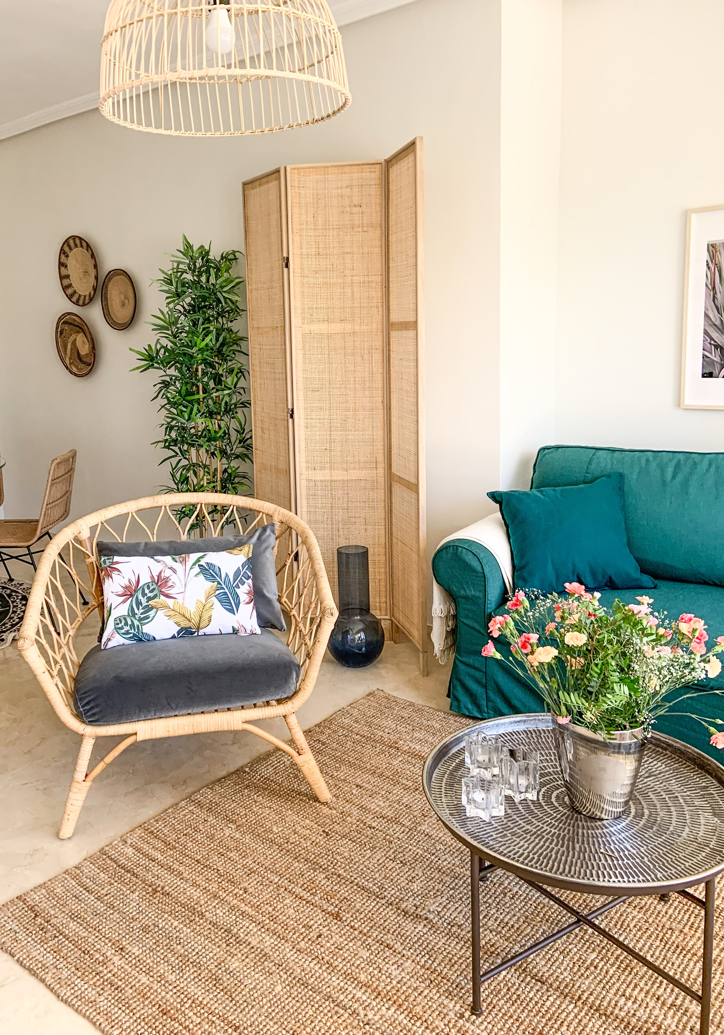
This home needed a new layer of paint. Neutral white with a hint of greige (a combo of warm beige and cool grey) gives a fantastic contrast with the pure white ceiling. This tone was a special mixture of the painter. Often people are afraid of pure white walls and add yellow to the paint - especially here in Spain. Perhaps they find it too bright with the harsh Spanish sunshine, but the yellowish paint on the walls can easily look stifling. A slightly greyish white looks softer than pure white yet is still fresh looking.
The location is absolutely fantastic for every golfer - just next to the golf course. Even though birdie and eagle were just simply birds for you, I’m sure you would enjoy the lush green environment. All the rooms have an access to the huge terrace facing to the pretty green field (well, there are some trees to cover the direct sight).
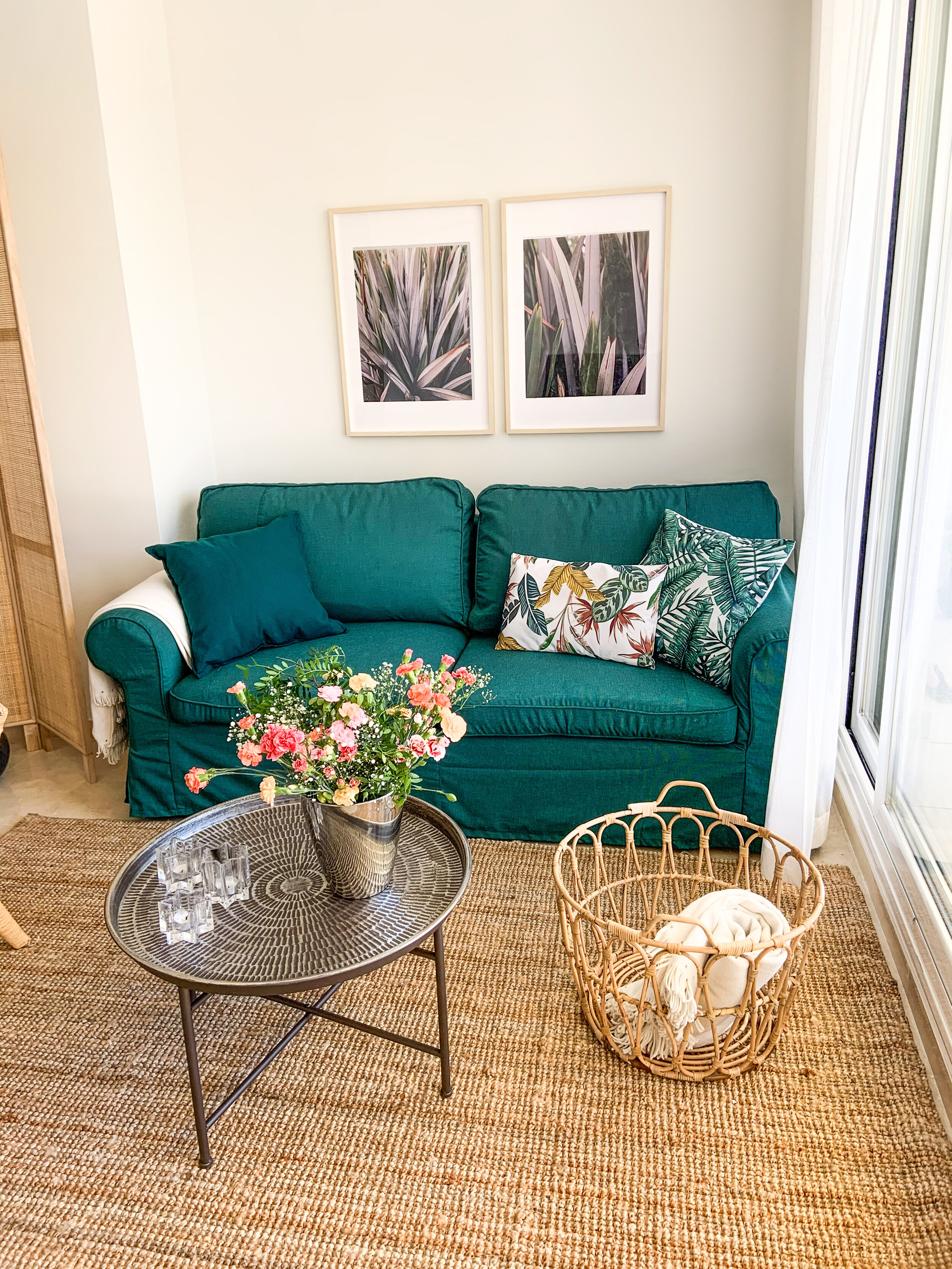
The aim was to update and refresh the interior of the living & dining area, master bedroom and guest room. The old sofa bed was still functioning and in pretty good shape, only the white cover was quite worn out. So the starting point was to find a nice couch cover. It was supposed to be an easy task, but in the end the only solution was to buy 2 covers and make them one. Fortunately I know a talented sewer!
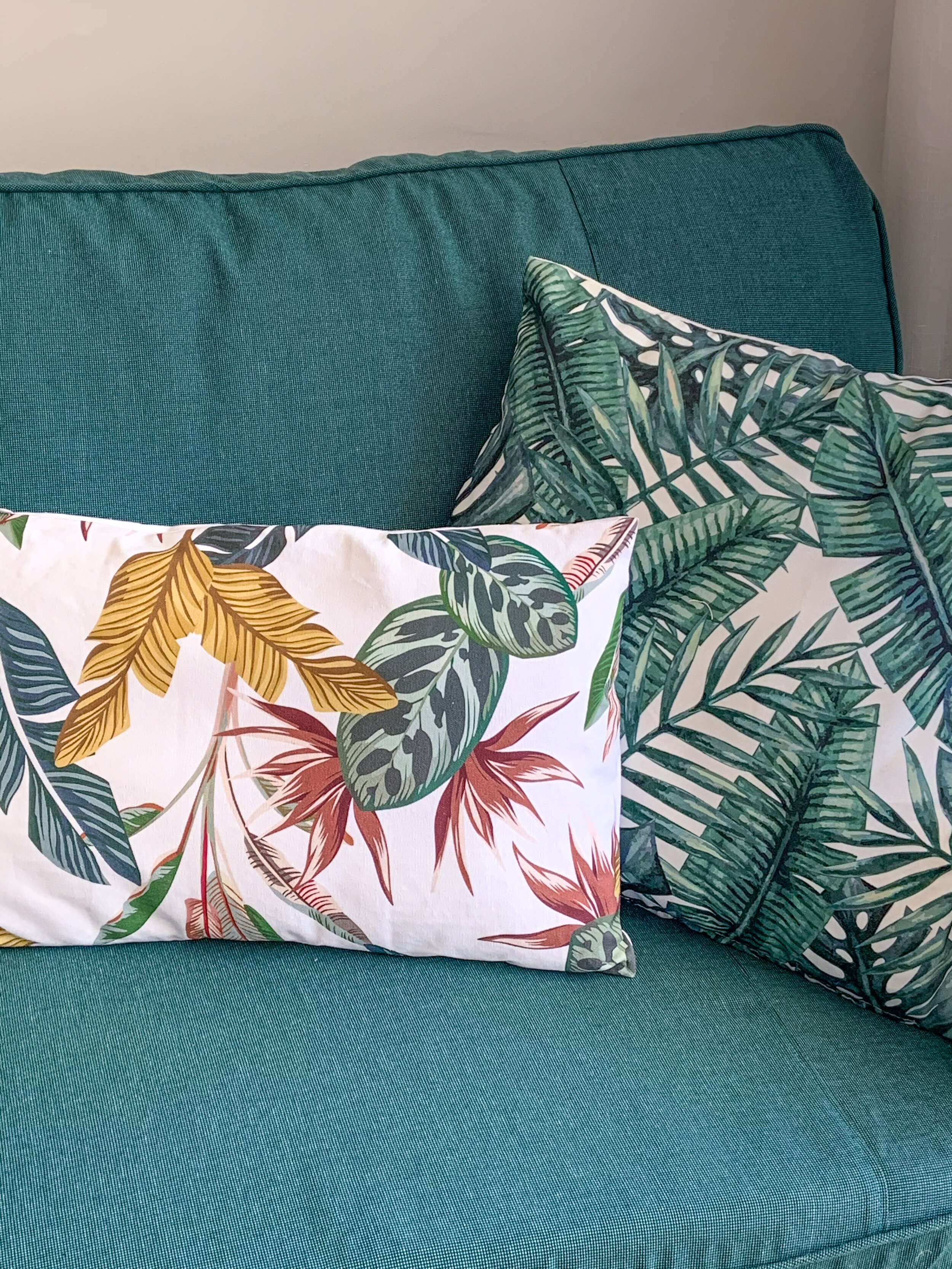
You might guess that the idea of a green couch came from outside - that’s correct! Why not bring the surrounding nature inside! With green natural materials such as jute, sisal and bamboo work perfectly. That combo creates a cosy and inviting look for a holiday home. I often like to add some black, because it sharpens the look without being too noticeable as black is still a neutral tone.
An electric fireplace was on the wish list of the owner. Absolutely a wonderful wish! It is not just a great feature yet a practical one as well. During the winter season it can be pretty chilly inside, even though the sun is shining and it’s warm outside. The electric fireplace warms up the room and creates a cosy atmosphere. A slim simple fireplace which is easy to use - just plug in and adjust the wanted temperature with a remote control - is a perfect choice.
So the couch was the only existing piece of furniture that was kept, all the others were changed. A round glass dining table for 6 persons keeps the dining area light and airy. Also the light TV stand and glass vitrine continue the airy feel even though they are black - the black parts are rather slim & thin so it’s exactly the right amount of this neutral dark hue.
Both bedrooms had already good beds and bedside tables - no need to change them. With new cushions and blankets one can make wonders. The mirrors were placed horizontal opposite the bed in the guest room. That looked a bit outdated, but as the mirrors were in good condition and the frame colour suited perfectly with the colour scheme, I wanted to use them and just rearrange them differently.
There was an empty space between the master bedroom and en suite bathroom. Btw, there was no door to the bathroom, so a sliding door to the doorway was installed to give some privacy. The owner had an idea of a reading corner with an extra bed. That fitted perfectly to this small place.
The kitchen and 2 bathrooms are still waiting for updating, but as they are totally functional no need to hurry. Instead the terrace needs a bit of TLC. That’s the next step together with the utility room.
Now the home is welcoming the family to enjoy their summer holidays!


