Let's Talk About Architecture - House F

Minimalistic modern house in an old town in Telde, Gran Canary.

I just picked up that title ’let’s talk about architecture’ but it’s not really talking about it - more like watching it. Sorry for that! When we imagine architecture in Spain, minimalism is not the first thing that comes to our minds, is it? As recently several impressive modern houses have come across, I decided to share those for you here in my blog. Have a look!

House F fits perfectly to this old town.

House F is designed by architect studio Xstudio. It is located in an urban oasis in the centre of Telde. Narrow cobbled streets and whitewashed walls are characteristic to this place and as the construction regulations are strict all these features must be taken into account when building something new.

The basic idea in the planing and designing was to respect the environment yet keeping in mind that architecture must express its own time and place since that’s the only way to value the urban history.

Shutters closed, shutters open.

House F is like a white canvas. Sometimes opening up to the surrounding are, sometimes closing down just like the old houses with white barriers around them.

This is a house for a couple in which they can decide to participate or not in the life of the neighbourhood - opening or closing themselves to the environment.

Concrete and wood.

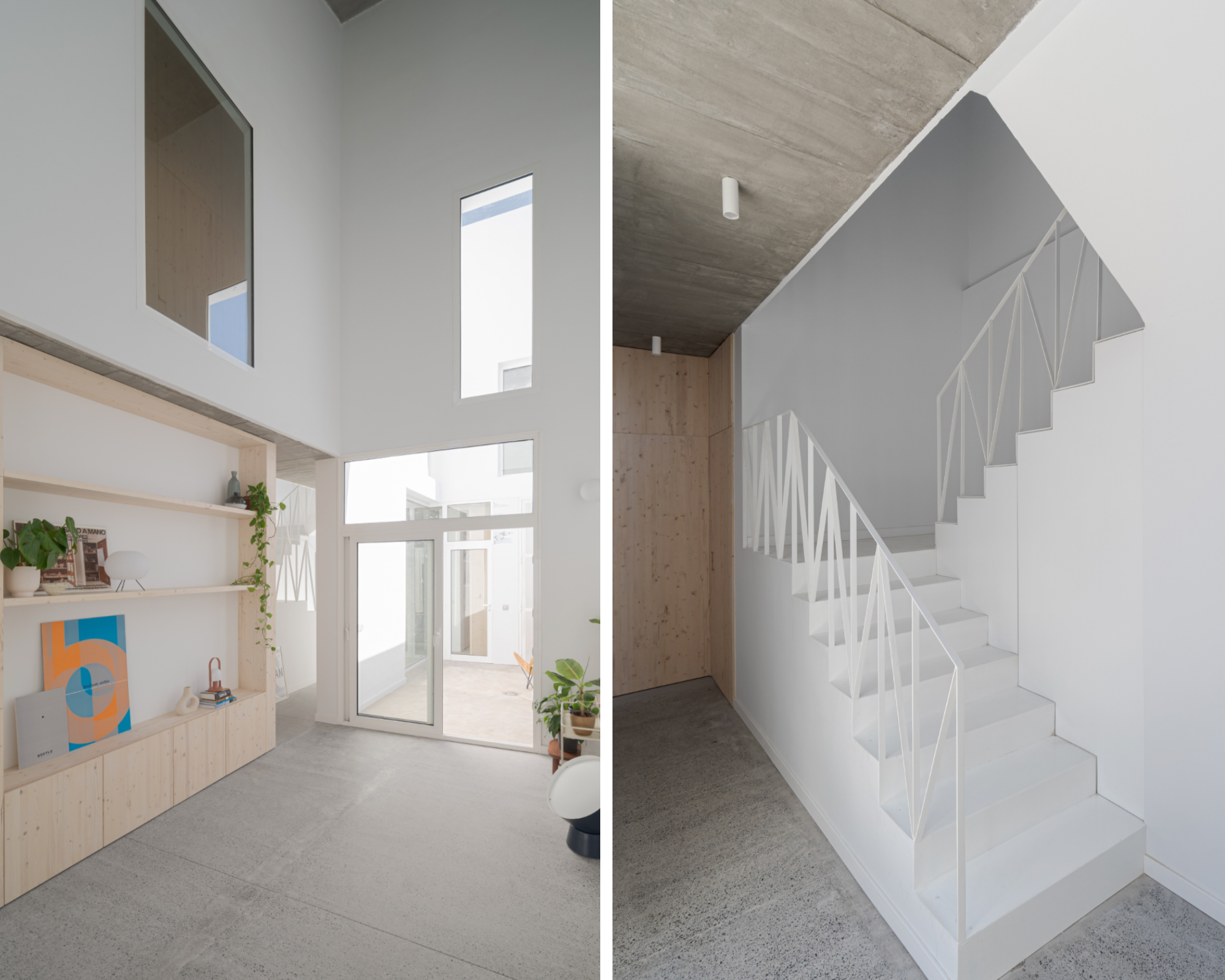
There is a beautiful balance of contrasts between cold and warm materials. Concrete walls and ceilings together with white walls and natural pine wood create a serene and pure atmosphere.

Peaceful patio

There are 2 main functional schemes in the house: a central patio into which the staircase and rooms open and another at the back of the plot, which both integrate the outside space as a part of the interior.

The living spaces have been left without special function. Only those which makes living conditions practical and pleasant are defined. Otherwise the rooms look as being reversible spaces in different scales.

High ceiling in the living area. Stairs in white.

Peek to the bathroom and kitchen.

All photos by David Rodriguez.

Adapted from the original article on Archilovers.

Zodiac Decor Ideas

This is fun! Take a look at what your zodiac sign is recommending for you. The signs are categorised in 4 main groups: fire, air, water and earth. Each of them have a different home decor style. Here are the zodiac decor ideas!

Fire

The zodiac signs Aries, Leo and Sagittarius belong to the Fire group. Their strong and passionate personality makes them love to stand out. That is why their style is original and have special pieces with WOW effect.

Air

Aquarius, Gemini and Libra are the zodiac signs of the Air. Born under these signs and free souls by nature. They love light and airy style, serene tones such as whites and greiges. Their decor style is minimal and pure.

Water

Imaginative, transparent and in constant movement, the signs of the water element - Pisces, Cancer and Scorpio - feel comfortable in a colour palette that reminds them of their element water. That is the shades of blue. The curved and wavy forms as well as imaginative patterns are for these zodiac signs.

Earth

Stability, organization, tranquility... these are the features associated with Capricorn, Taurus and Virgo - all signs of Earth. They have also a common connection with tones of sand and terracotta. They love robust decor pieces, which make them feel connected to the ground.

Do these zodiac decor ideas reflect your own style?

Nature Inspired Wallpaper designs

Looking for Nature Inspired Wallpapers?

Italian wallpaper company Tecnografia is specialised in large scale wallpapers and decorative panels. I picked up here some of my favourite wallpapers from their new collection - all nature inspired and hand painted designs. Which one is your favourite?

Step into this lush green rain forest! It definitely has a soothing effect. I can feel and breathe that air coming from the fresh and humid jungle.

Landscape wallpaper by Tecnografia.

This wallpaper goes perfectly with Japandi style interior. It is minimal yet eye-catching and gives you a feel of an artwork. No pictures needed on this wall.

Bamboo wallpaper designed by Marco Fontana.

Who can resists of peonies? Huge peonies in sophisticated hues make a beautiful statement wall for any room. I think in a bedroom they make you dream and fall asleep easily.

Pemberley wallpaper comes in different tones.

Would you like to have a statement wall at your home?

Tips for Scandinavian Boho Style Home Decor

I have collected here some tips and suggestions for creating a chic Scandinavian boho style home decor. Earlier I made an article about what is Scandi home decor (you can find it any clicking here). It is a functional and minimalist style, and by adding some boho flavours, you can create a warmer and cosier atmosphere without loosing the airy & light look.

Modern Scandinavian Boho style home decor

Pick up Unique Hand-Made Pieces

It can be a wall art or a pretty ceramics bowl to give that final touch to your Scandi boho home. The unique pieces are eye-catching and add personality to the place.

Visit local galleries and workshops to see what they to offer. You can also find wonderful pieces in art markets without breaking a bank.

Select a Calming Colour Palette

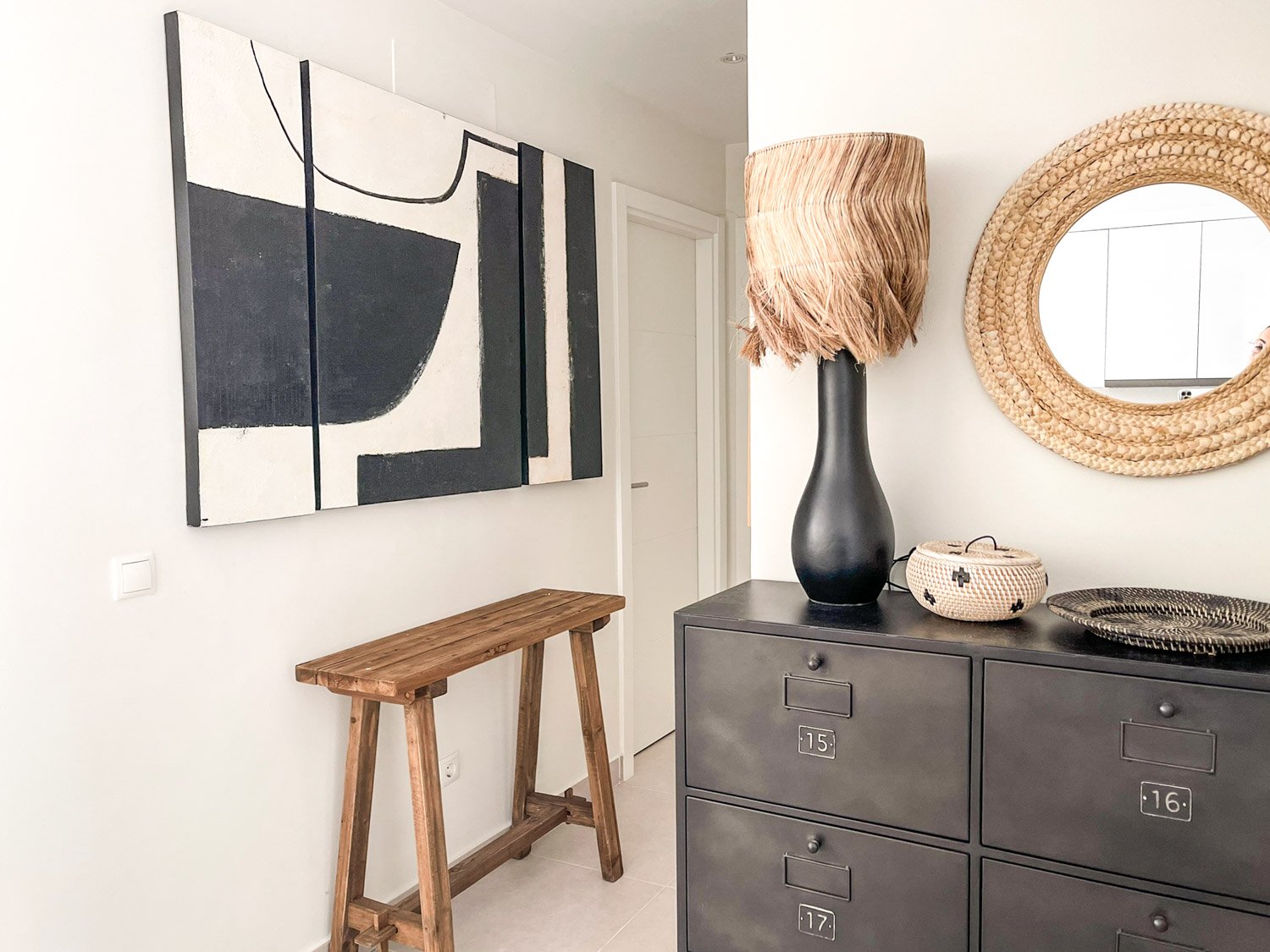
Boho style in home decor is associated with bright rich colours. So how does it go with a Scandinavian decor? When boho style is mixed with Scandi decor the colour palette looks a bit different. In this case the palette is full of soft earthy tones - usually different shades of beige and white. Adding a bit of black gives a bit of sharpness for the dreamy soft look.

I would recommend to have the walls in white tone - any hue from even bright white to a creamy one will look good. If you want to go bold, a black accent wall is for you.

Of course, you can have a real accent colour if you wish. That colour shouldn’t be too vibrant so choose a soft tone of any of your fave colour. A blush pink, olive green, ochre yellow - just to mention a few - will go beautifully in small amounts.

Decorate with Big Photo Poster

One big photo poster looks great in a Scandi boho style home. Choose an image you like best. It can be a palm leaf, waves of the sea or an animal print. One of my favourite one is a Highland cow poster in black and white. The image is strong yet sweet.

Get the Lighting Right

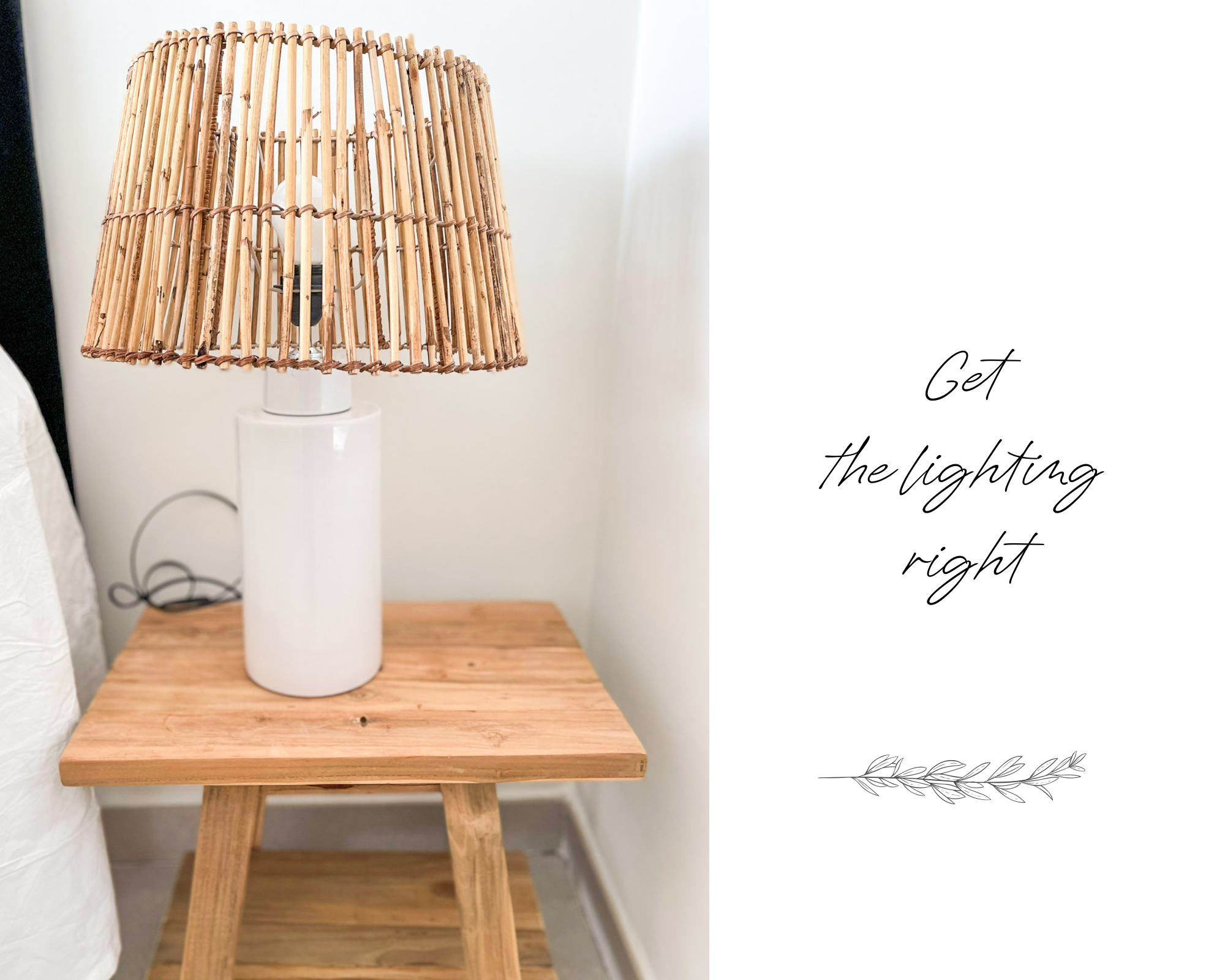
With the right lighting you can change the atmosphere easily. Those modern buildings usually have ready installed led spot lights in the ceiling. Those make a good overall lighting. For the right atmosphere you would also need table and floor lamps. People usually need a lot of light time to time - for working, for cleaning etc. - so it is good to have that option too. Yet we also want to have a cosy feeling at home so dimming effect is quite a must.

Choose Beautiful Boho Accessories

Less is more when it comes to the Scandinavian home decor. I would recommend to choose a couple of statement pieces - they don’t even need to have a function, just to look gorgeous.

Ceramics and glass vases as well as wooden items go perfectly with Scandi boho style. Don’t forget rattan baskets! Decorative pieces made of wooden beads give a nice finished touch.

Scandi Boho Bathroom Decor

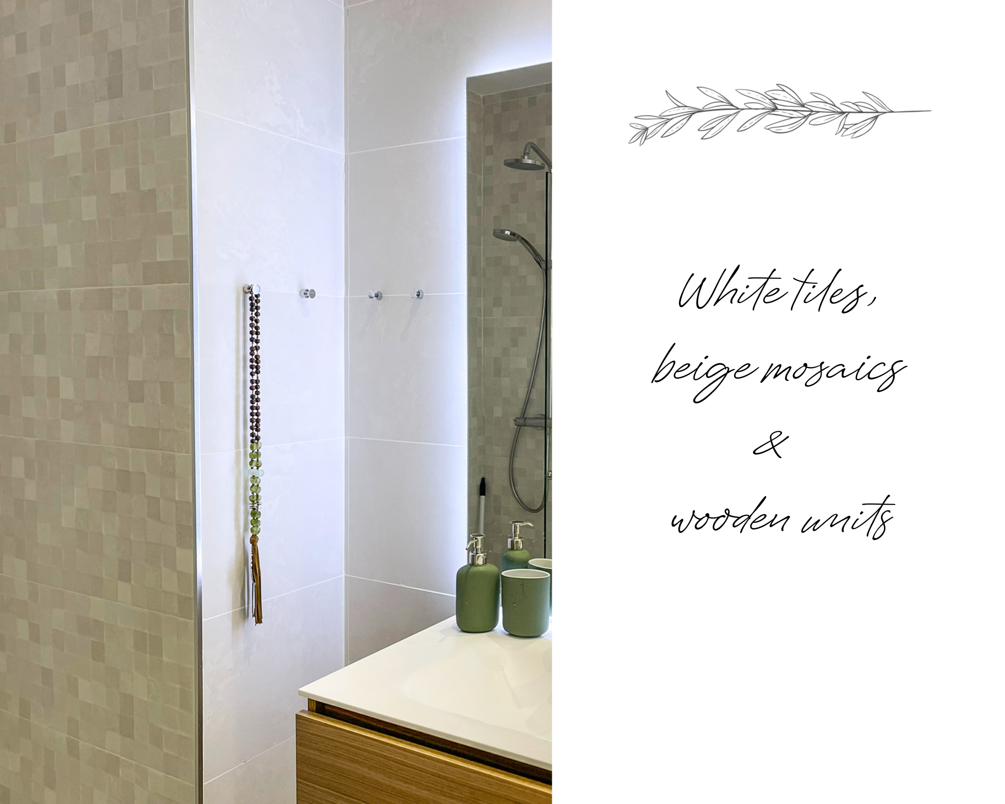
As we know now Scandinavian boho decor is all about neutrals. You can play with different whites, beige, greige (mix of beige and grey) and different sizes what comes to tiles. match together big and mosaics tiles.

Floating wooden vanity units look modern, stylish and it’s practical as well. Of course, it matches perfectly to Scandi boho home. Simple towel racks and hooks are the best choice.

Ceramics accessories and wooden decor items look beautiful. I love a simple hanging item made of wooden beads.

Use Natural Materials

Wood, rattan, glass, ceramics and linen are the main materials for Scandi boho home style. You cannot go wrong with these natural and organic materials.

Foe example choose:

  • a wooden dining table with rattan chairs

  • a comfy sofa in linen

  • wool and/or jute rugs

  • linen curtains

  • bamboo lamp shades

  • ceramics and glass items

How do you like Scandi Boho home decor style?

Iconic Stool 60 by Alvar Aalto

Iconic Stool 60 was created by Finnish architect Alvar Aalto in 1933. The stool has been in production ever since - thanks to its simple, time transcending model. Alvar Aalto wanted to design a universal object made entirely from native birch.

Stool 60 available at Finnish furniture company Artek.

When I saw that Stool 60 is available in bright blue, I just couldn’t resist. I had to buy it for my client as the colour was exactly the same as the chosen accent colour for their new home in Spain. This blue tone is called Bothnia Blue, and it was possible to order from Danish Wood Wood company.

Bothnia Blue

Every Stool 60 is unique developing a rich patina and ageing with grace over the years. It is also multi-functional - you can use it as a seat, table, storage unit or as a display surface.

This year there have been special editions celebrating the stools 90th anniversary. Find out more at Artek!

Skylight Circular Roof Window

Circular roof windows are a great way to increase natural light in the space below. Architects are increasingly designing them for modern spaces. In this building all the penthouse apartments have one on the covered part of the terrace. Absolutely a fantastic idea, although not the most practical thing as they are just holes without any cover. Even though it is not raining that much in Costa del Sol there are still rainy days and sometimes the rains bring red fine sand from Sahara.

Penthouses with circular roof window.

Almost all the home owners at Med One building have installed a glass to protect their terrace without loosing any light. My client wanted that too. Not an easy task to do but Rayosur made it look so easy.

The circular window is divided into 2 pieces.

First Rayosur brought the glass up to the terrace. It came in 2 half circular pieces. Then 2 men were needed to lift it up the the roof.

Next step is to get this half circular window piece up to the roof.

First half done!

And the circular roof window is installed!

Now it is nice to relax in the terrace and enjoy the fabulous views even if it happens to rain a few drops. The glass has a slight blue tone so the light is not so harsh.

What Is Scandinavian Style?

“I would like to have a Scandinavian style home.” That’s the answer what I get from most of my clients when I ask which style they prefer. Some of them like to have a little bit colour and some just neutral tones. Everyone wants to have light and cosy feel. So with these specs I start my planning.

My job was to turn a newly-built empty apartment into a cosy and functional Scandinavian style holiday home for a family with 6 children. The flat has 3 small bedrooms, 2 bathrooms, open-planned kitchen-dining & living and a huge terrace. A part of the terrace will be glazed in the near future.

Natural neutral Scandinavian look.

Main Elements Of Scandinavian Style

In Scandinavian style the focus is on clean simple lines, minimalism and functionality without sacrificing beauty. Bright airy spaces are characteristic as well as lack of clutter. You cannot find impractical dust collectors in this style. Nature plays a role as well especially in materials. All natural materials from wooden pieces to cotton and linen in textiles are highly represented. To bring the nature inside don’t forget green plants.

Main bedroom is minimalistic yet inviting.

Colours In Scandi Style

Scandinavian style relies heavily on neutrals. Bright whites with pops of black and neutrals are the main hues. This doesn’t mean that everything is monochromatic. Many tones are coming into play as accent colours. Most frequently used are soft shades with a hint of grey in them. Warm tan tones are also used as well as other natural-inspired colours, for example sage green pop often up in Scandinavian style.

A bunkbed saves some space for a small work station.

Why Scandinavian Style Is Popular?

That’s actually what I’m asking every time I visit Ikea. No matter which city or country I’m in - Ikea is full of people filling their yellow bags or trolleys with simple, minimalistic style furniture and other decor items. How come we all love this style?

Uncluttered bright environment evokes a sense of calm, and that’s something many people are missing from their daily lives. Coming to a home with clean yet warm look, which focuses on sharp contrasts, whites, natural elements and a hint of black simple makes us feel easy and good. So simple is that!

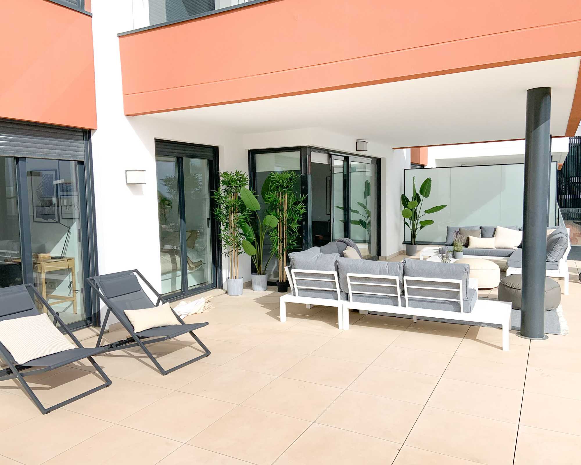
Most of the time will be spent on this huge terrace. Having a holiday home in Costa del Sol is all about enjoying the sun & sea and the wonderful warm climate, isn’t it?

A part of the terrace will be glazed so the place will be sheltered from the wind. It will also be practical as all the cushions can be left there while there’s nobody at home.

Plenty of seating to chill out.

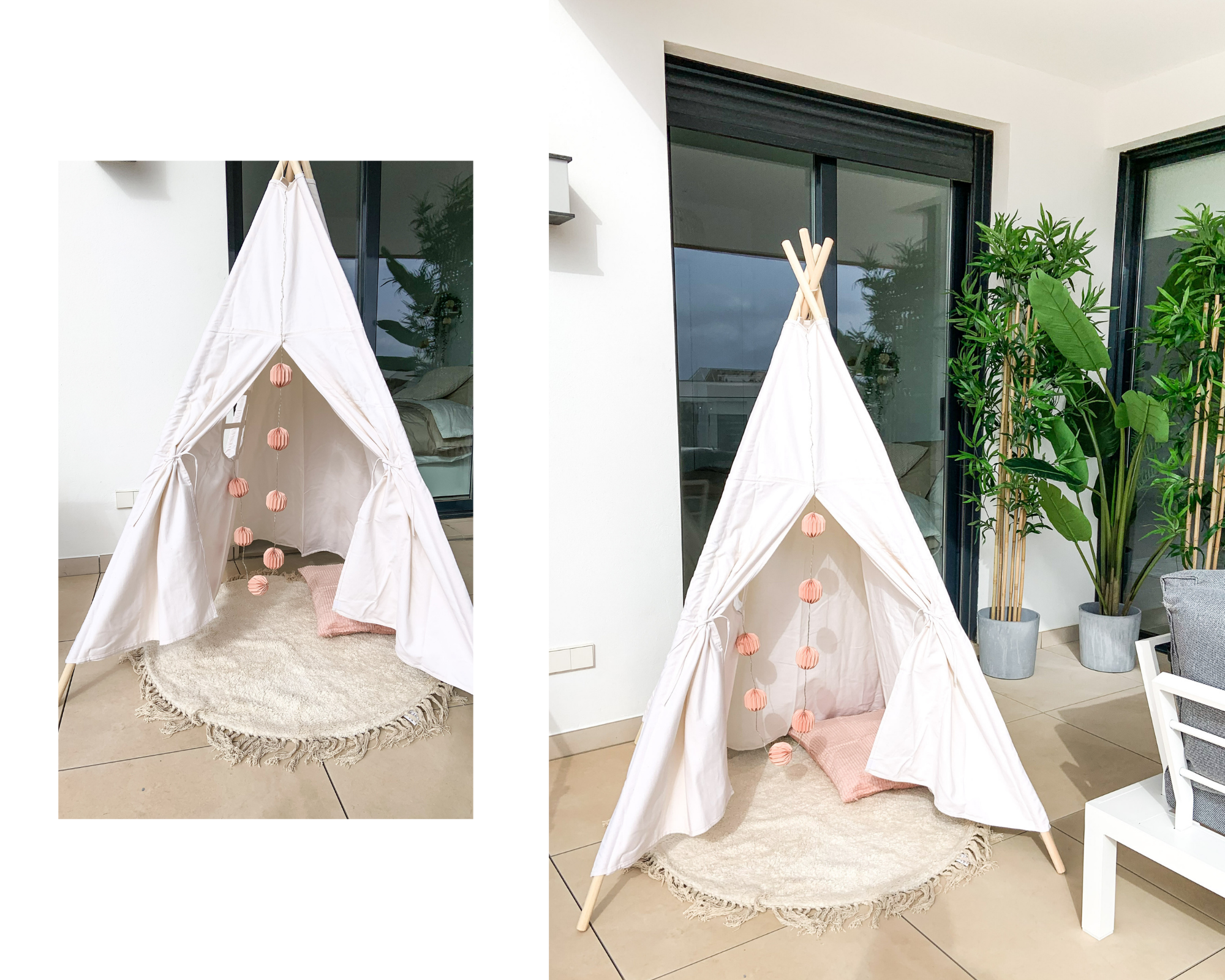
Something for the younger kids.

Actually that’s the place for a jacuzzi - coming soon!

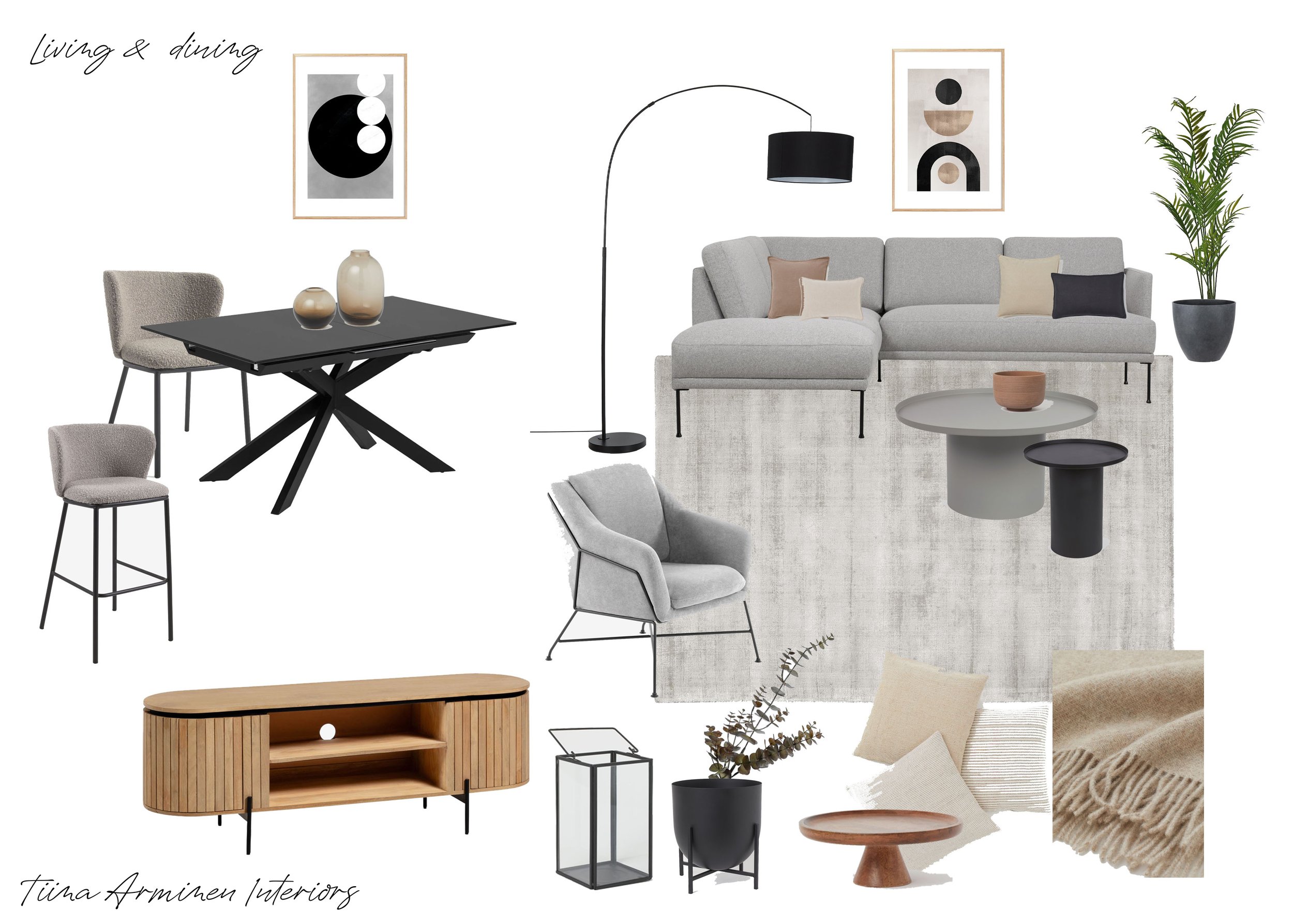
Moodboard for a Scandinavian Style living & dining space.

Tips For Timeless Home

This home is in a new modern construction building. The owners wanted to have a light classic style home without breaking a bank. The couple spends the whole winter season in this home so it was important to make it functional as well. We picked up the main furniture together and then I added small decor items to make the look and atmosphere inviting and cosy.

How do we get a personalized home that’s classic and refined, yet does not succumb to expensive decorating trends along the way? Here are some tips for you.

1.Neutral tones

Use natural, neutral hues for bigger pieces of furniture and walls. Choose white, beige, grey and black. Remember that there are plenty of white hues from warm to cool and bright to soft ones.

White couch gives an elegant look and brightens the room. It is also easy to decorate it as you can add both light and dark accessories with it.

Light neutrals.

2. Art

A work of art on your side table or on a wall immediately adds some personality to your space. Pick up something you like to look at and it will last over the years. Antique markets, small art galleries as well as online poster shops are great places to find fascinating pieces.

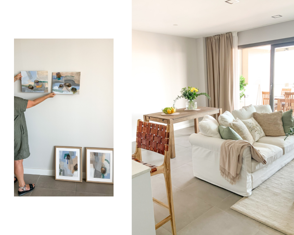
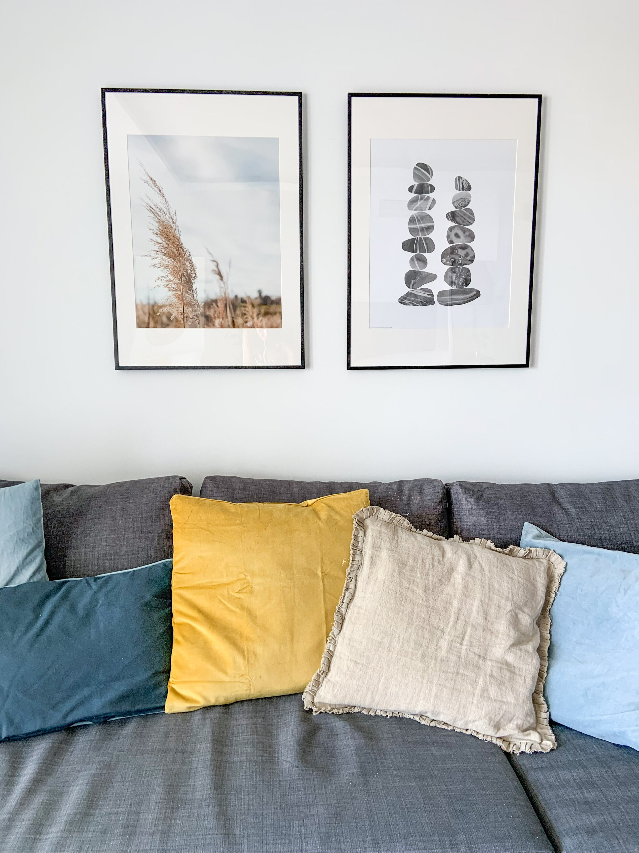
The white wall behind the dining table got some colour from the paintings with beautiful seaside pastels. A set of 4 paintings by Atelier 30.

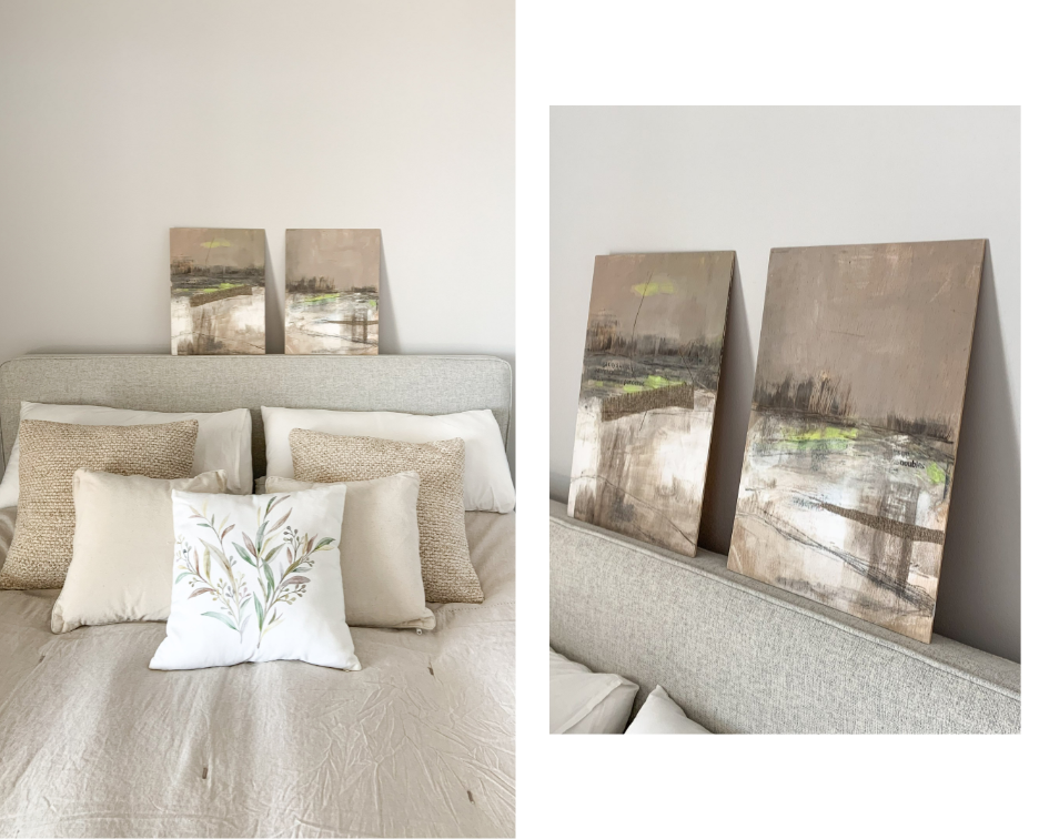
These 2 paintings by Daniela Raffaele are a perfect match for this bedroom.

3. Mix Of Cushions

Cushions are probably the easiest thing to change up. They bring a cosy, inviting and classic atmosphere to your home. Mix hues and patterns. As long as the colours are matching you can have stripes, checks and other motifs all together, and they make wonderful and harmonious combinations.

Hint of green in cushion covers brings the nature inside.

4. Fresh-cut Flowers

Flowers and plants bring textures to a room. In a holiday home where you don’t live all year round fresh green plants might not be the ideal option. Nowadays the faux ones are so real that I recommend to go for them. Of course, nothing beats a bouquet of fresh-cut flowers so buy your weekly florals when ever you spend a week or two at your holiday place.

Fresh-cut flowers give that final touch to home decor.

5. Timeless Lamps

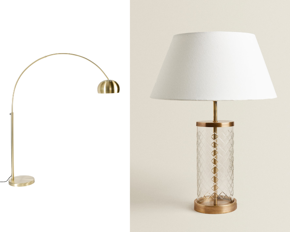
Design lamps are , of course, timeless. Yet a mixture of traditional, modern and vintage can also be timeless and look gorgeous. If you keep them simple with a similar twist such as material or colour, I can assure you that the result will be perfect.

White & gold make a beautiful timeless combo.

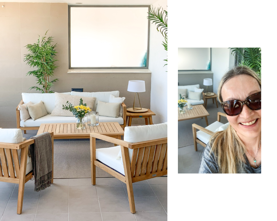
Btw, this home has a gorgeous huge glazed terrace with a dining and sitting area.

Glazed terrace can be in use all year round.

Furnishing a Vacation Home From the Scratch

This totally renovated 2 bedroom apartment was bought for rental purposes as well as for the family themselves to spend their vacations and for remote work when ever possible. Beautiful sea and garden views together with an open plan layout make the small apartment feeling airy, light and spacious.

Renting out a vacation home in Spain is rather easy. Of course, it’s renters market at the moment and that makes it even more important to stand out from the crowd and attract potential renters.

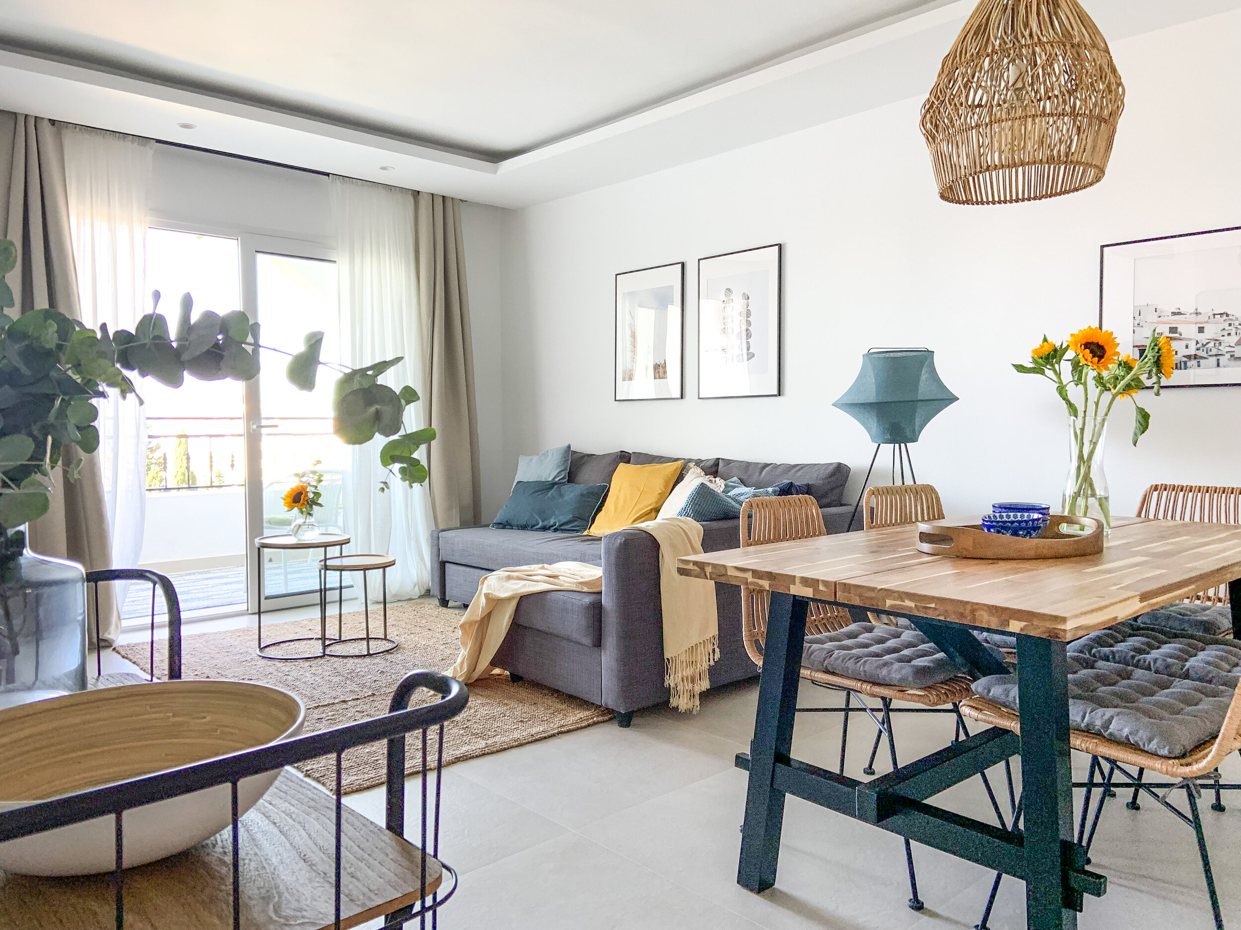
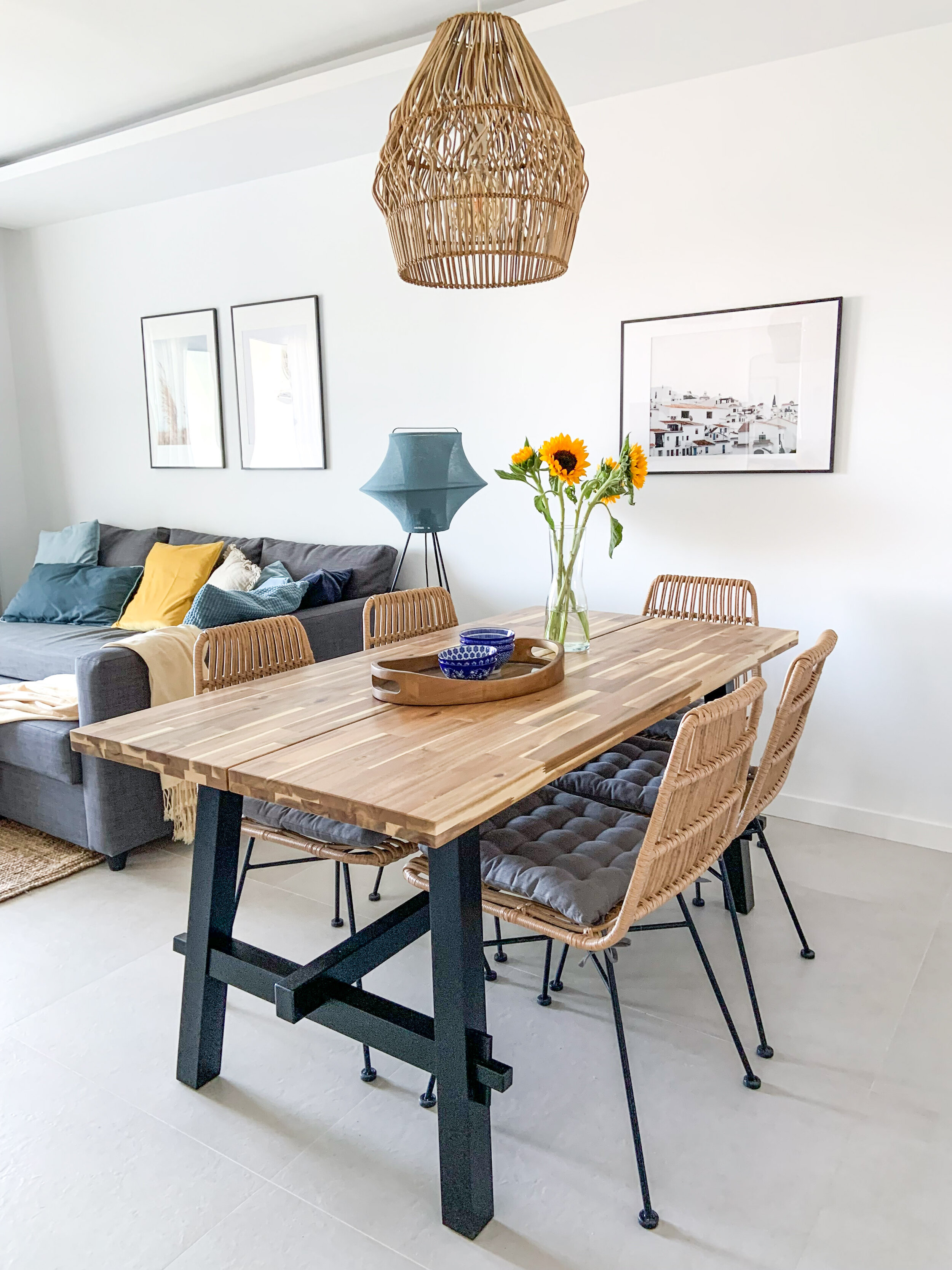
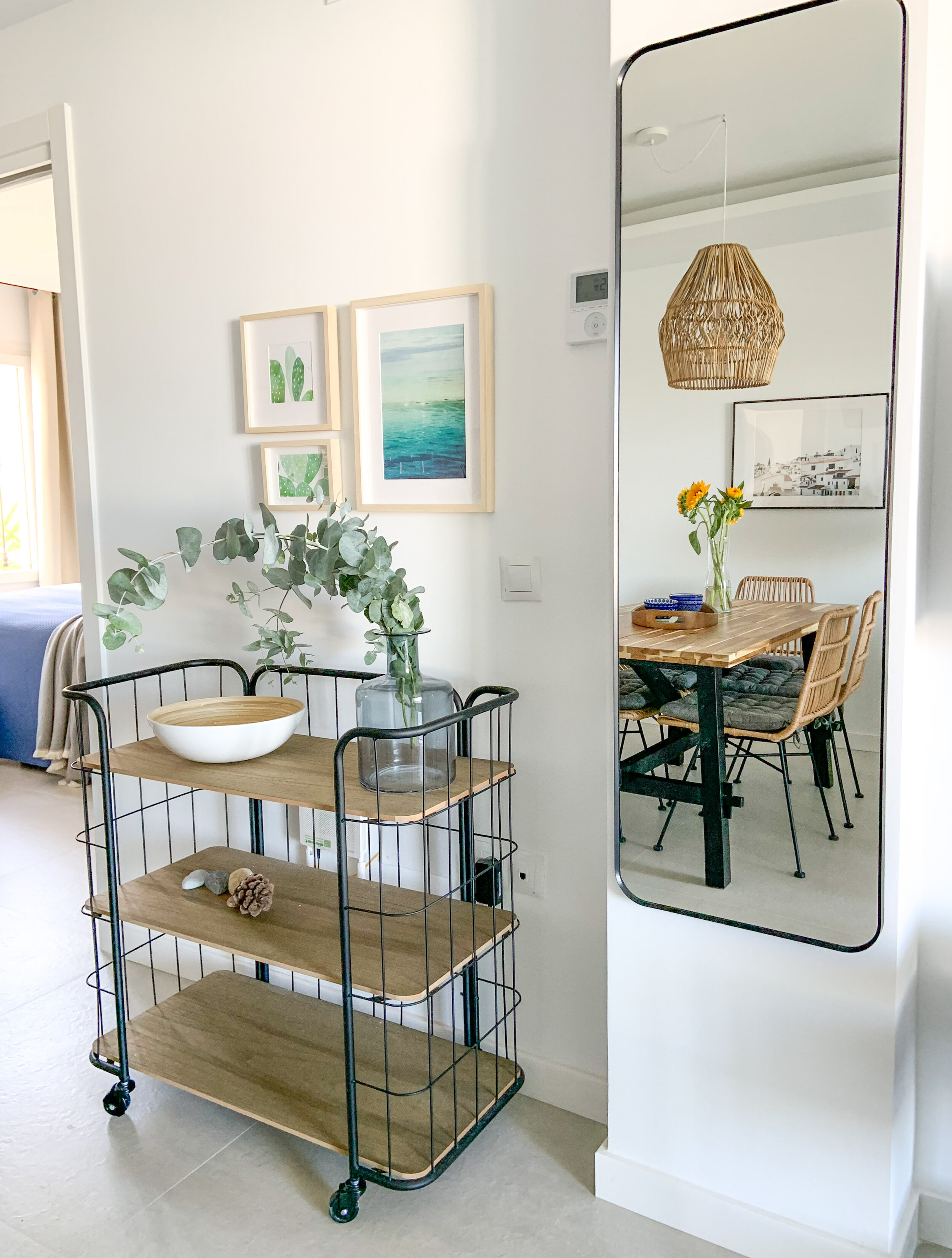
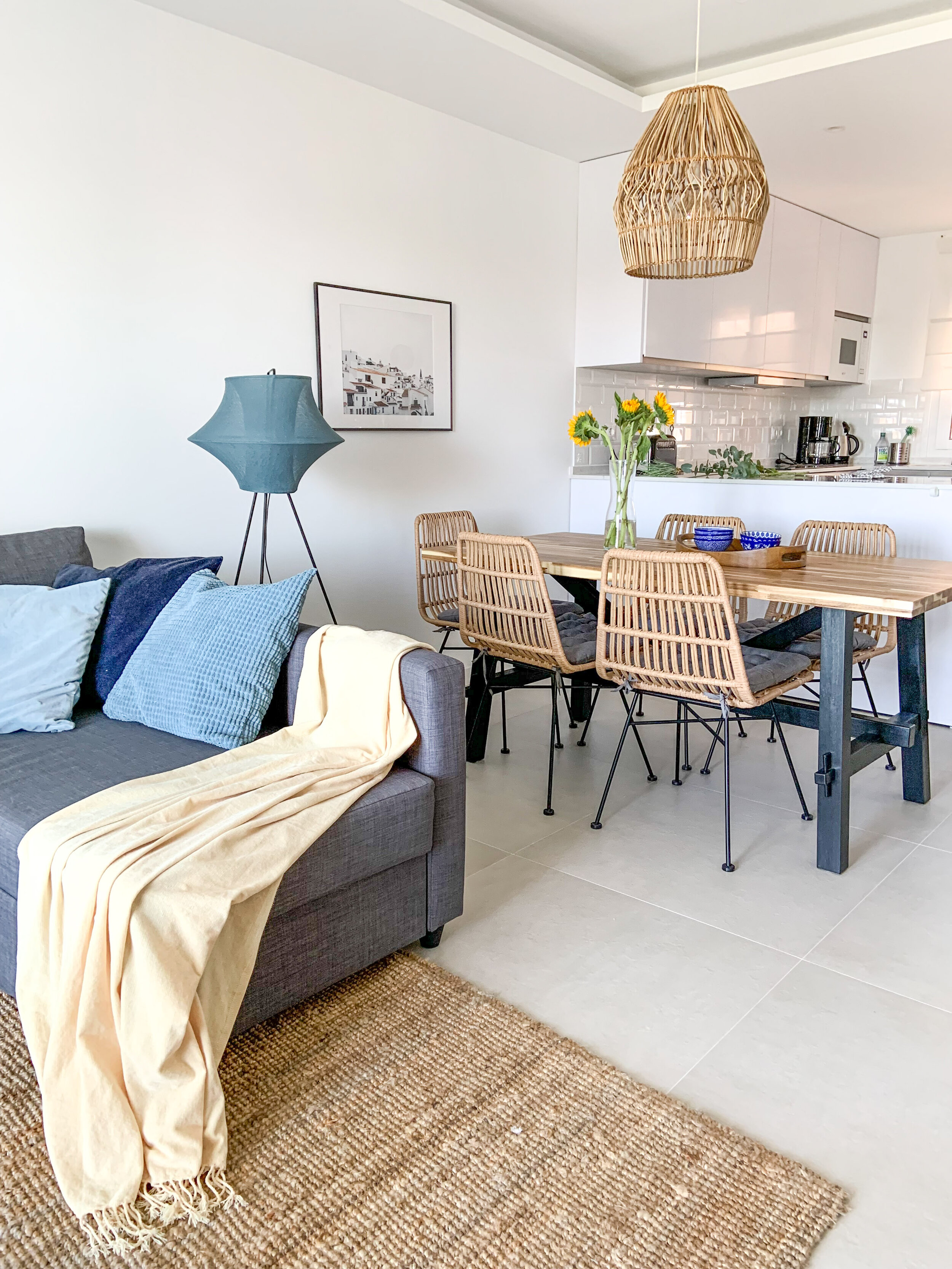
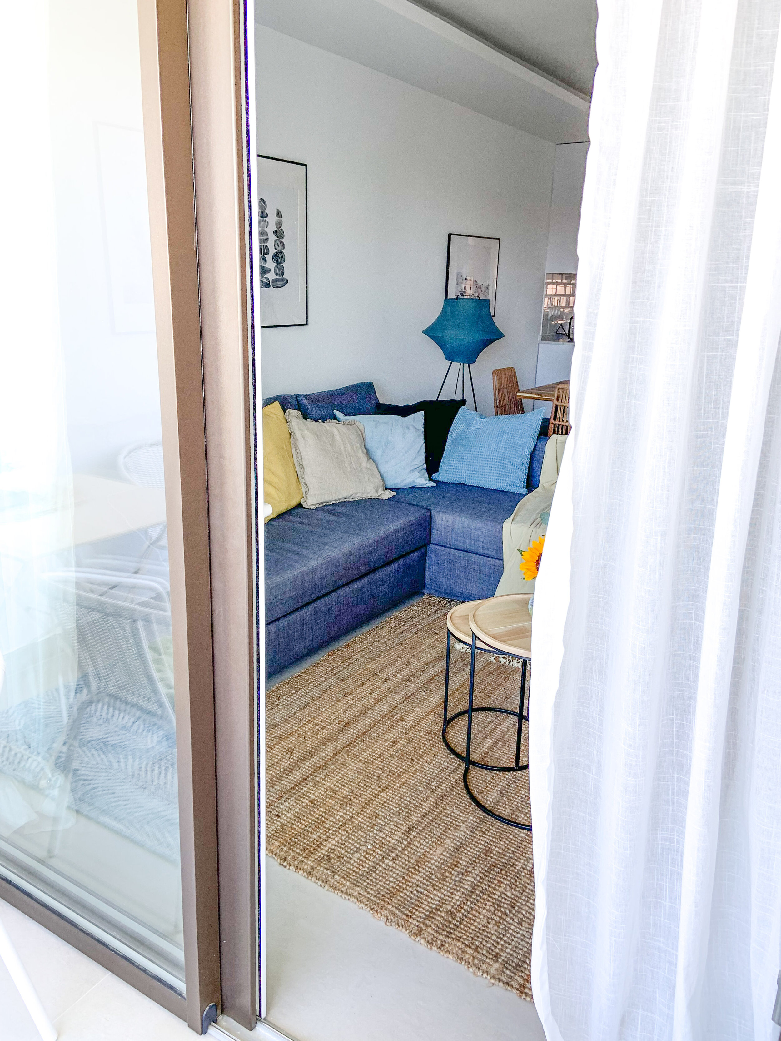
Living & dining - natural hues with tones of fresh blue & sunny yellow.

Living & dining - natural hues with tones of fresh blue & sunny yellow.

Tips For Creating a Standout Vacation Rental

  1. Keep it simple

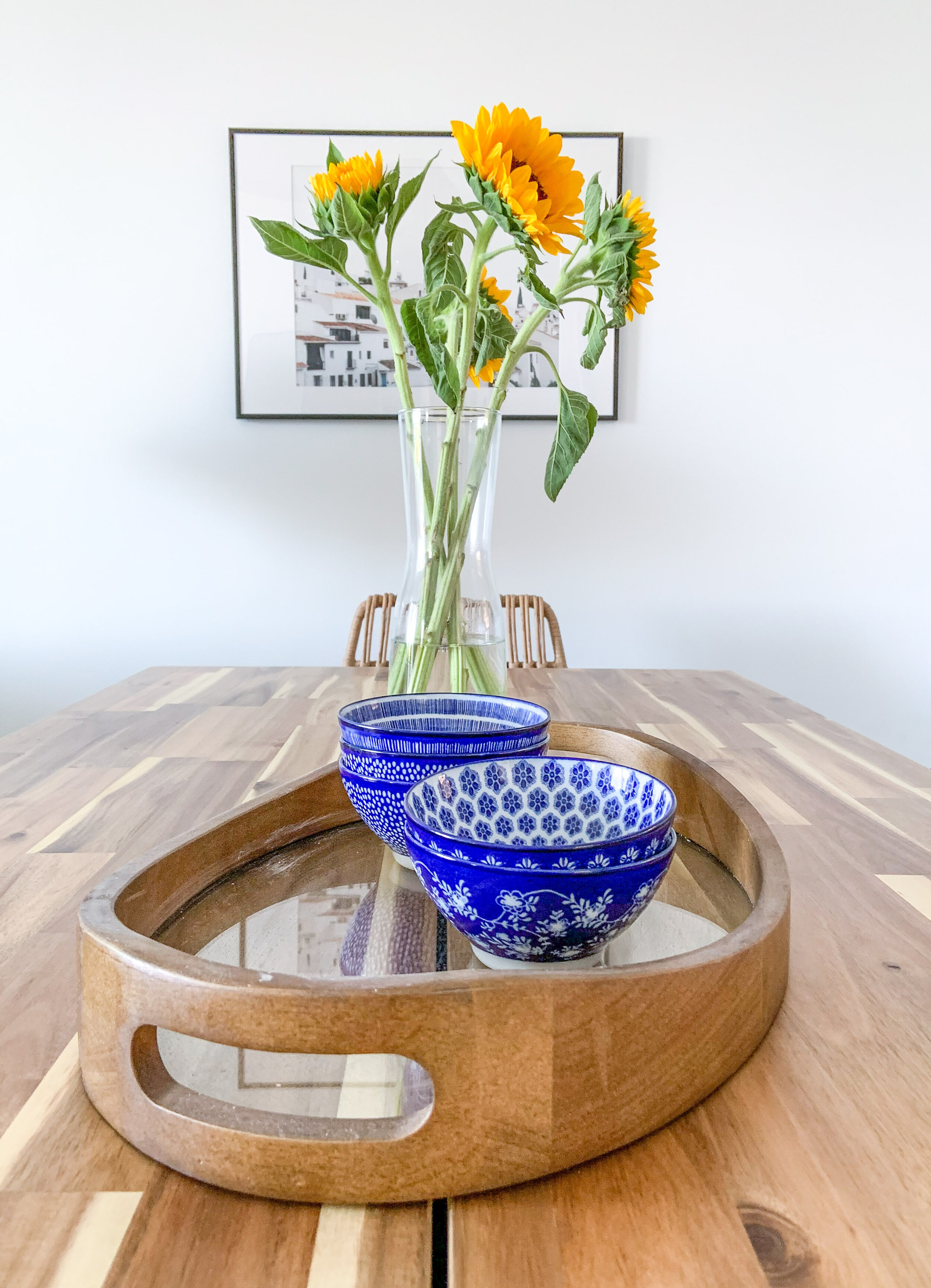
    When designing vacation rentals, simplicity in the furnishing is the key word. Keep the furniture highly edited and accessorising down to a minimum. Use neutrals as your foundation, then build on that with accent colours. Use cushions, blankets, vases, bowls and ‘feel good’ art.

  2. Mix & match

    You can buy the main pieces of furniture in one place and save with the transportation , but add also some smaller pieces from different brands. In this particular case we bought a lot from Ikea such as the sofa, dining table and beds, but the home was spiced up with pieces from Zara Home, Westwing and Casa Mijas.

  3. Decorate with Purpose

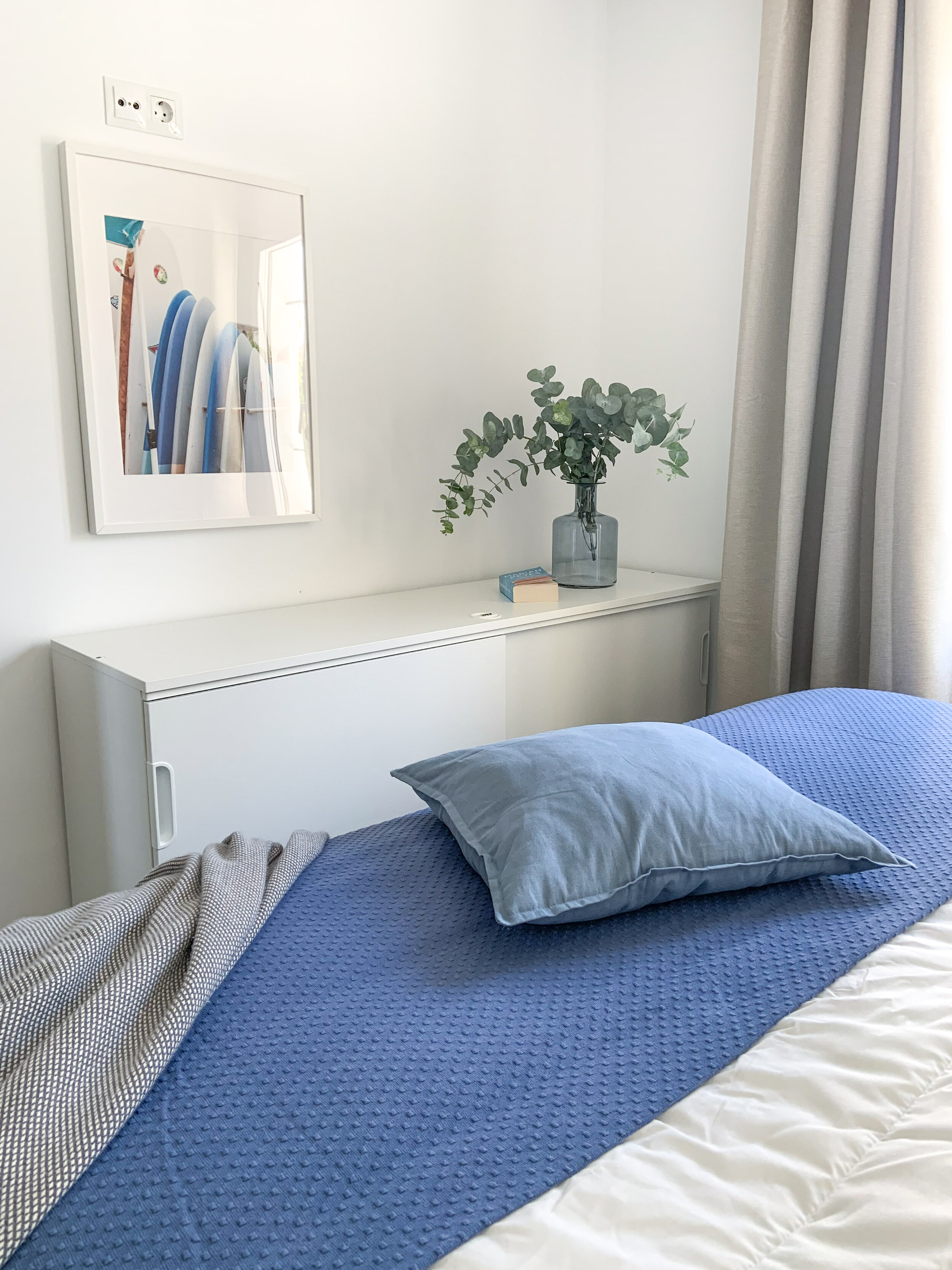
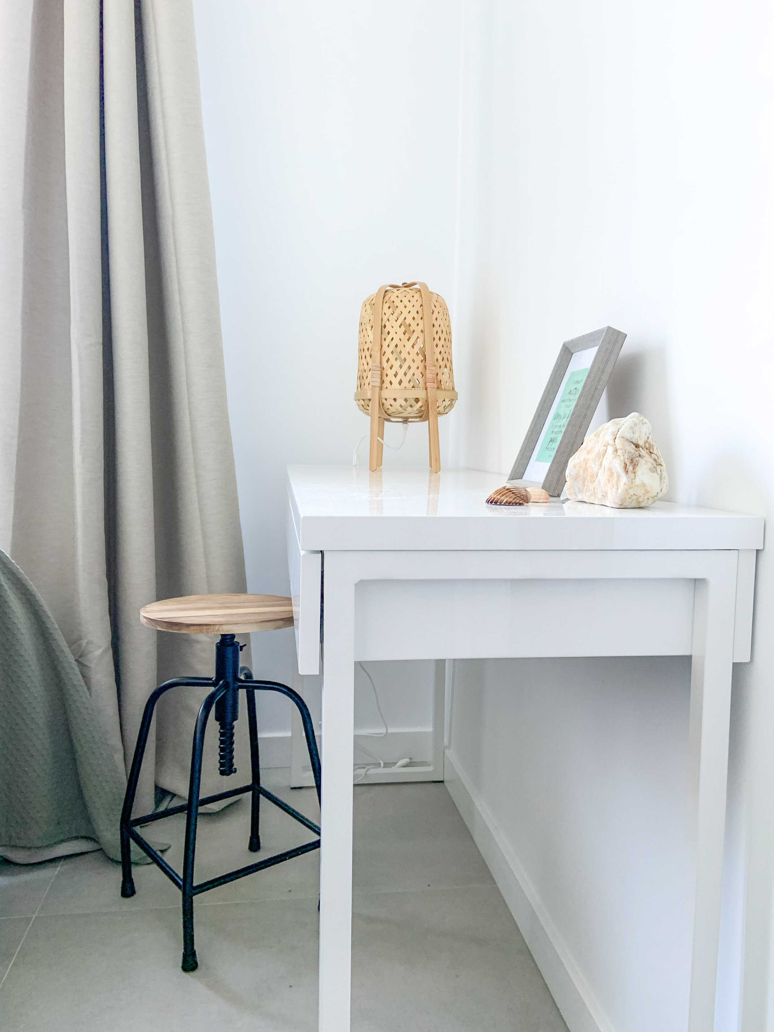
    Every room and space should have a function. In this home it was easy and obvious as the open plan layout gave spaces for different functions - cooking, dining and watching TV & relaxing. Both bedrooms were quite small, but it was important to make the beds inviting and comfortable. In the other bedroom there’s a locked sideboard for owners’ personal stuff, and a desk for working in the other.

  4. Add Thoughtful Touches

    Choosing matching bedlinen and towels show that you care and want your guests to enjoy their stay. Same thing goes with the kitchen utensils - there should be enough of them and all going well together.

IMG_3695.jpg

When you need beautiful images to your walls, go to StockBoutique by AT!

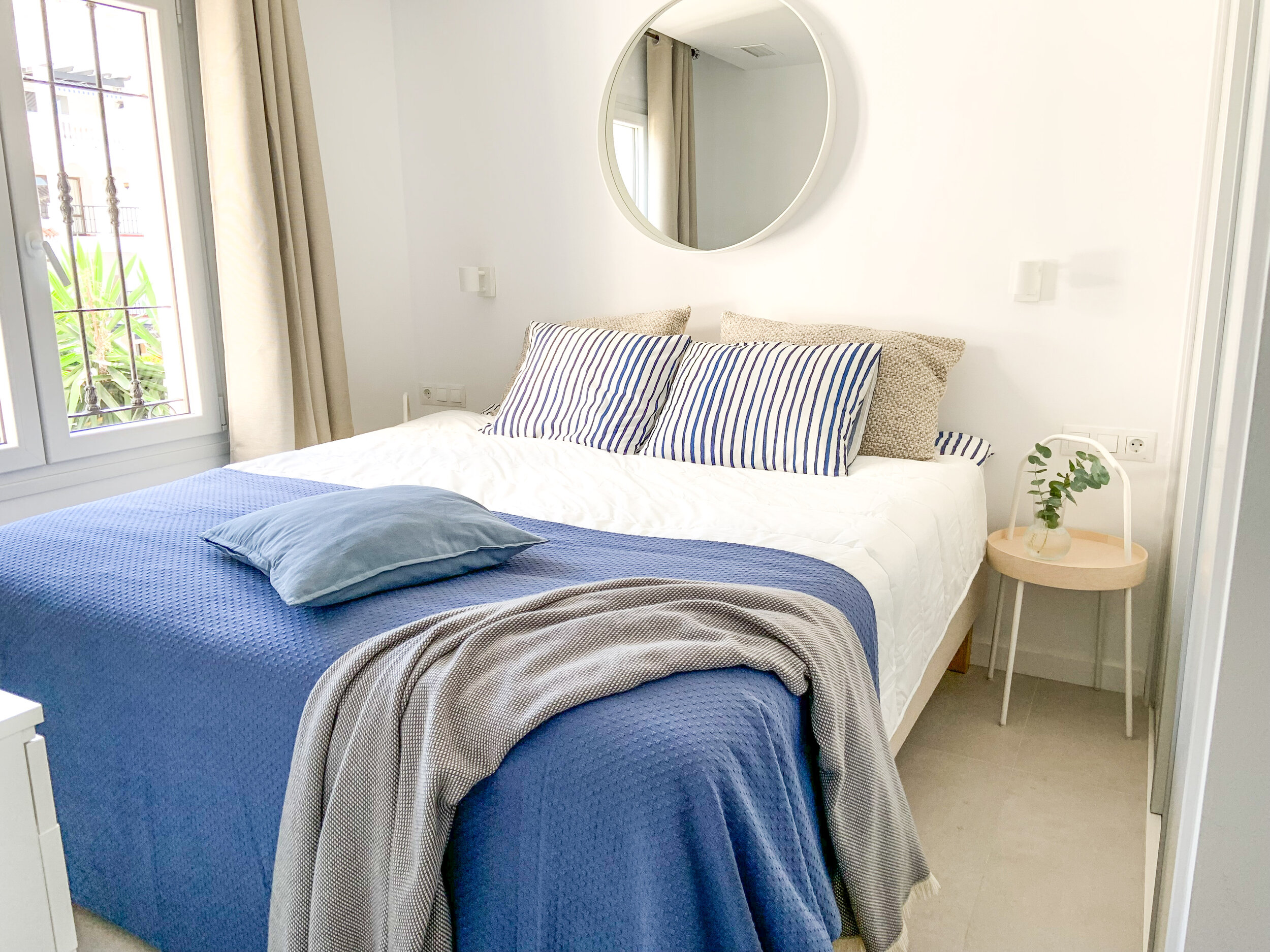
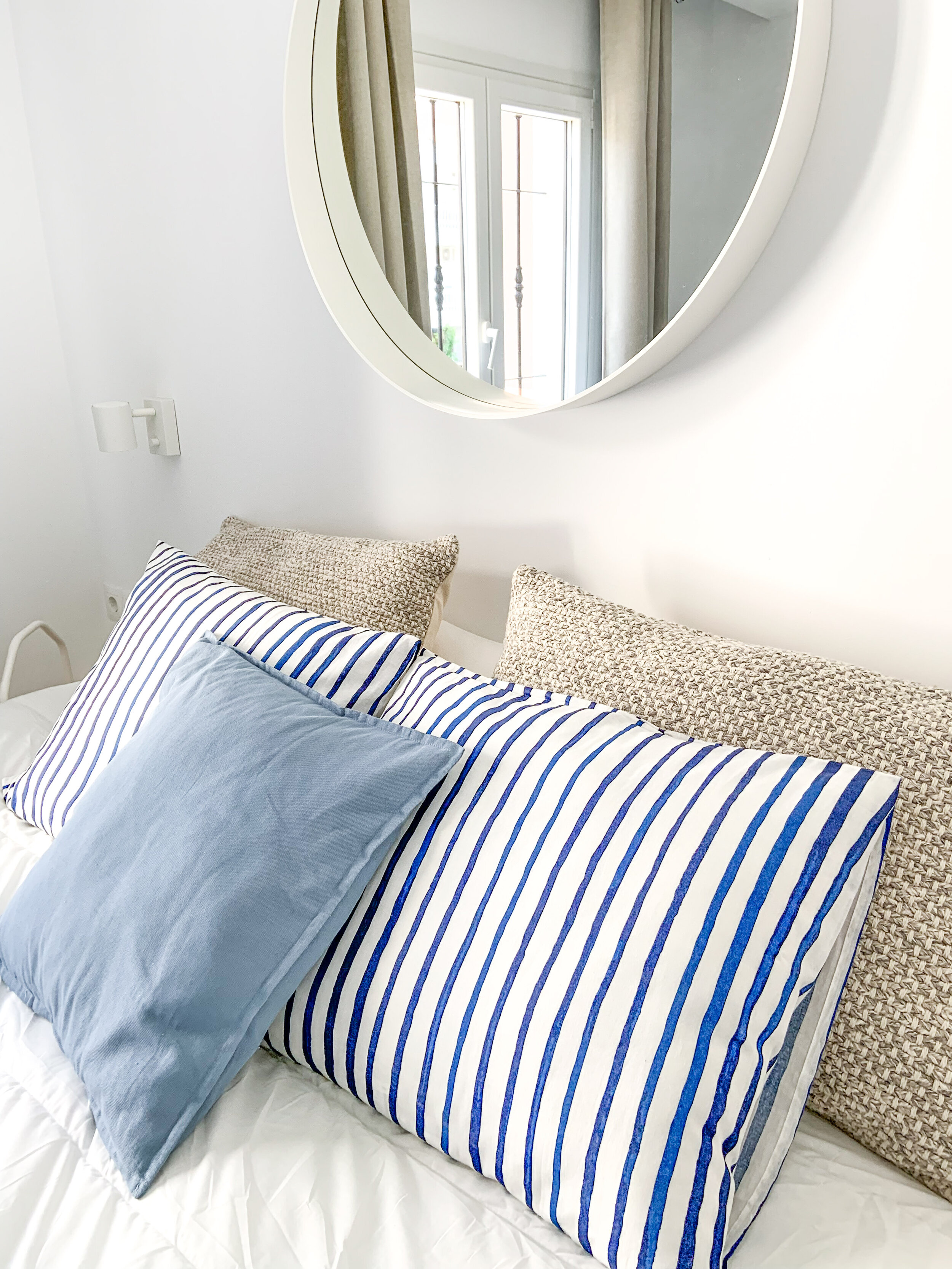
Blue bedroom.

Blue bedroom.

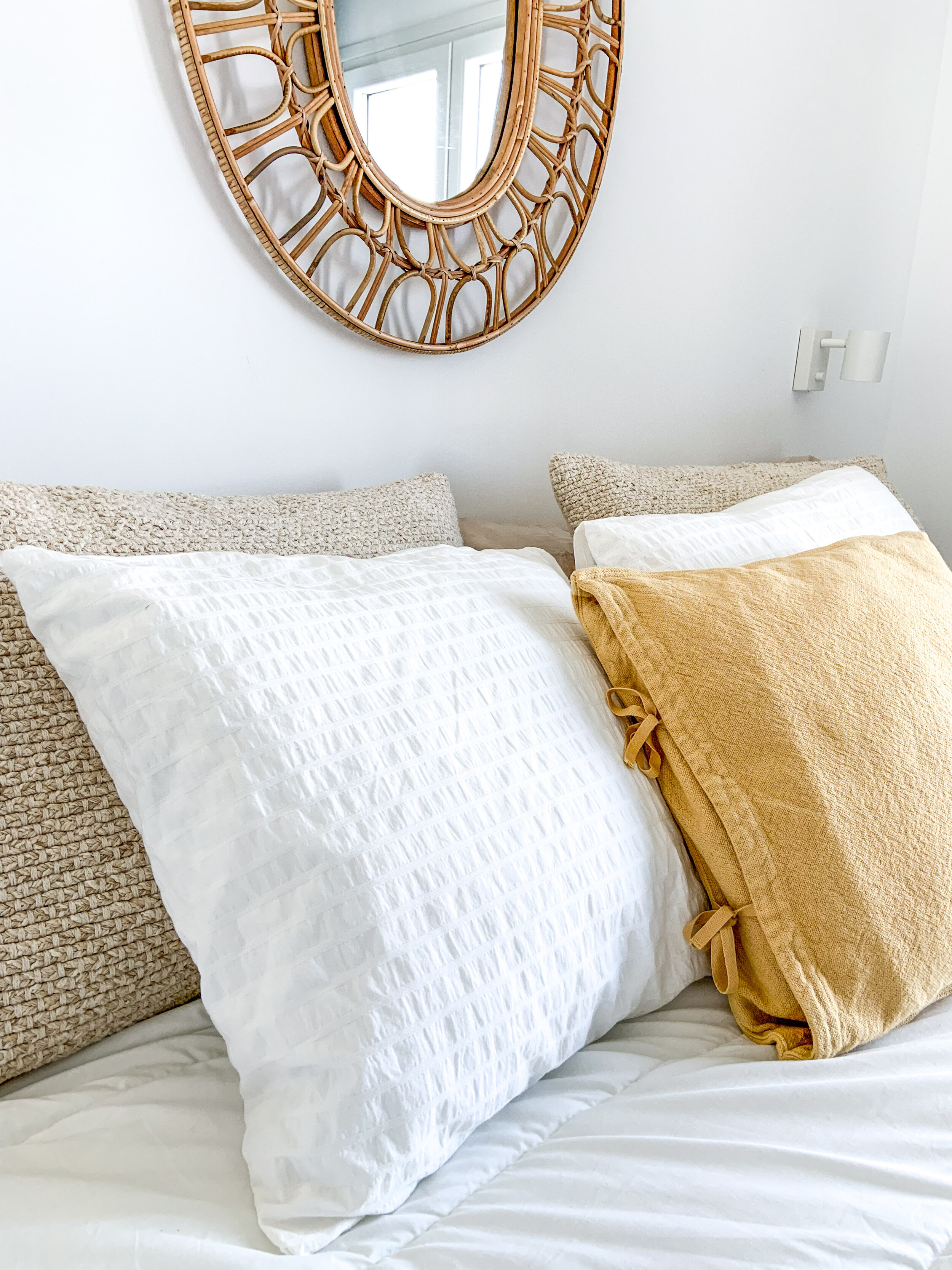
Sunny yellow details.

Sunny yellow details.

The idea is that if guests have a wonderful experience with the home, hopefully they take better care of it. The more you finish a rental home — the more you complete the story — the more respect people have for it.

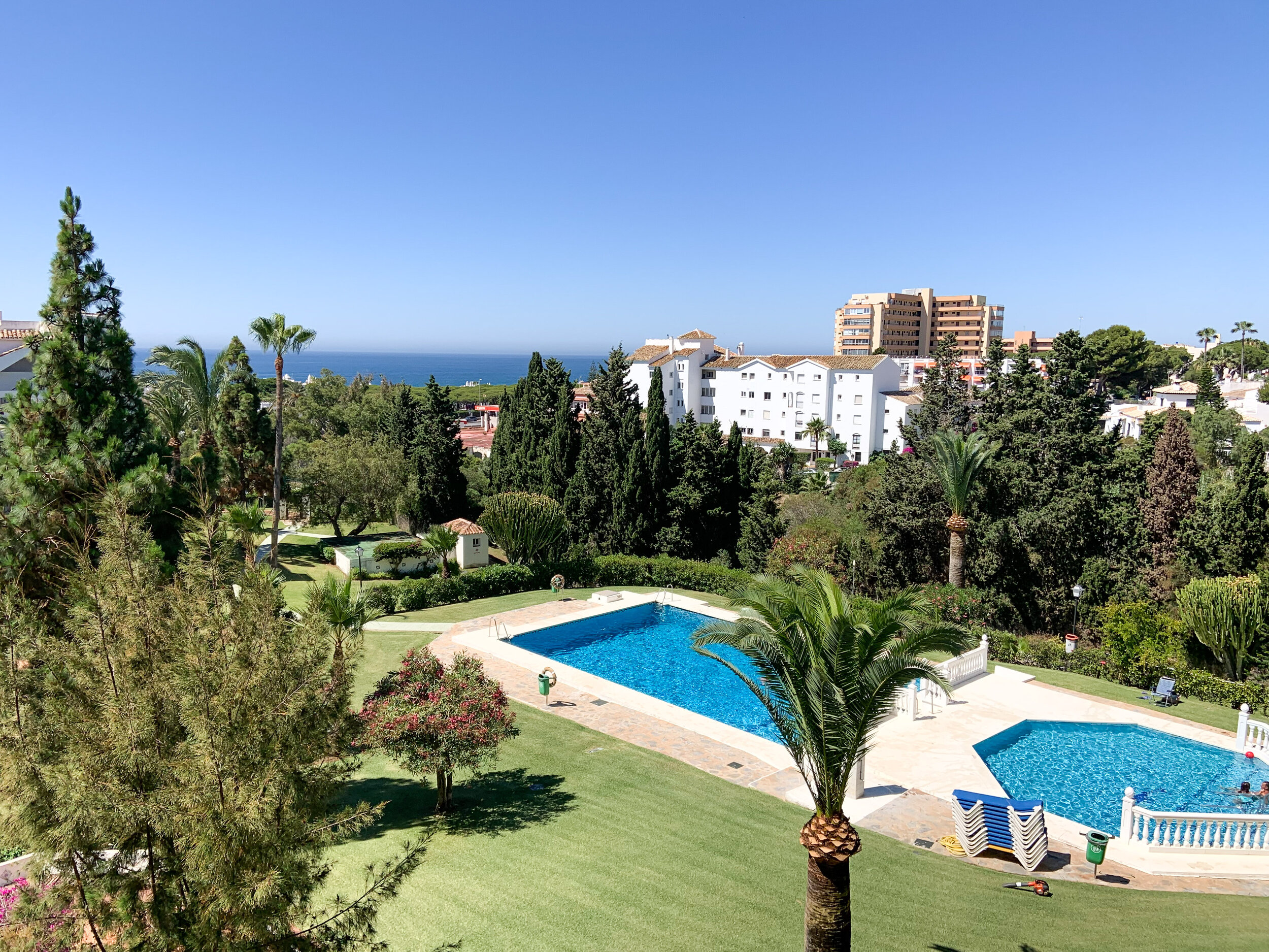
Beautiful and well-maintained garden with 2 pools.

Beautiful and well-maintained garden with 2 pools.

If you need a holiday home for a week or 2, or for the whole month, this home is available here.

Tips For Decorating A Rooftop Terrace

Decorating A Rooftop

This roof top terrace might look familiar to you. I styled it a couple of years ago (click here!). Under the harsh sun materials fade and loose their colour and texture - that happened to this terrace too. As it’s a rental guests didn’t really take as good care as it would’ve needed, so the owner decided that it was the time to refresh it.

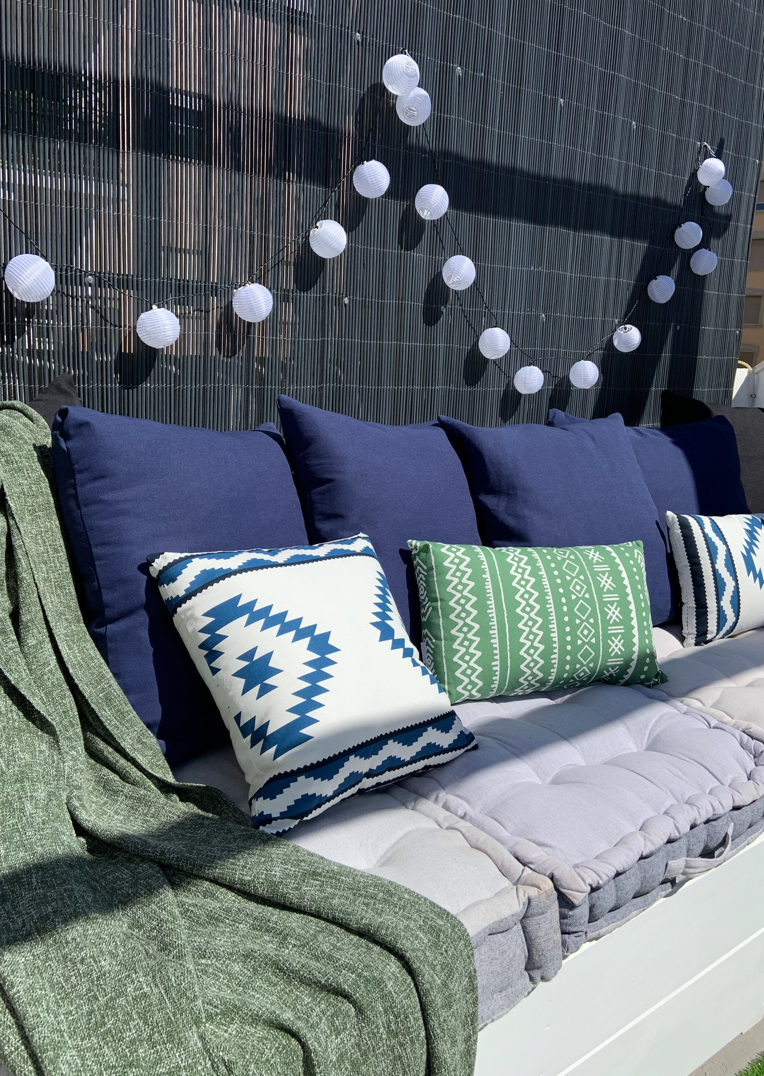
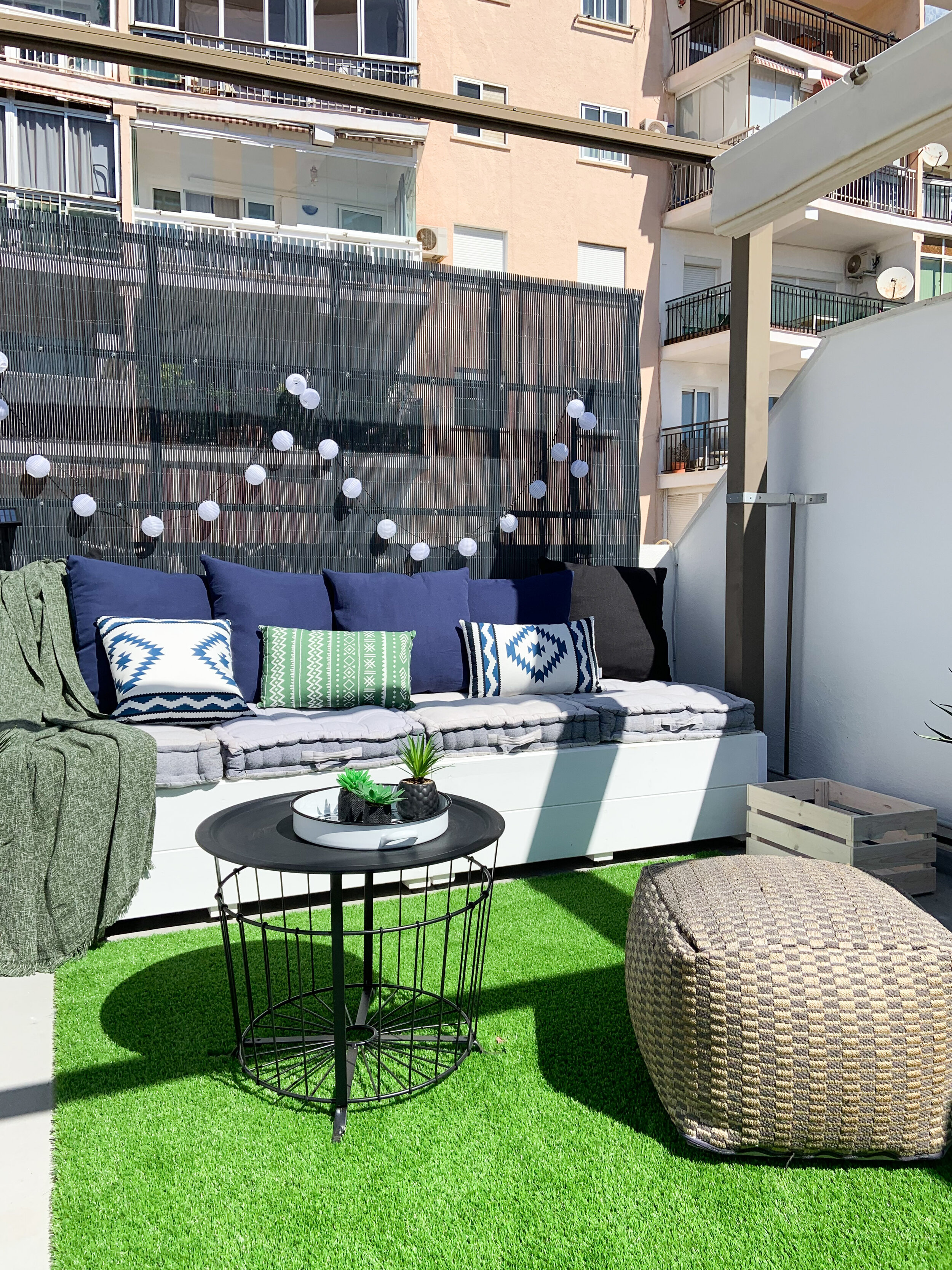
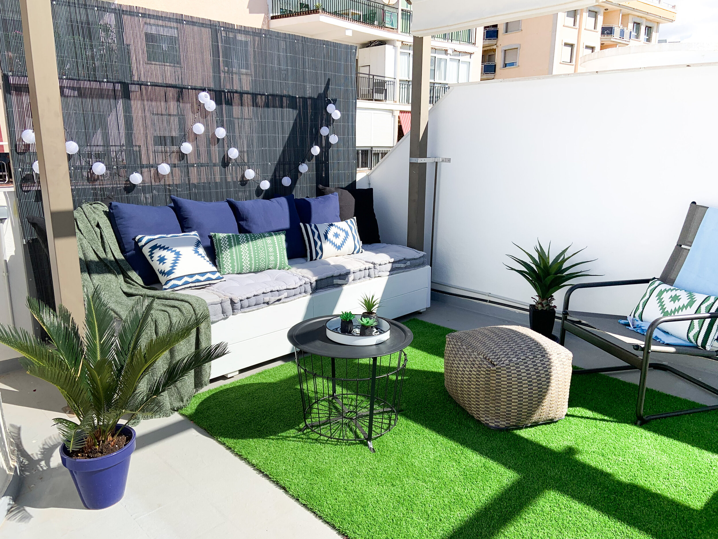
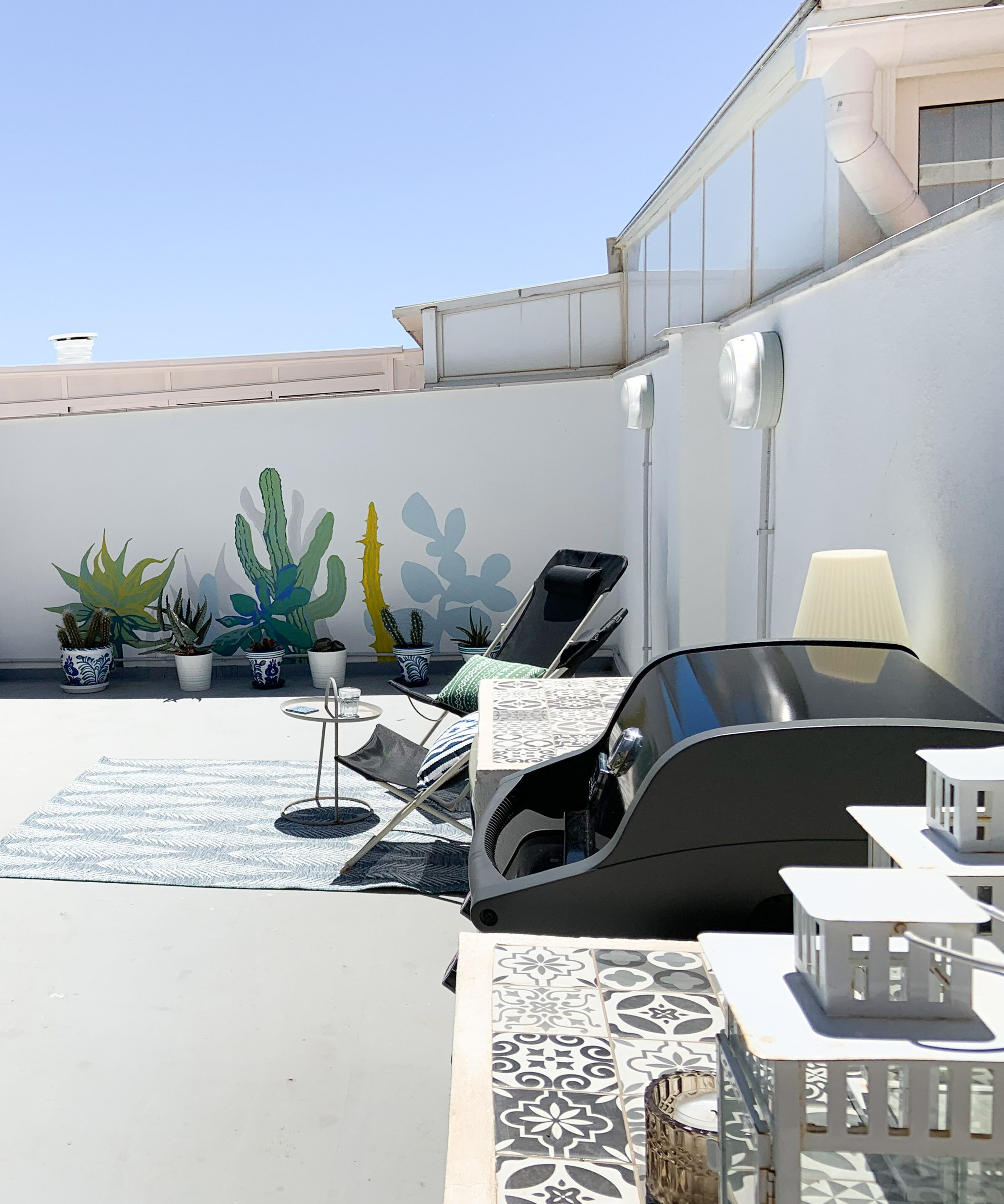
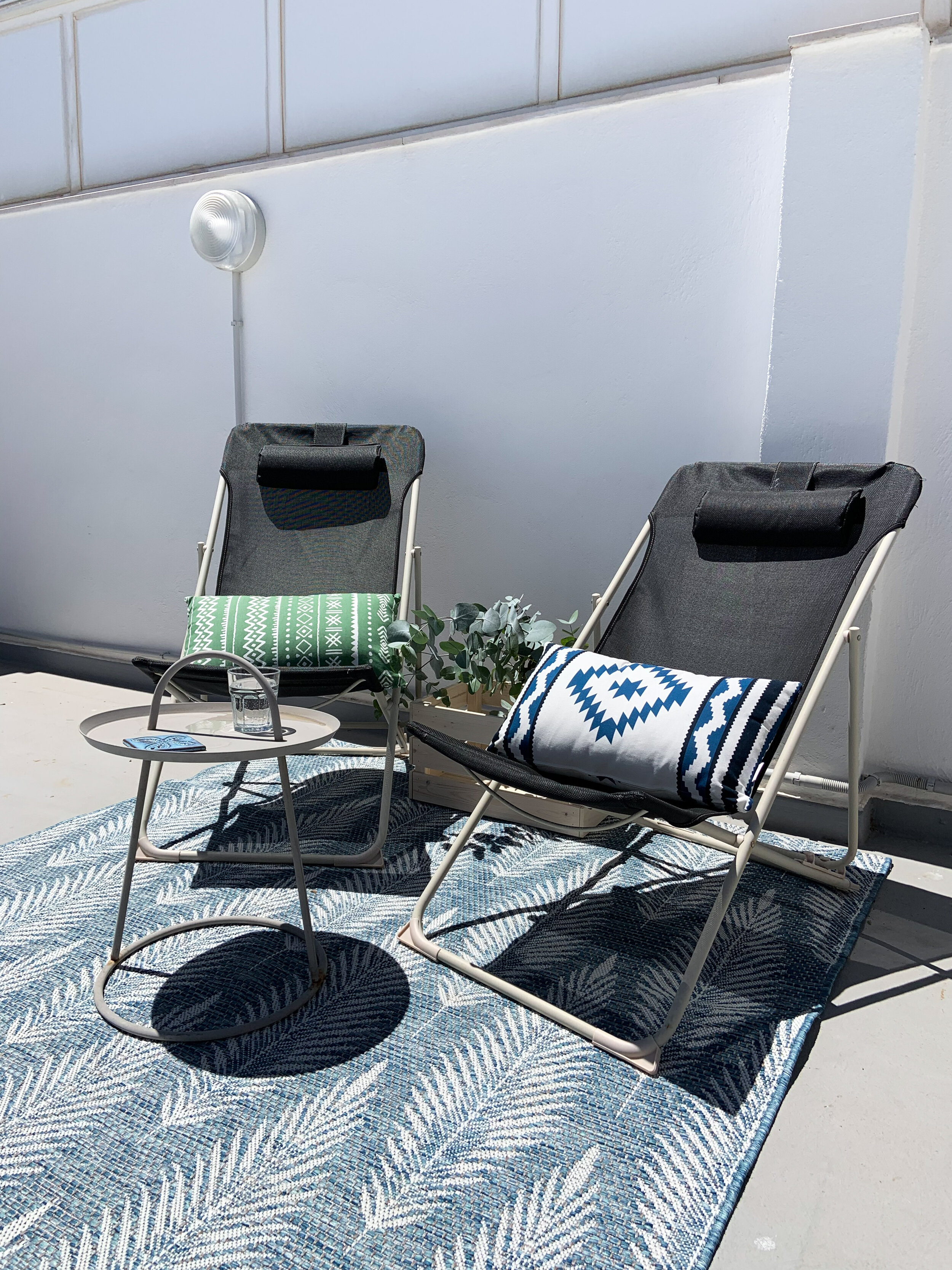
The roof top terrace got a new layer of paint, rugs made of more durable materials as well as a shelter wall to block the view from the opposite building. As much as possible the existing pieces of furniture were used.

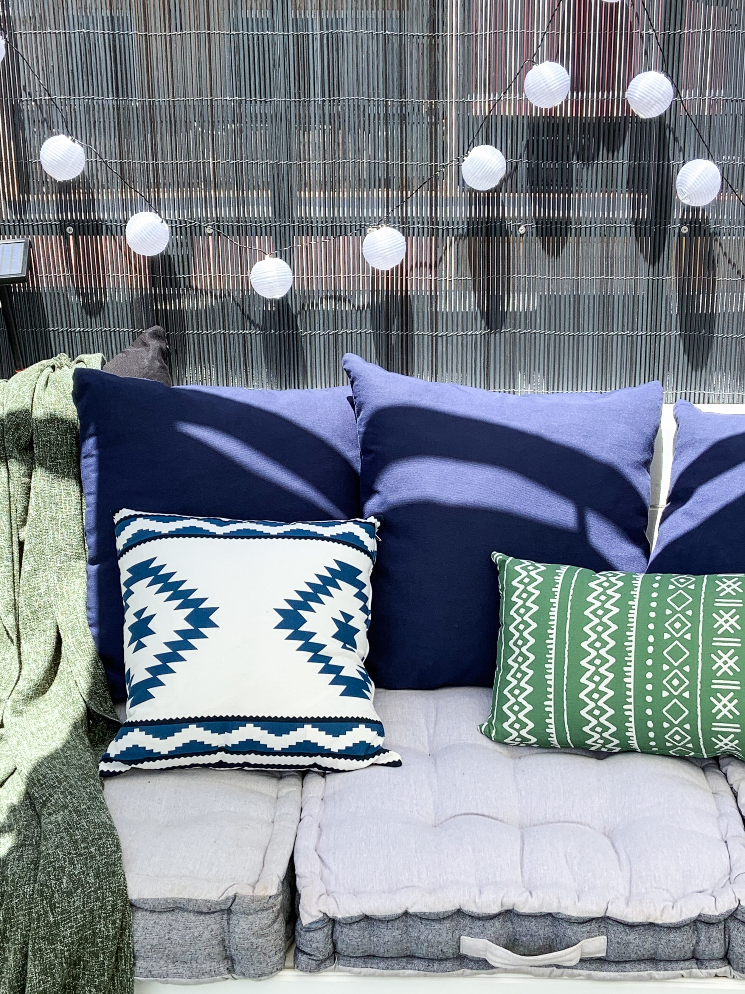
The colour scheme was changed to a more vibrant one - with blue & green accents. Mirai Kodit made the hard work - I just did the decoration and took some pics.

IMG_3603.jpg

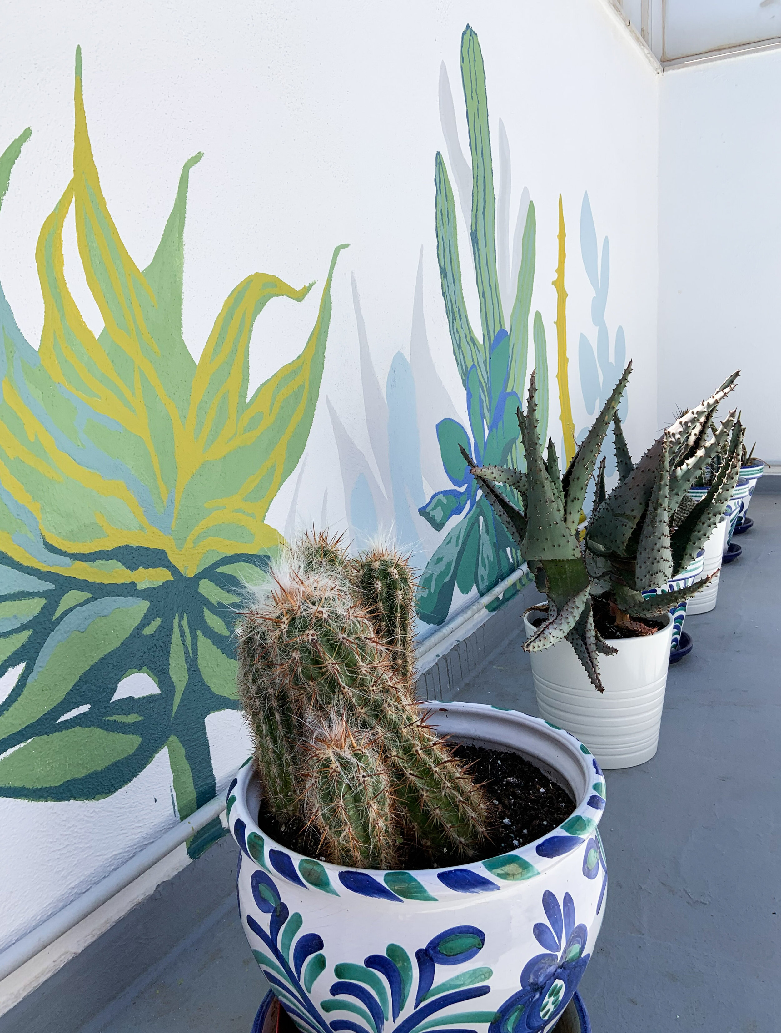
The real center piece is the mural on the back wall made by Sanna-Mari Prittinen. The cactus garden is simply gorgeous!

IMG_3604.jpg

Tips To Transform A Rooftop Into Relaxing Haven

  1. Add some shade. For sure it’s going to get hot up there. So enjoy the outside and beat the heat by adding awnings, umbrellas or pergolas.

  2. Go green. Plants and flowers that need direct sunlight, love your rooftop. Cactus and succulents are a sure choice.

  3. Get cozy. Cushions, blankets, rugs together with lanterns, candles and lighting chains soften the space.

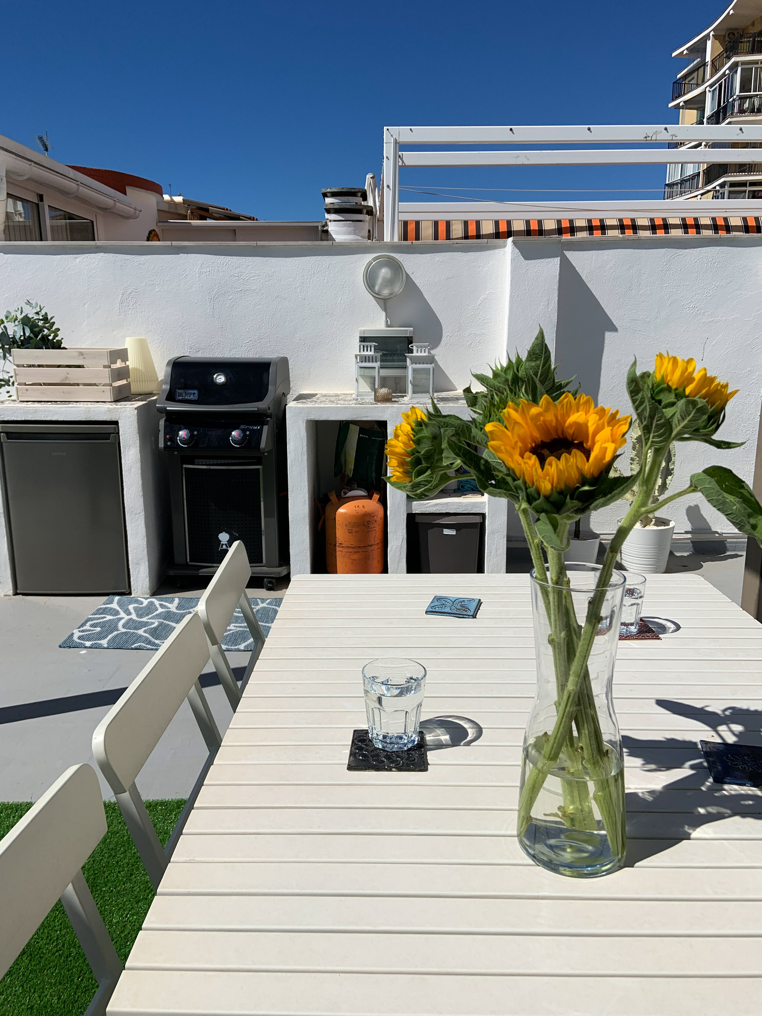
  4. Get cooking. A grill for cookouts and a dining table for summer gatherings with family and friends make delicious and memorable moments.

  5. Make it fun. Adding eye-catching features such as murals, figures, old cafe signs etc create an unique atmosphere and a place your guests will definitely remember.

IMG_3618.jpg