home in Costa del Sol

Furnishing a Vacation Home From the Scratch

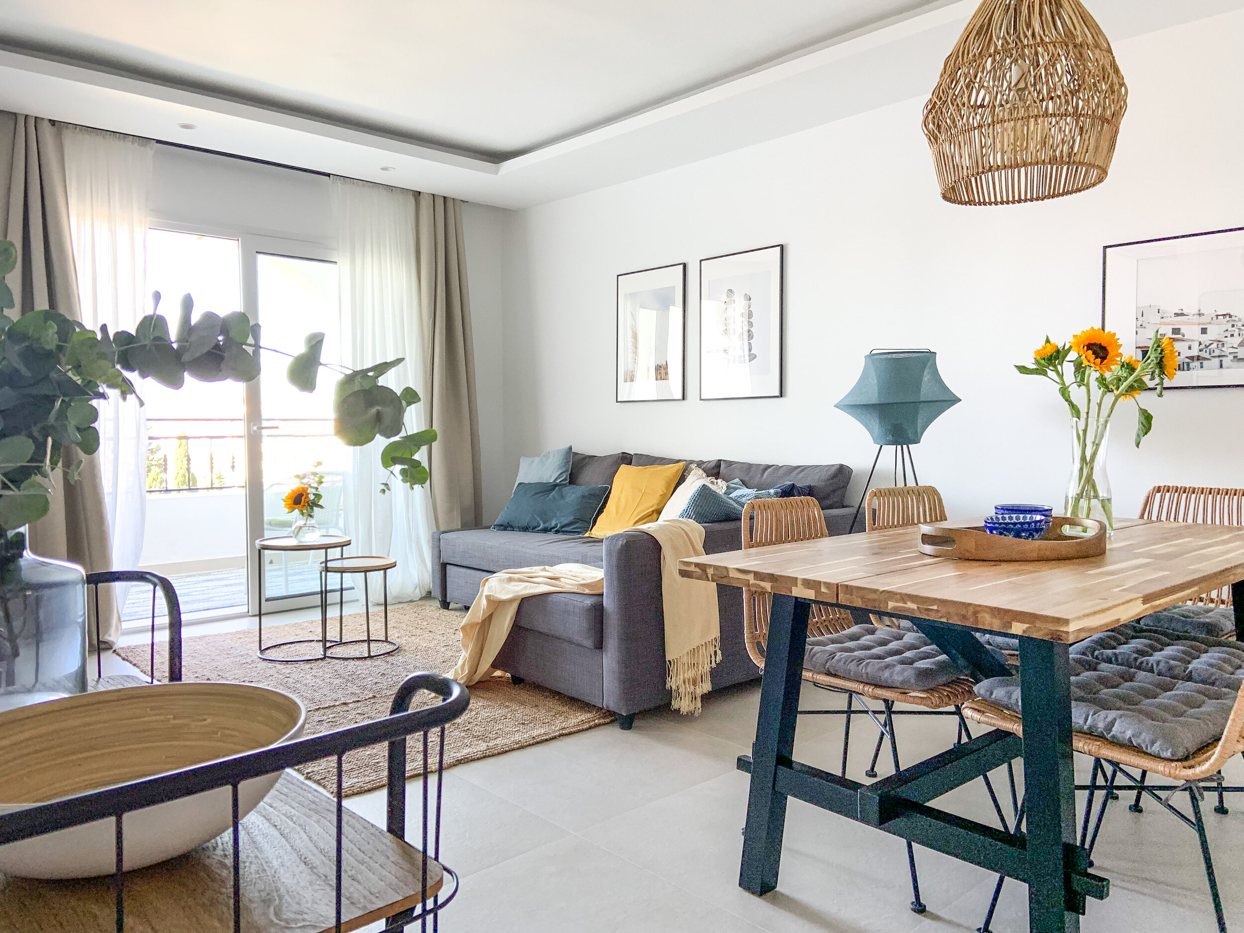
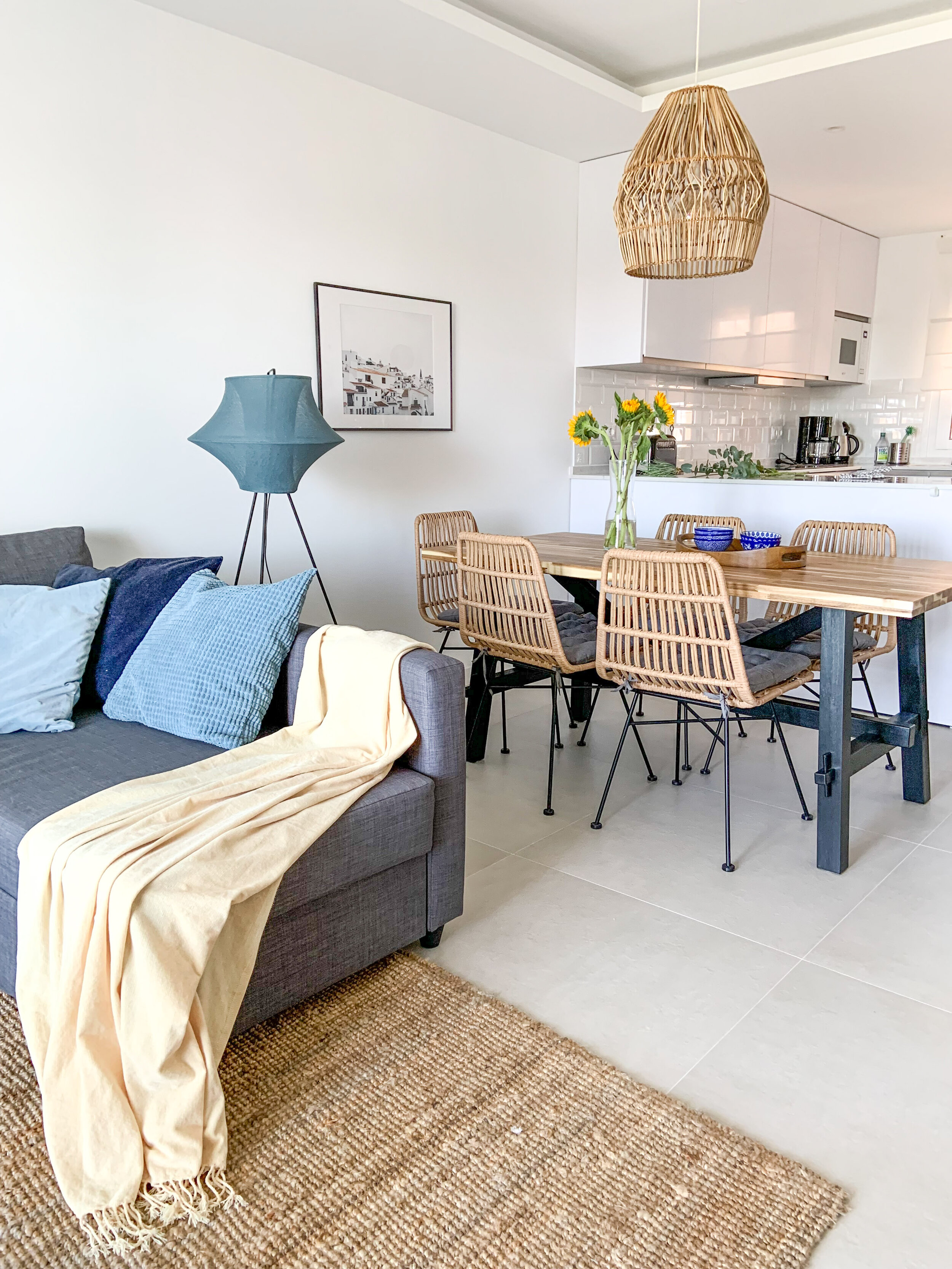
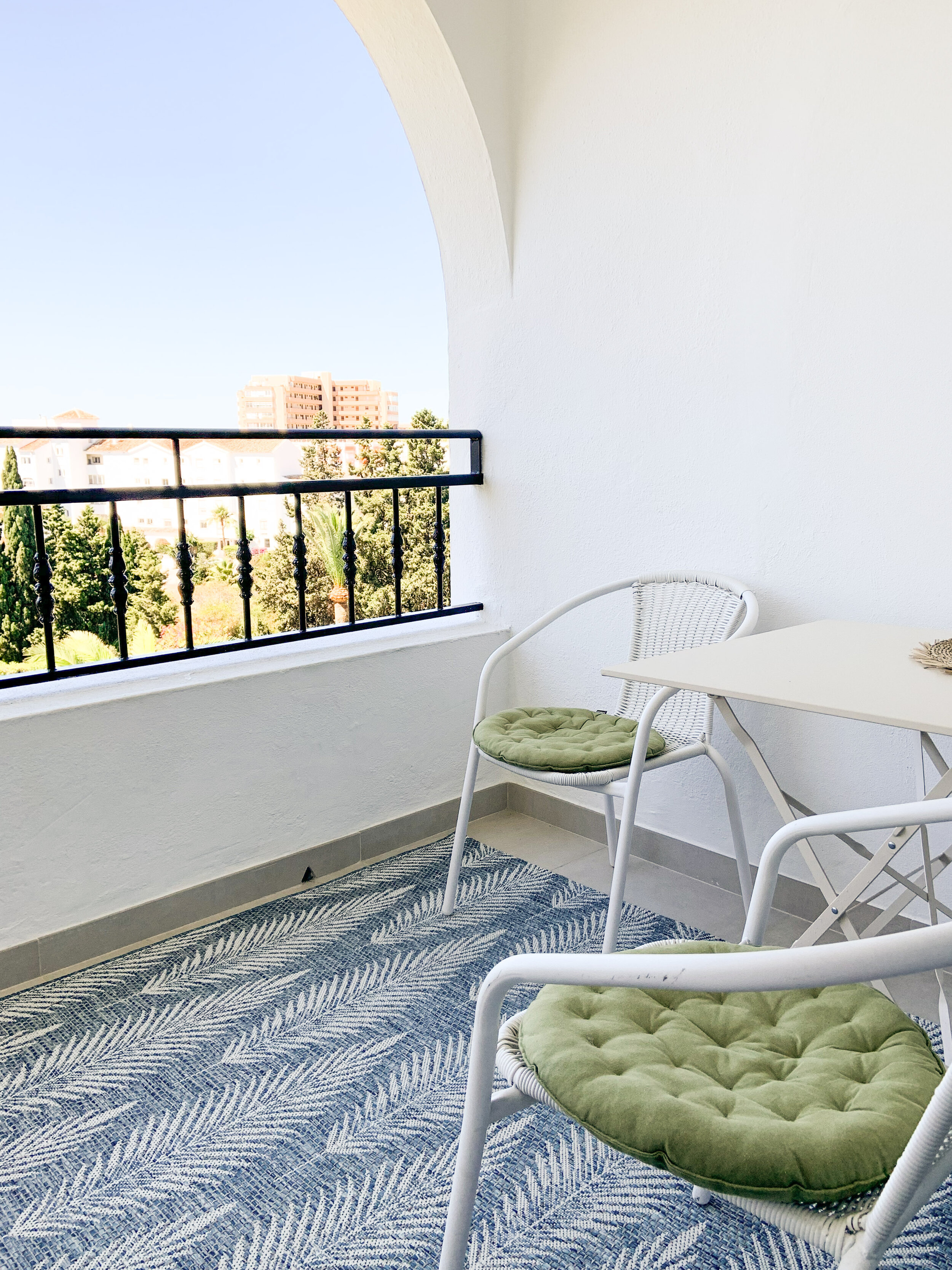
This totally renovated 2 bedroom apartment was bought for rental purposes as well as for the family themselves to spend their vacations and for remote work when ever possible. Beautiful sea and garden views together with an open plan layout make the small apartment feeling airy, light and spacious.

Renting out a vacation home in Spain is rather easy. Of course, it’s renters market at the moment and that makes it even more important to stand out from the crowd and attract potential renters.

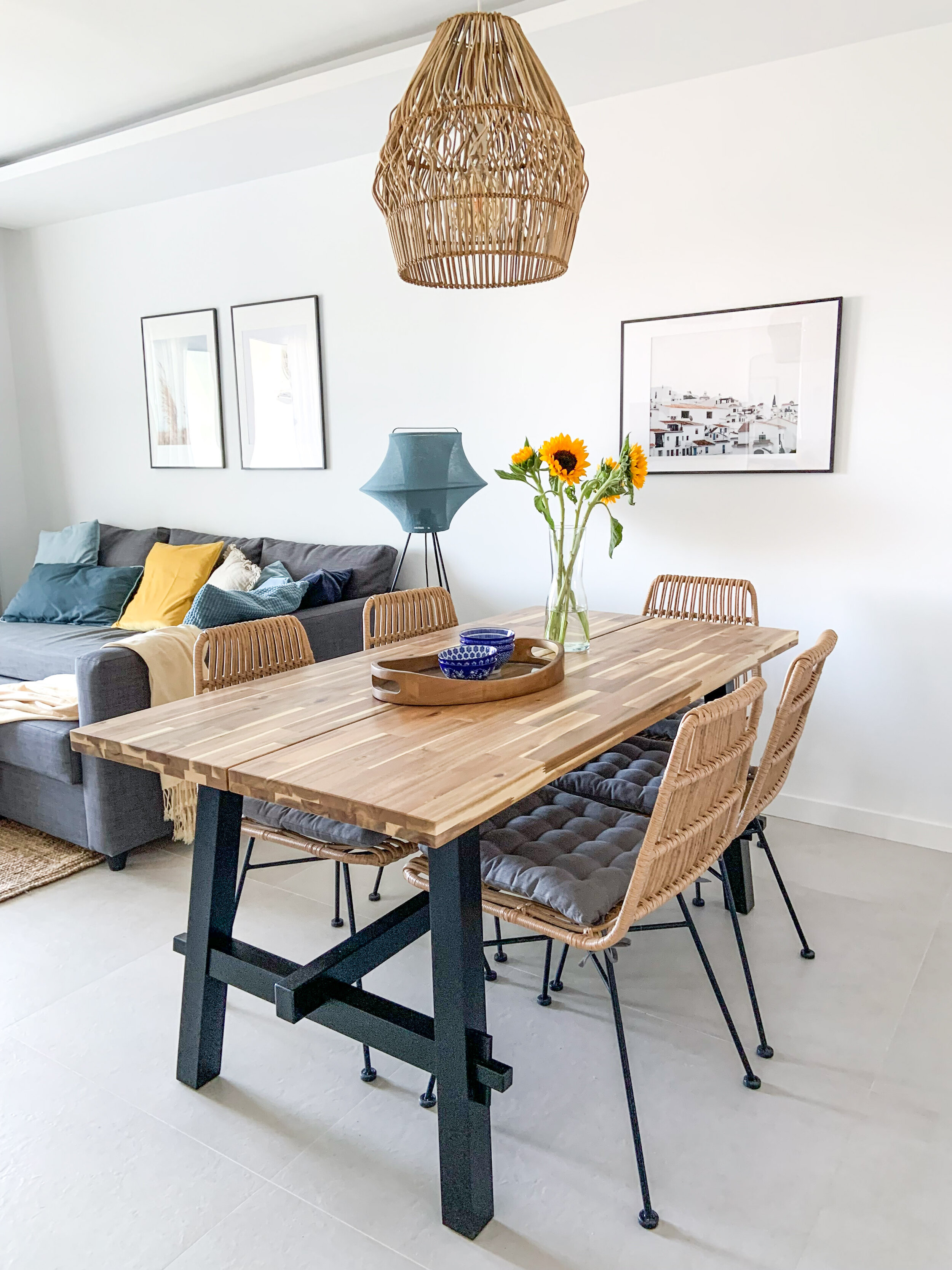
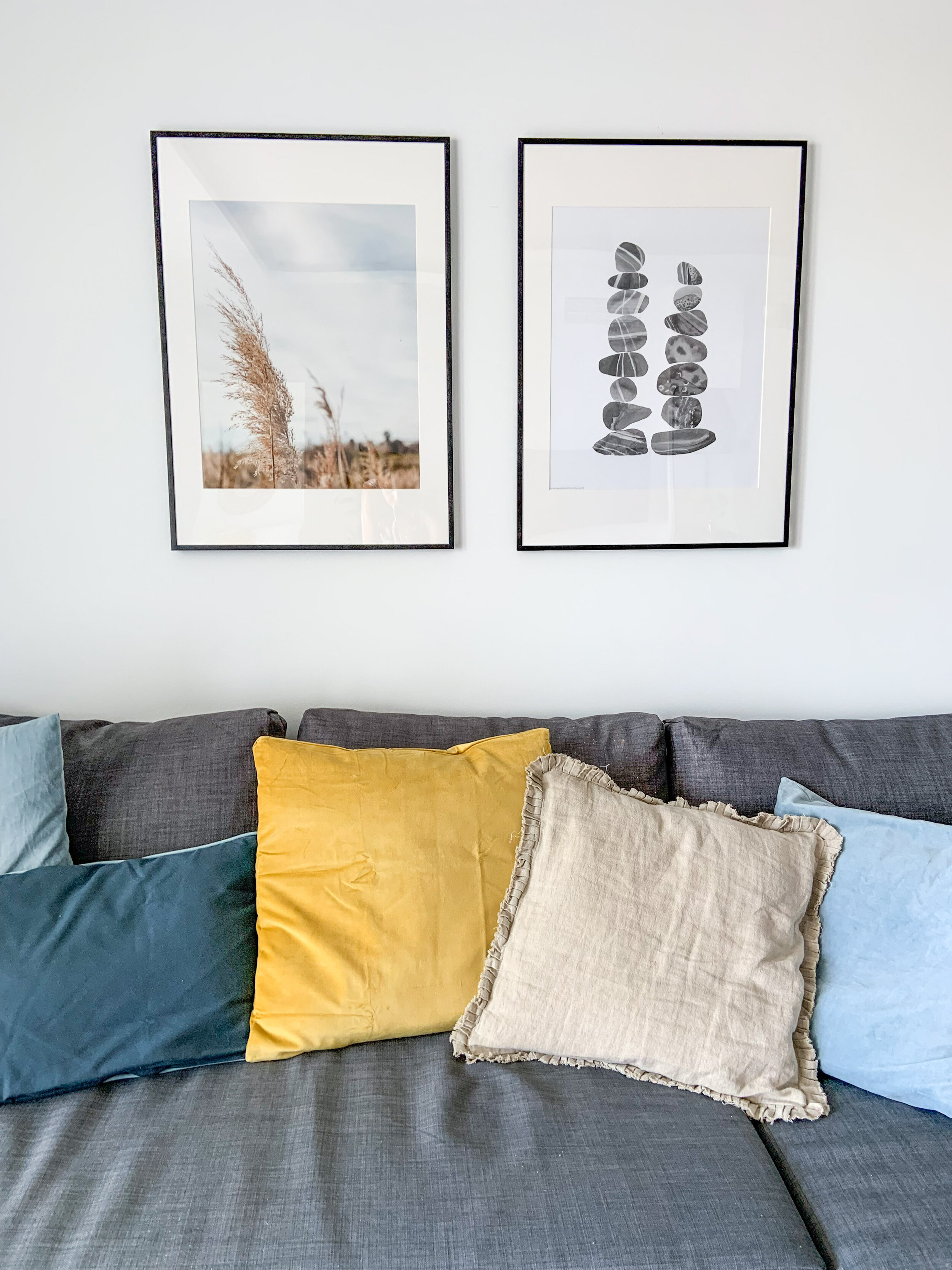
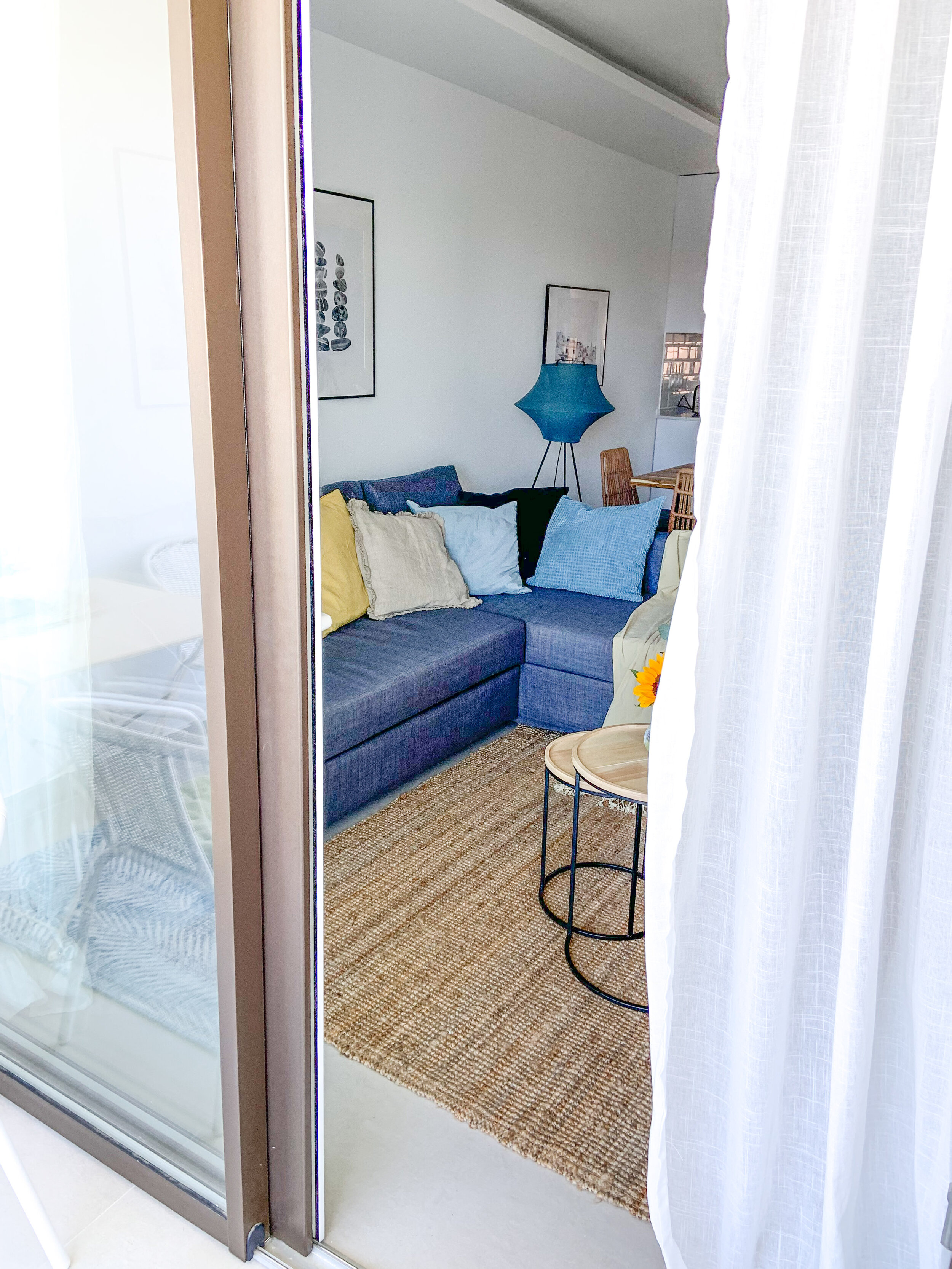
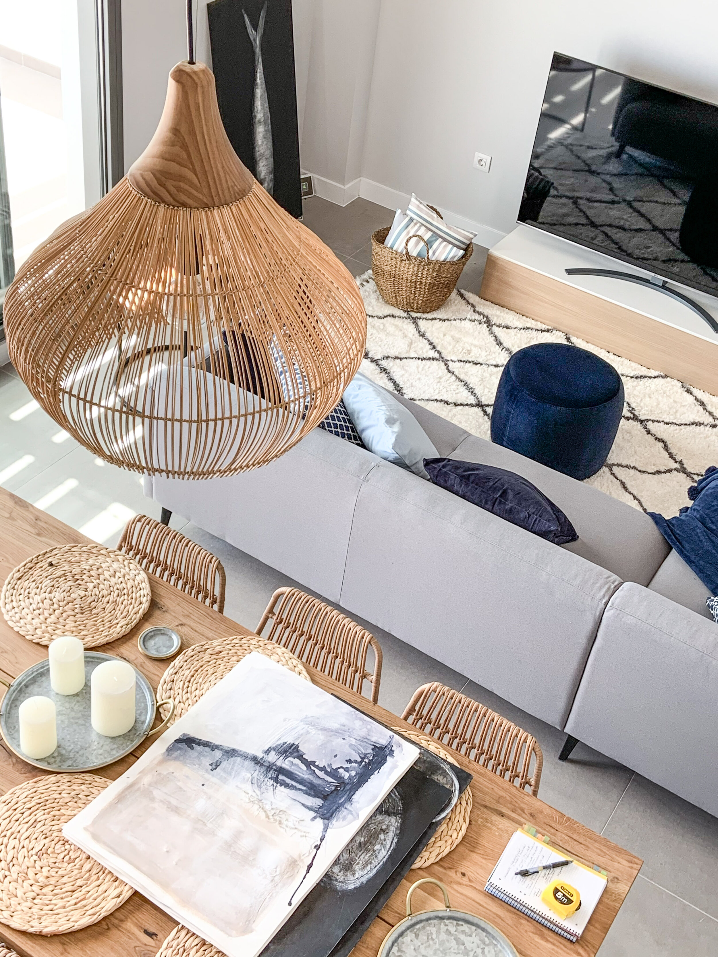
Living & dining - natural hues with tones of fresh blue & sunny yellow.

Living & dining - natural hues with tones of fresh blue & sunny yellow.

Tips For Creating a Standout Vacation Rental

  1. Keep it simple

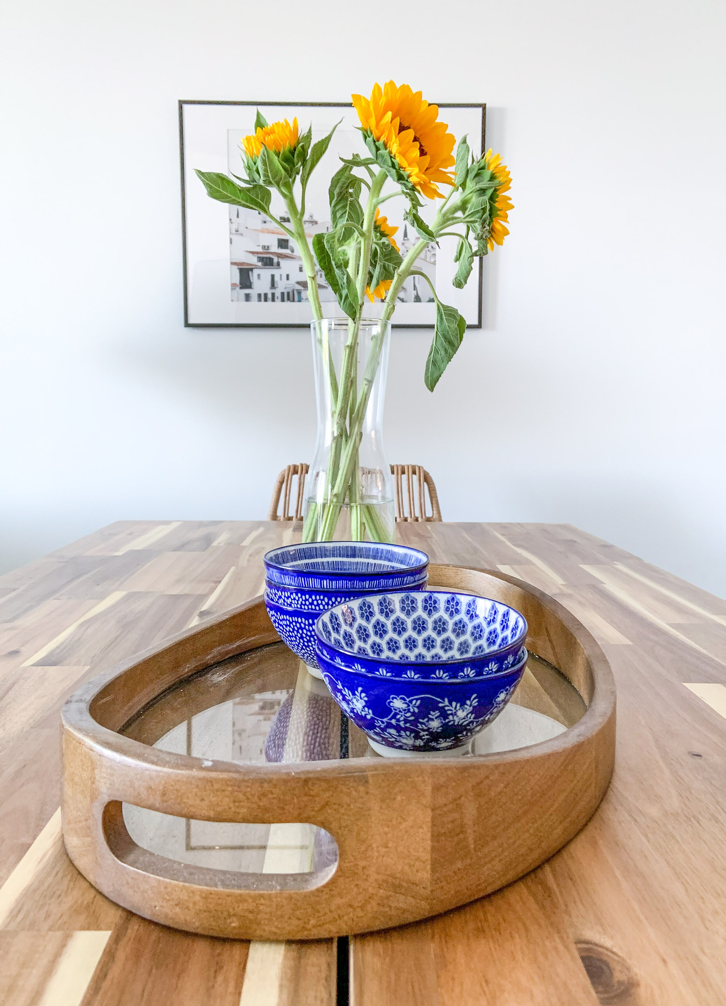
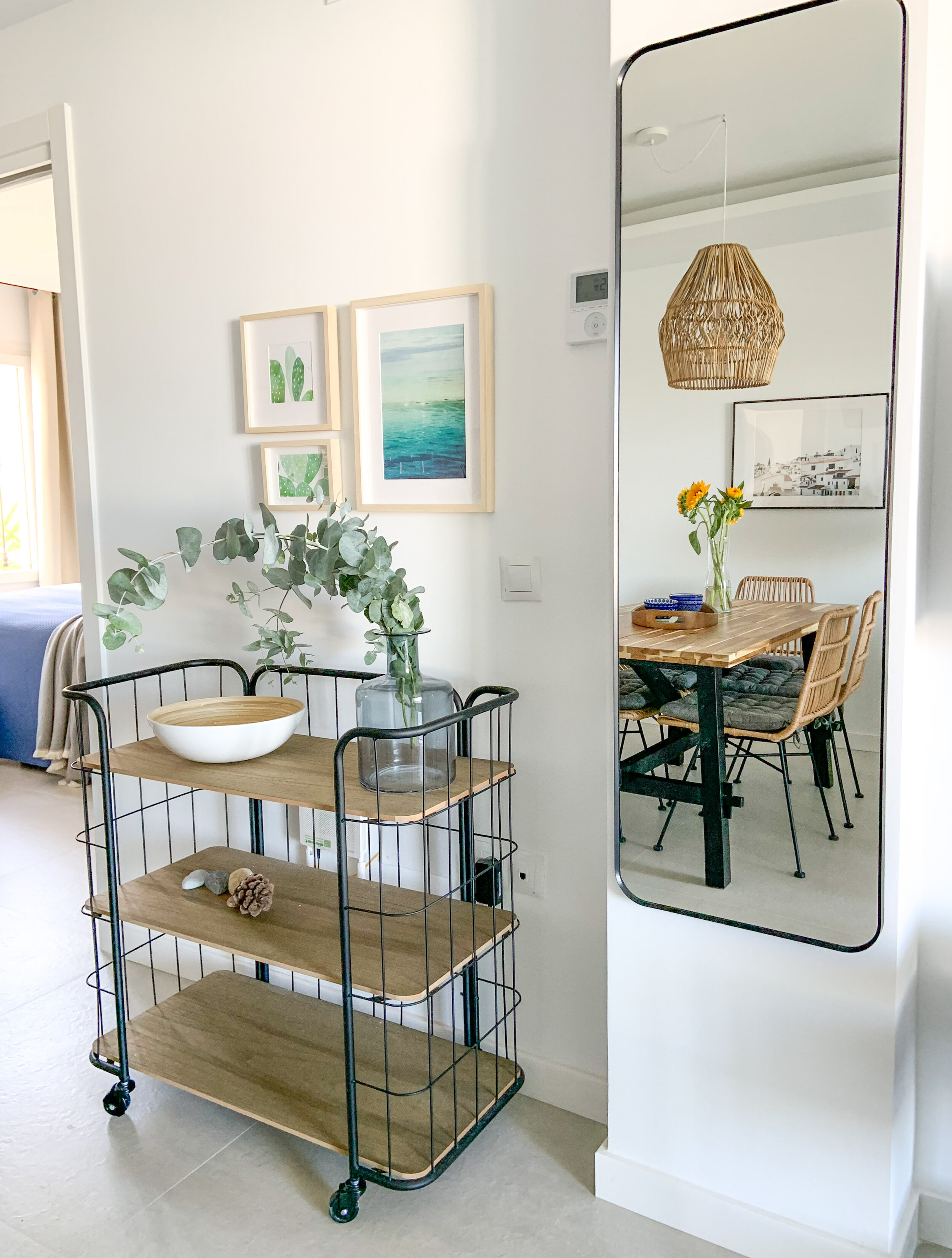
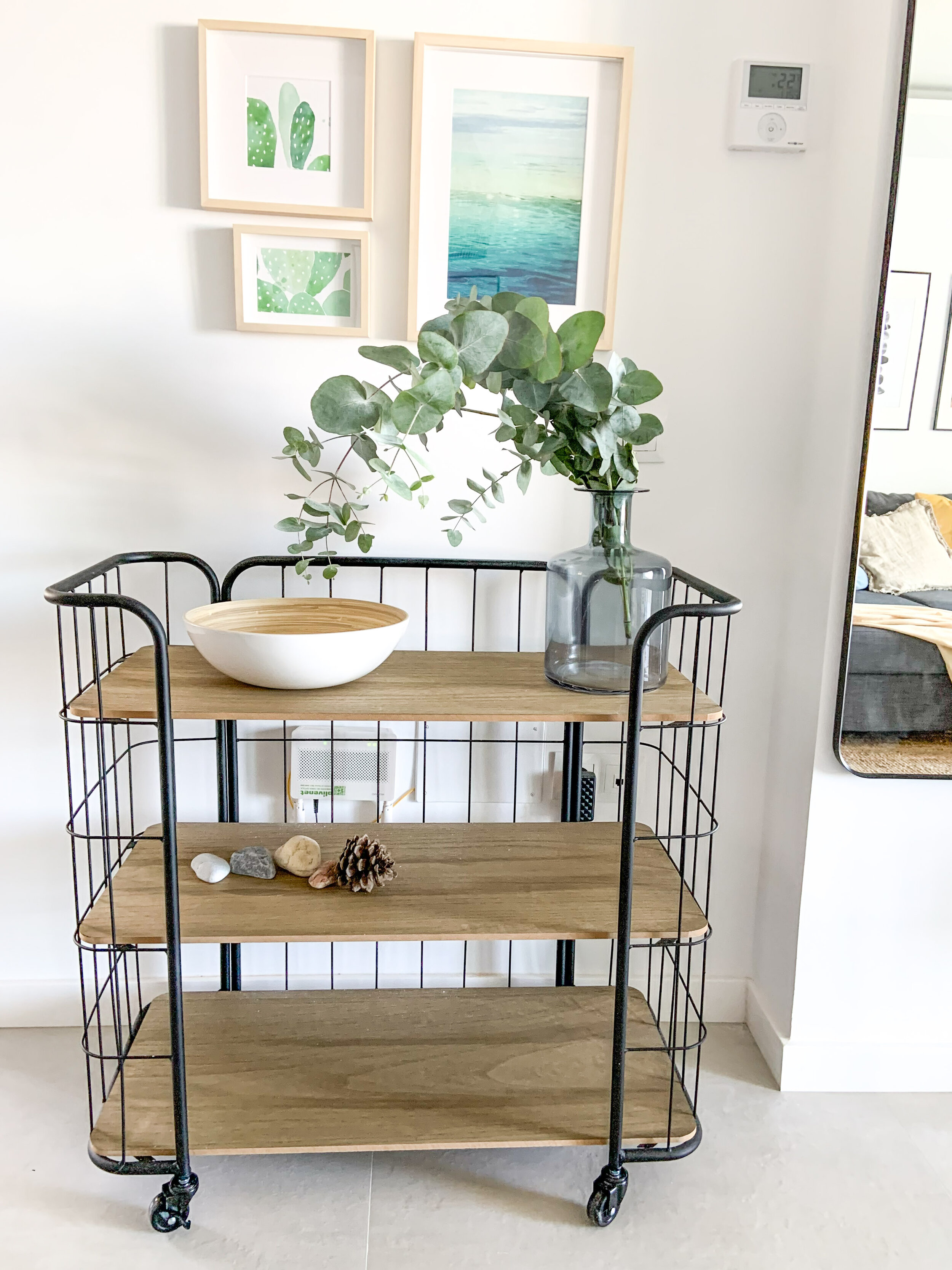
    When designing vacation rentals, simplicity in the furnishing is the key word. Keep the furniture highly edited and accessorising down to a minimum. Use neutrals as your foundation, then build on that with accent colours. Use cushions, blankets, vases, bowls and ‘feel good’ art.

  2. Mix & match

    You can buy the main pieces of furniture in one place and save with the transportation , but add also some smaller pieces from different brands. In this particular case we bought a lot from Ikea such as the sofa, dining table and beds, but the home was spiced up with pieces from Zara Home, Westwing and Casa Mijas.

  3. Decorate with Purpose

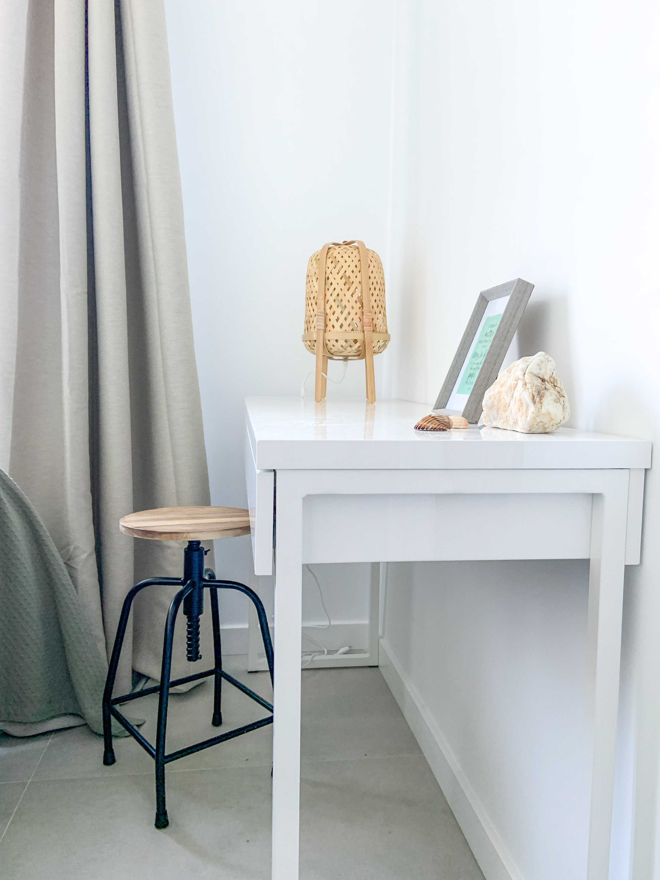
    Every room and space should have a function. In this home it was easy and obvious as the open plan layout gave spaces for different functions - cooking, dining and watching TV & relaxing. Both bedrooms were quite small, but it was important to make the beds inviting and comfortable. In the other bedroom there’s a locked sideboard for owners’ personal stuff, and a desk for working in the other.

  4. Add Thoughtful Touches

    Choosing matching bedlinen and towels show that you care and want your guests to enjoy their stay. Same thing goes with the kitchen utensils - there should be enough of them and all going well together.

IMG_3695.jpg

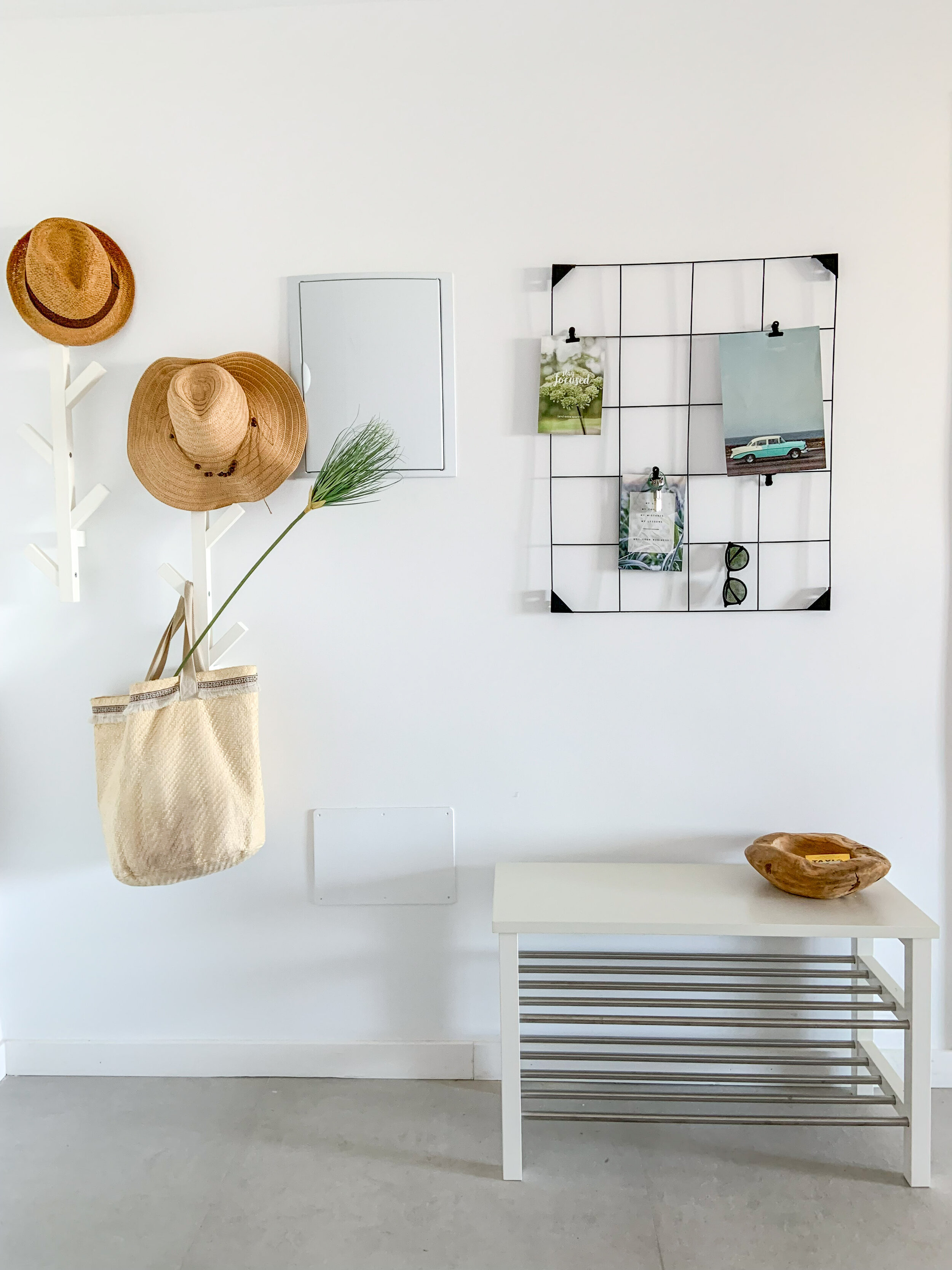
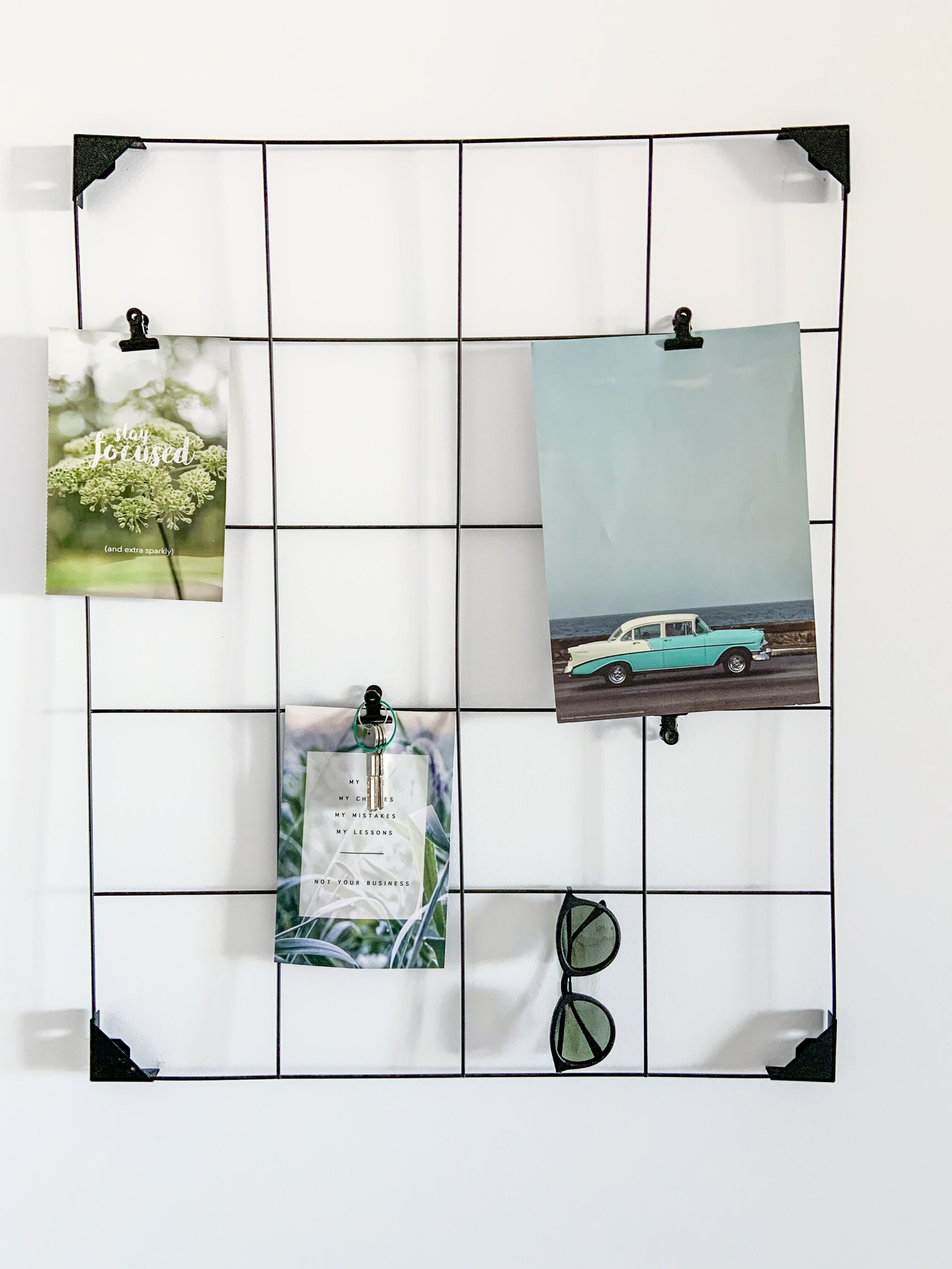
When you need beautiful images to your walls, go to StockBoutique by AT!

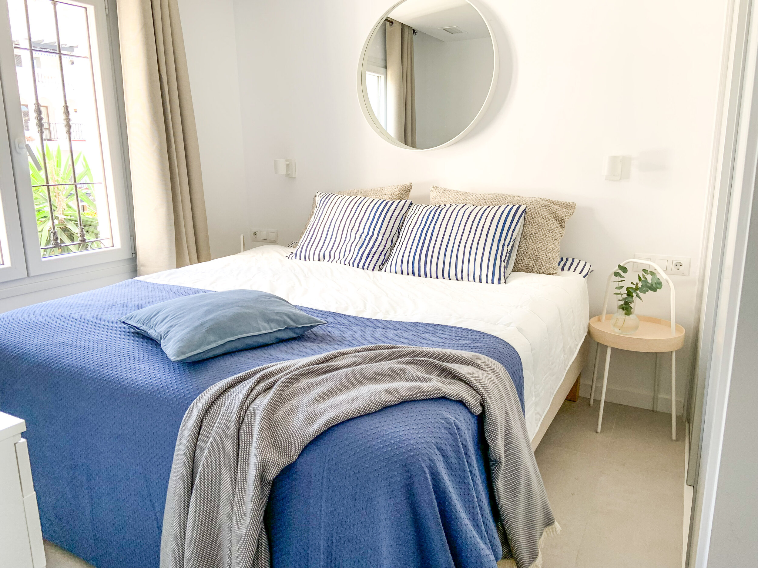
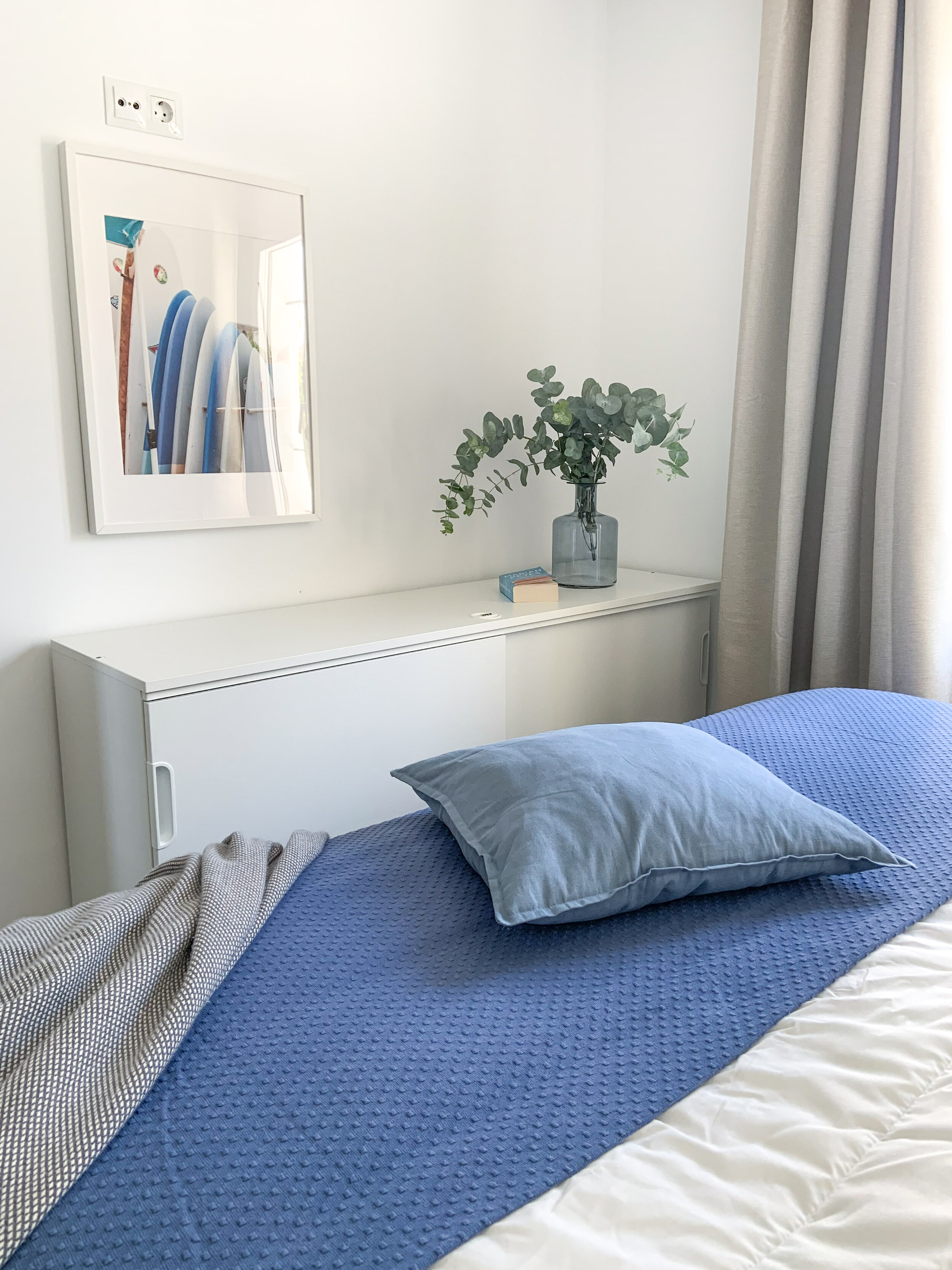
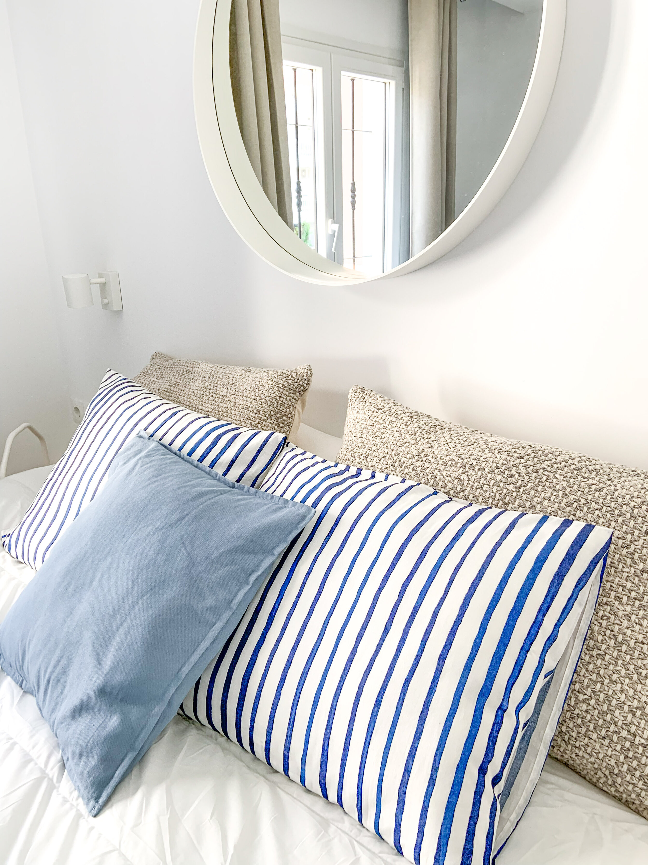
Blue bedroom.

Blue bedroom.

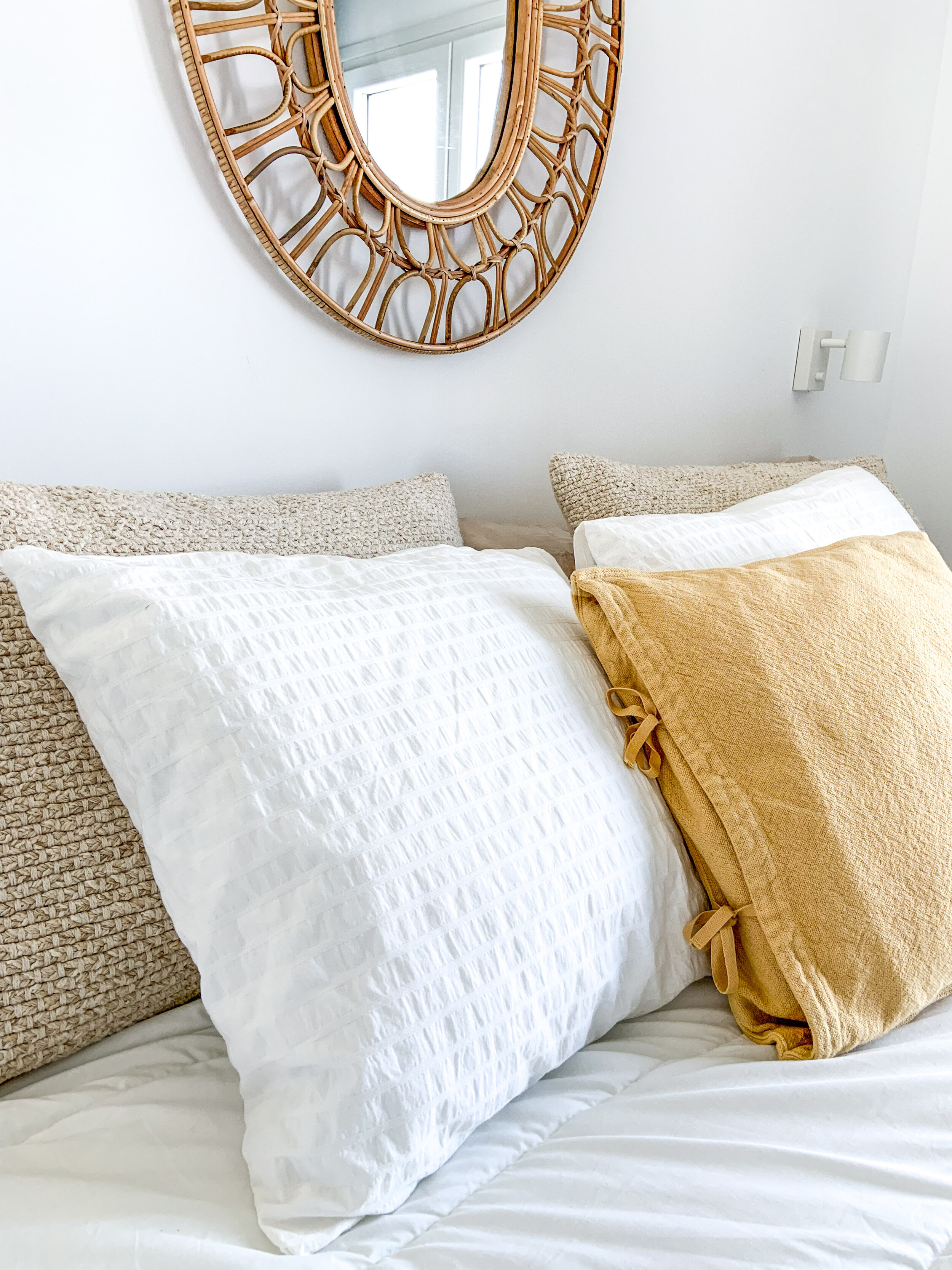
Sunny yellow details.

Sunny yellow details.

The idea is that if guests have a wonderful experience with the home, hopefully they take better care of it. The more you finish a rental home — the more you complete the story — the more respect people have for it.

Beautiful and well-maintained garden with 2 pools.

Beautiful and well-maintained garden with 2 pools.

If you need a holiday home for a week or 2, or for the whole month, this home is available here.

Kids' Bedroom Decor

One of my favourite projects has been the makeover of this apartment in Benalmadena. I will start showing it to you with a sneak peek of the kids’ room. The owner couple wanted to make one of the three bedrooms a place where their two grandchildren - a little girl & boy - would love to sleep while visiting them.

Actually the room was already made but something was missing in the atmosphere. It was ok, but not really inviting. As the space was limited and the main pieces of furniture were the two beds, I obviously concentrated on making the bedd ss inviting as possible for the kid. So that they would want to jump on beds without being worried if the bedspreads get wrinkled.
As always I started with a moodboard. The wish of the owners was to have pastel tones, so I picked up soft tones of blue & pink.

forthekids-1.jpg

Things to Keep in Mind While Decorating for Kids

  • Keep it simple

  • Play with colours

  • Make it kid-friendly

  • Create a space that is stylish, comfortable & fun

IMG_1625.jpg

I wanted to create a place for the children where they could have a little rest also during the day time. After a playful beach day it would be nice to curl up with a book or game and have a little nap.

Kids grow fast! So the decor might need some adjusting in the near future. Keeping the walls and furniture in neutral tones and adding colours in textiles such as in cushions and blankets, makes the room growing with time and stays relevant for years to come. You just change the cushion covers and blankets according to kids’ wishes.

Kidsroom_2.png
Kidsroom_1.png

I think it looks charming, happy and welcoming - what do you think?

kidsroom_decor.jpg

Home With A View

Finally it seems that this new built apartment home will be ready to move-in. The decoration project itself could have been done in a couple of weeks, but sometimes the delivery times take a bit longer time than expected. Also the building had some issues that needed to be fixed before bringing the furniture in.

This is a holiday home - or second home - for a busy Finnish entrepreneur who wanted to have a place to relax, unwind and just enjoy time with friends and family. There’s a golf course nearby, well, actually several of them. The location is also perfect for cycling - I would say for extreme cycling - as the landscape is very hilly. Walking from down the train station up to the apartment a few times has definitely made my condition going up.

IMG_0712.jpg

Planning the decor

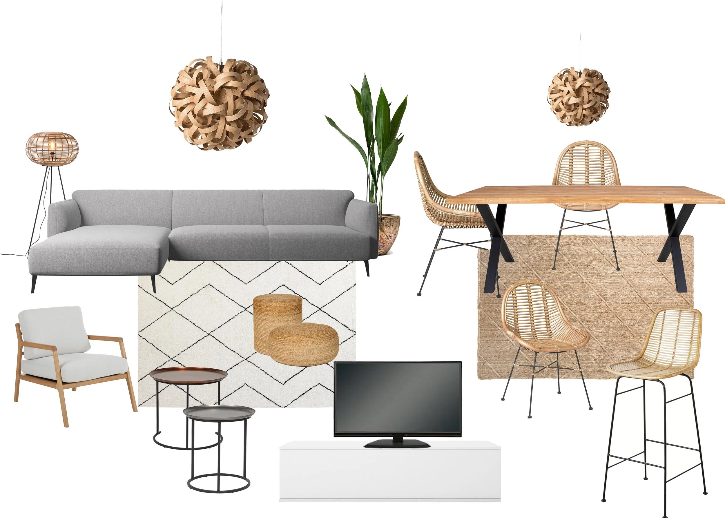
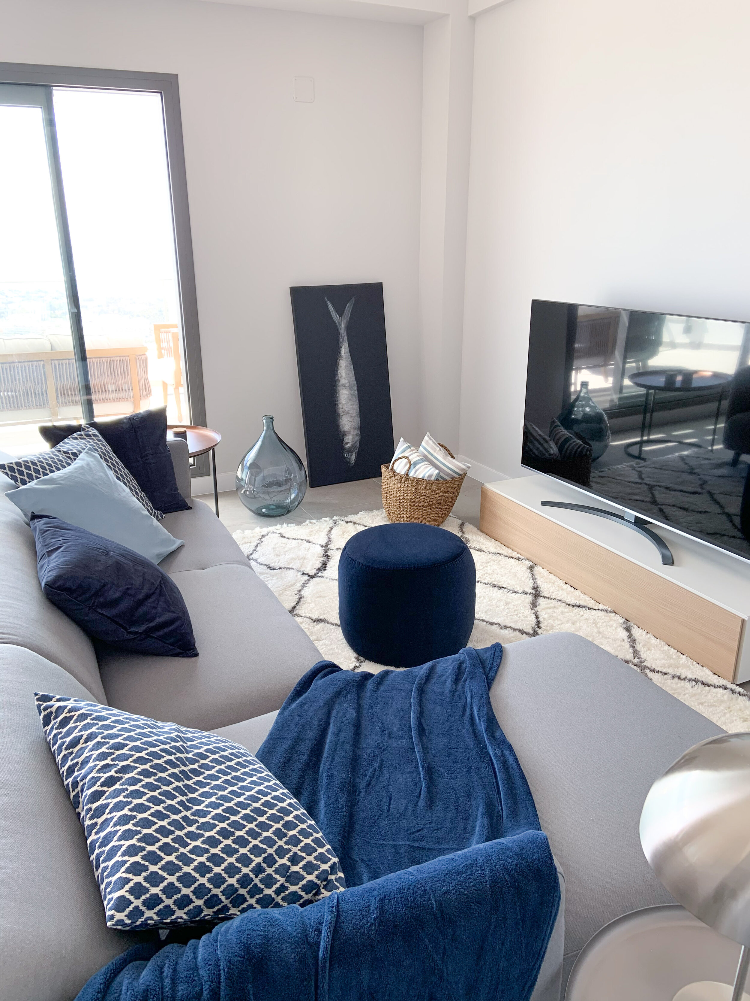
The wish from the owner’s side was to have a modern cosy home. A dining table for 6 persons and a sectional sofa were the main pieces of furniture on the wish list. There’s not so much space to play with so I decided to leave extra seats and cupboards out, and just concentrate on these main items.

living_dining_2.jpg

Originally the TV was planned to be placed on the wall, but that option would have needed an extra construction work to ensure the wall would be strong enough. So the TV is on a low drawer unit. The legs are still missing but on their way.

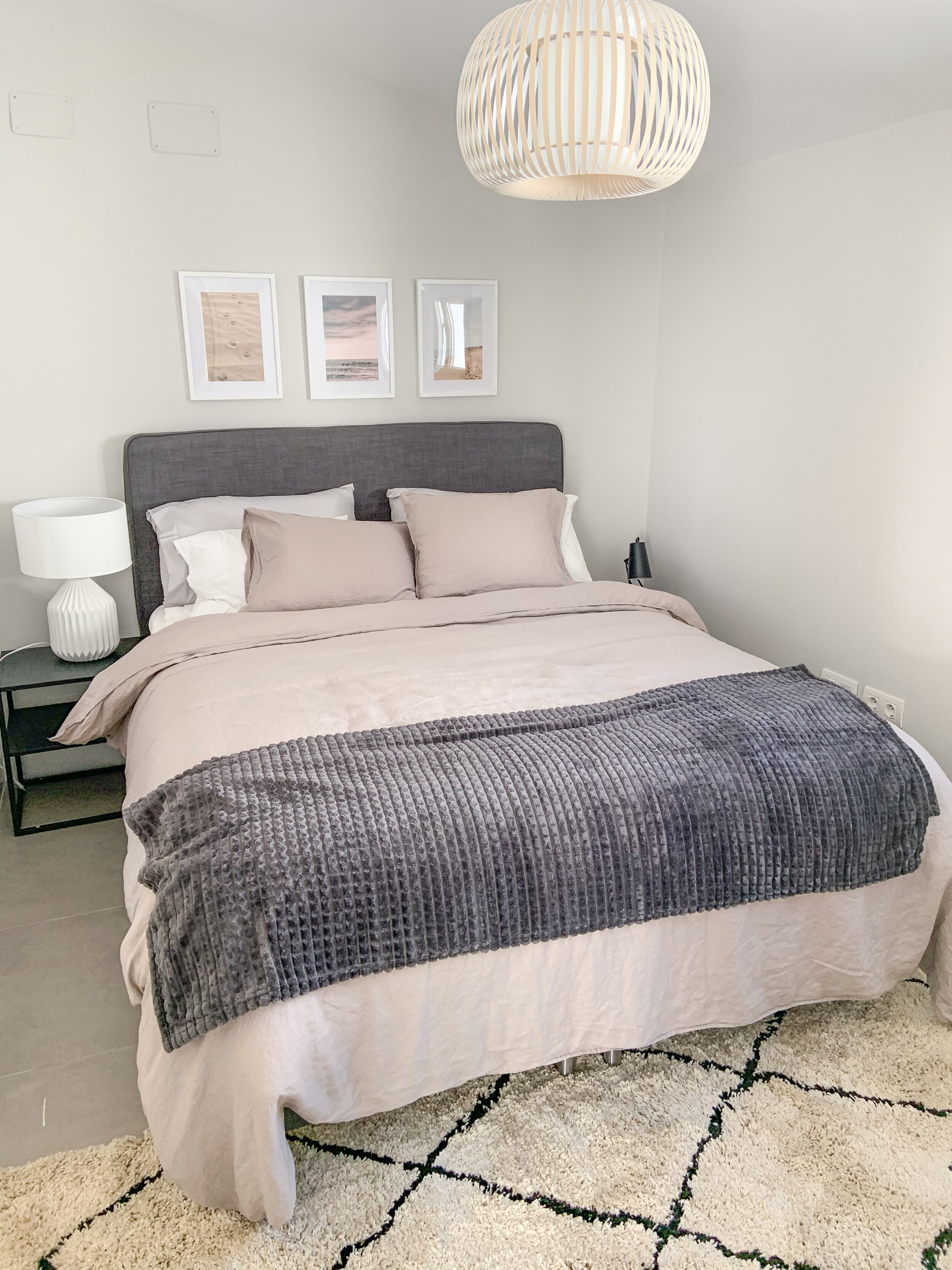
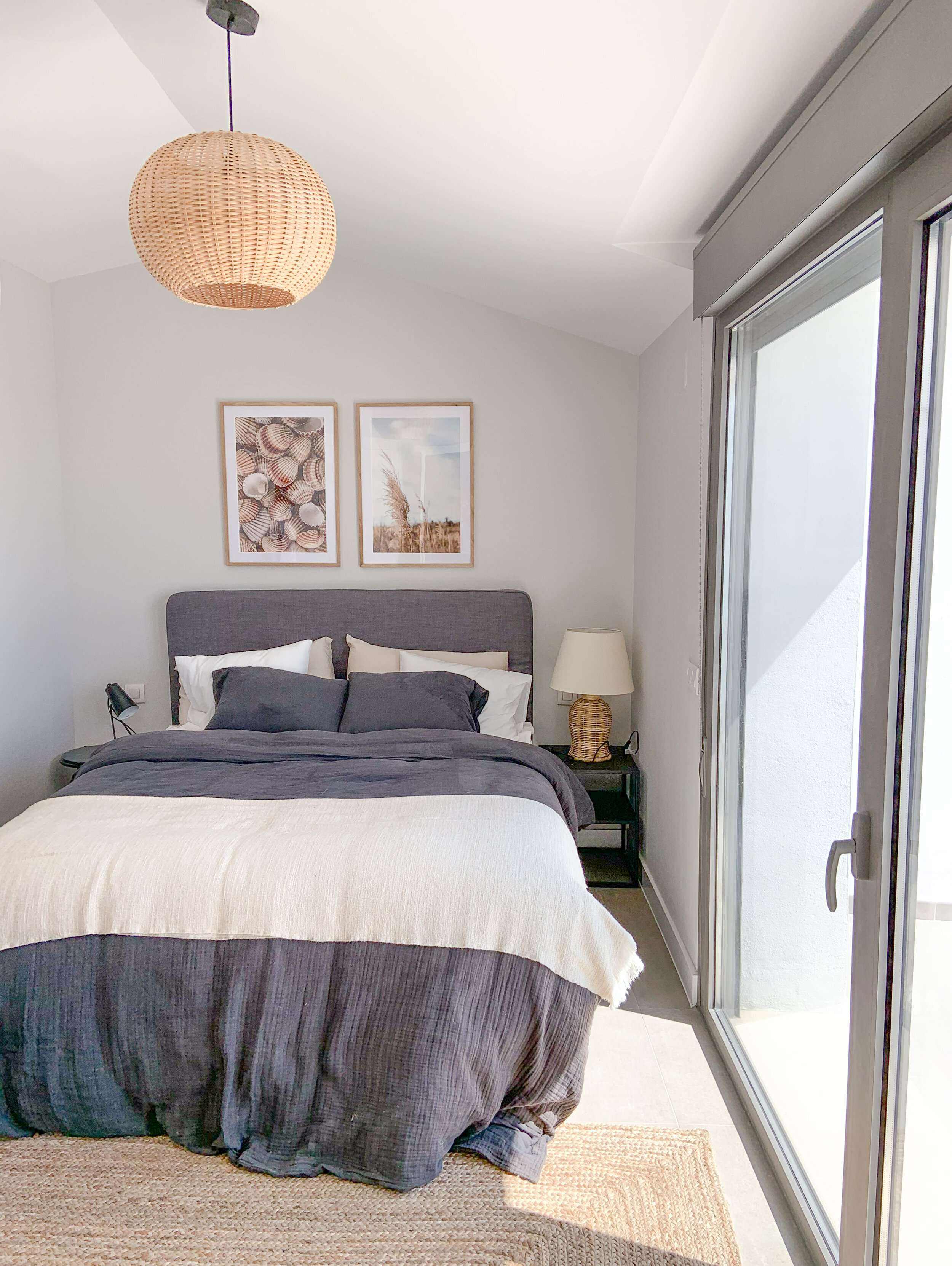
Upstairs there are 2 ensuite bedrooms with built-in wardrobes. Both bedrooms have similar 160cm wide beds. Nothing else is needed beside the nightstands and lamps.

Hues of the home

I chose a neutral colour palette - shades of grey, beige and greige. With these tones it is easy to add any other colour without making the atmosphere too busy. In the living space I added some blue. I felt that fitted well for a home with a seaview.

Art for the walls

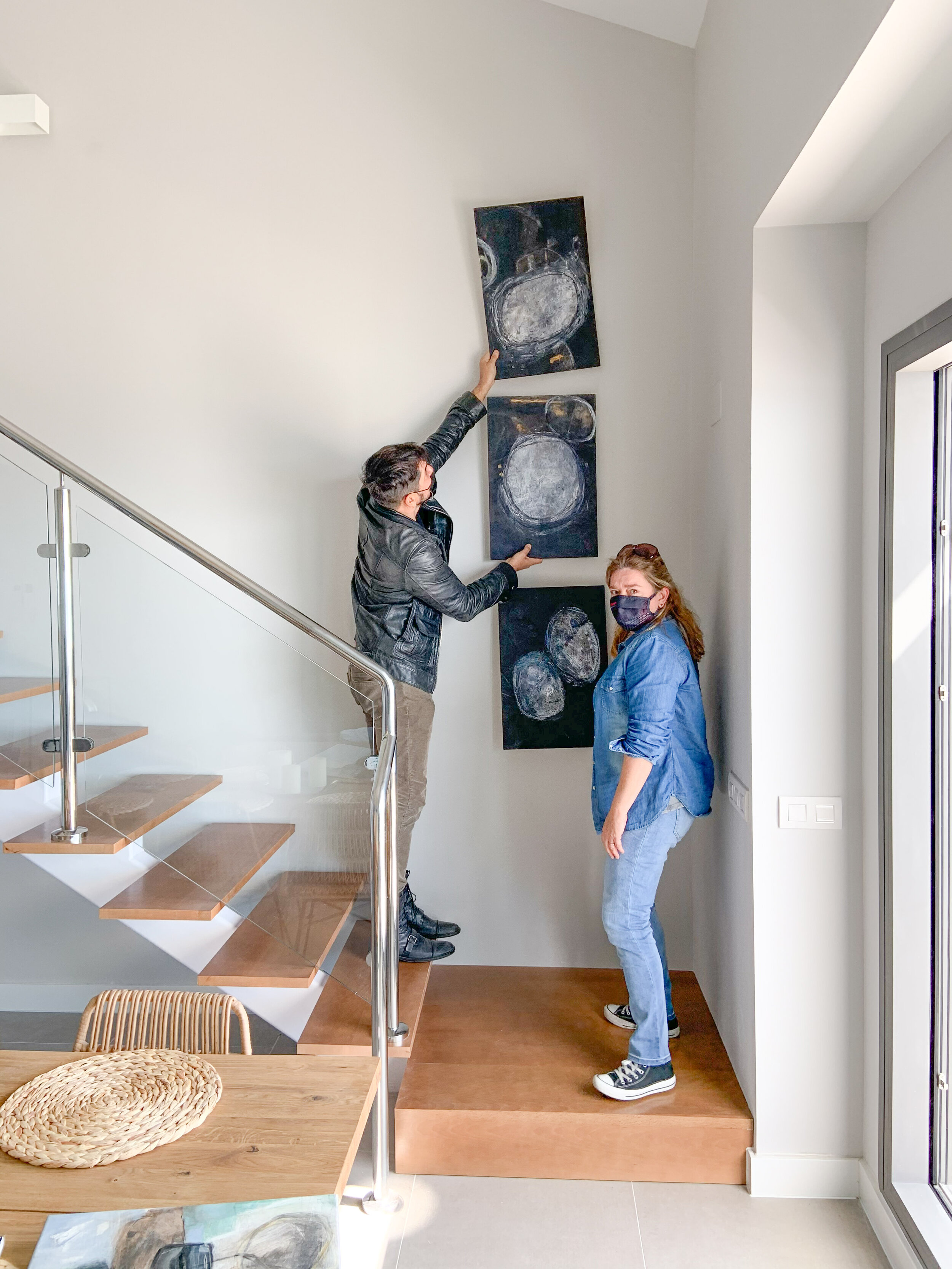
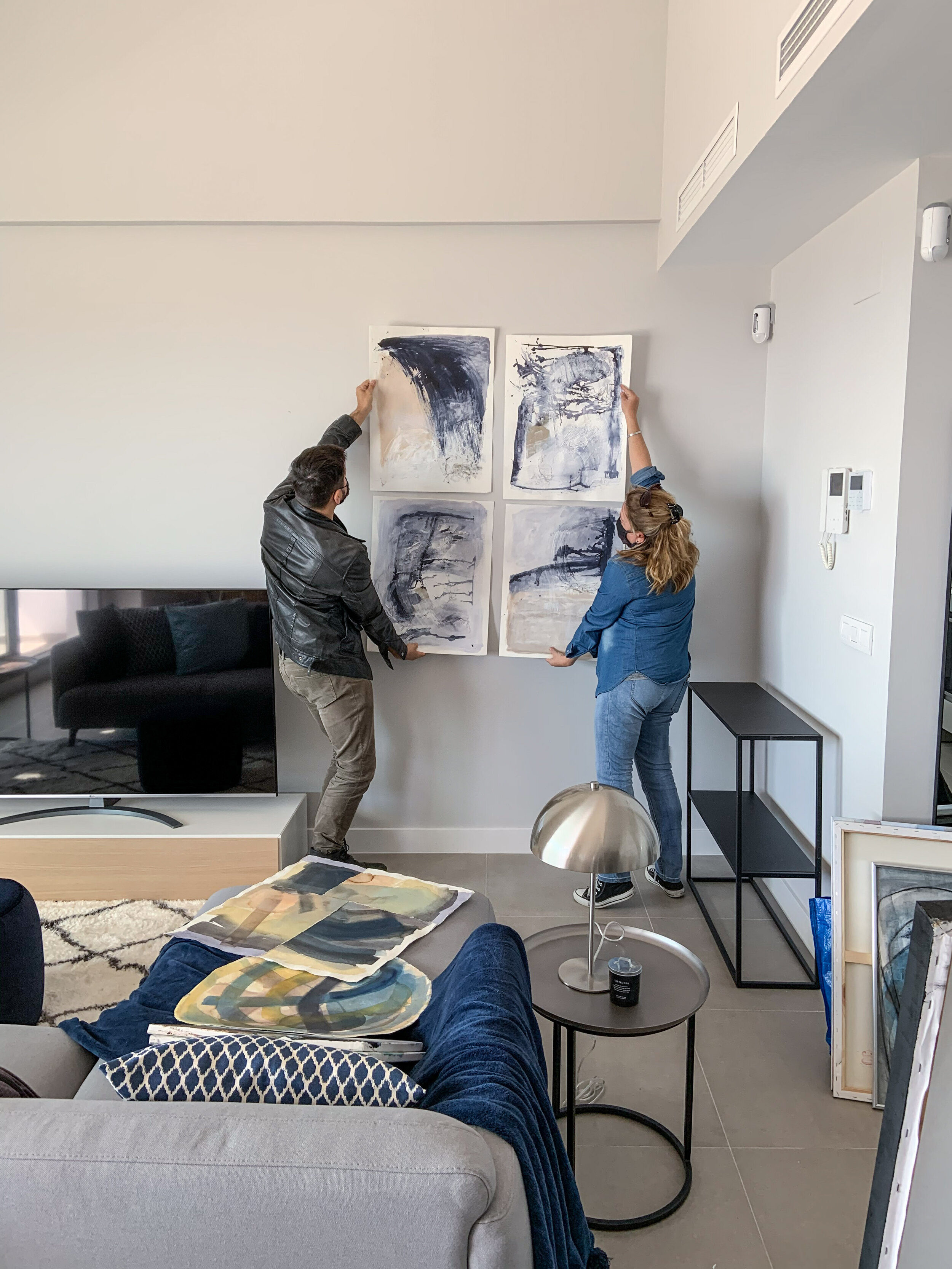
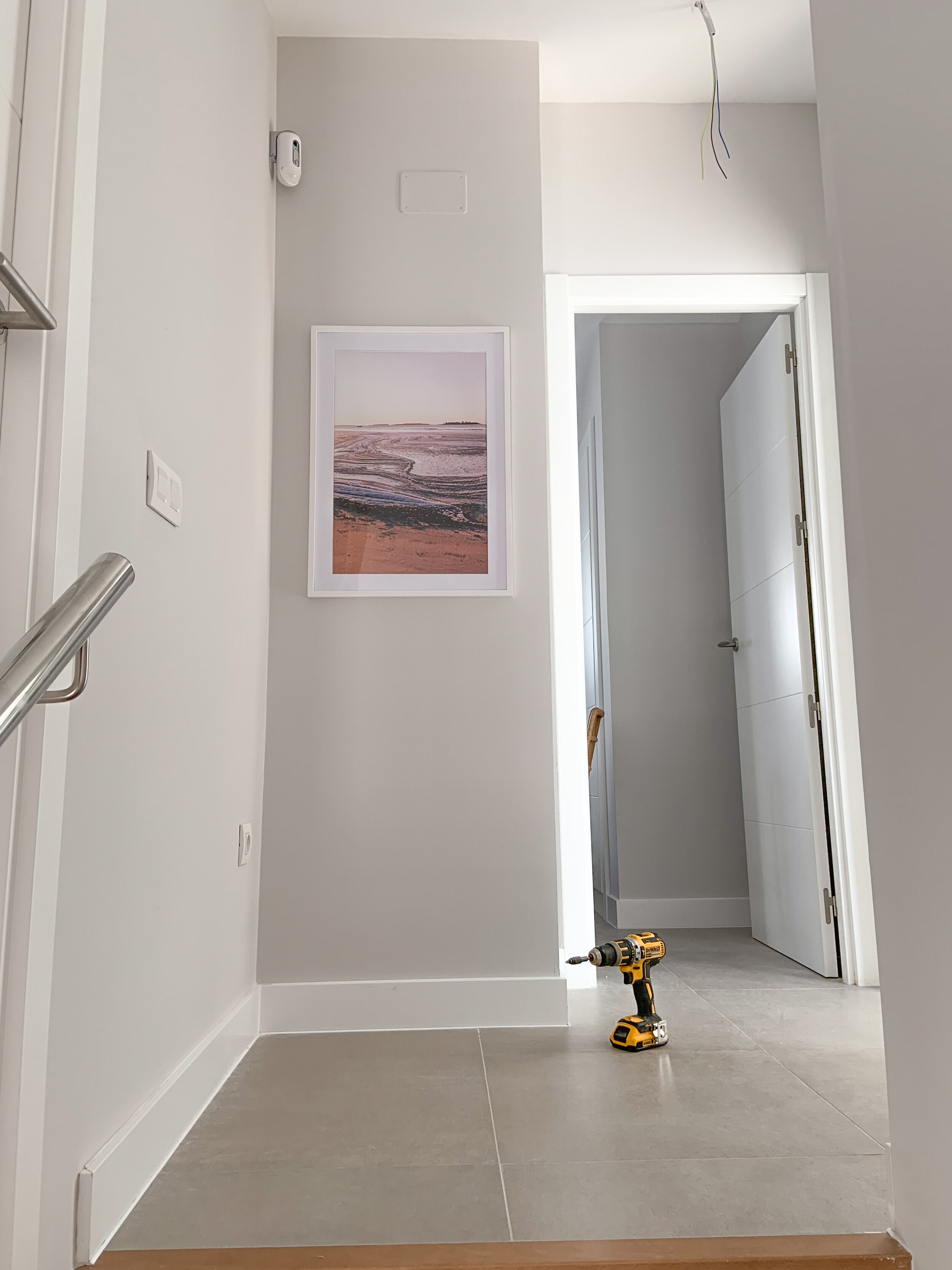
For upstairs I picked up some photos and had them printed on high quality Hahne Muhle paper, and then framed the pictures. Downstairs the ceiling is very high and it really felt that the space needs paintings instead of photos. I found the art of Daniela Raffaele some time ago and asked her to bring a few ready made paintings to see on the spot how they would look in this place.

The ‘Sardina’ and set of 3 smaller paintings caught my eye straight away. I also want to have a rather big painting beside the TV. It could have more colour on it - to be a real wow-factor.

Find out more here!